Understanding Recessions: A Data-Driven Look at Three Major Economic Crises
You've probably heard the word "recession" countless times in the news, especially during economic uncertainty. But what exactly is a recession, and how can we identify one? More importantly, how do different recessions compare to each other?
In this article, we'll dive into 25 years of economic data to understand three major recessions that shaped our modern economy: the 2001 Dot-com Bubble, the 2007-2009 Financial Crisis, and the 2020 COVID-19 Recession. By examining real economic indicators, we'll discover what makes each recession unique and what patterns emerge across all of them.
What Is a Recession?
The simple definition you might hear is "two consecutive quarters of GDP decline." However, the official arbiter in the United States—the National Bureau of Economic Research (NBER)—uses a more nuanced approach. According to NBER, a recession is "a significant decline in economic activity that is spread across the economy and lasts more than a few months."
Why does this matter? Because understanding recessions helps us make better financial decisions, whether we're planning investments, considering career moves, or simply trying to understand the economic headlines.
The Five Key Economic Indicators
Economists track many metrics, but five indicators are particularly important for identifying and measuring recessions:
-
Real GDP (Gross Domestic Product) - The total value of goods and services produced in the economy, adjusted for inflation. Think of it as the economy's overall scorecard.
-
Unemployment Rate - The percentage of people actively looking for work but unable to find jobs. This directly affects millions of households.
-
Consumer Spending - How much households spend on goods and services. Since consumer spending represents about 70% of the U.S. economy, this is a critical indicator.
-
Business Investment - How much companies spend on equipment, buildings, and technology. When businesses stop investing, it signals pessimism about the future.
-
Industrial Production - The output of factories, mines, and utilities. This measures the "real economy" of physical goods production.
Now, let's examine how these indicators behaved during three very different recessions.
Three Recessions, Three Stories
The 2001 Dot-com Bubble: The Mild Recession
Duration: April 2001 - November 2001 (8 months)
The early 2000s brought the collapse of the internet stock bubble. After years of irrational exuberance over anything with ".com" in its name, reality set in. Technology stocks crashed, and the economy followed.
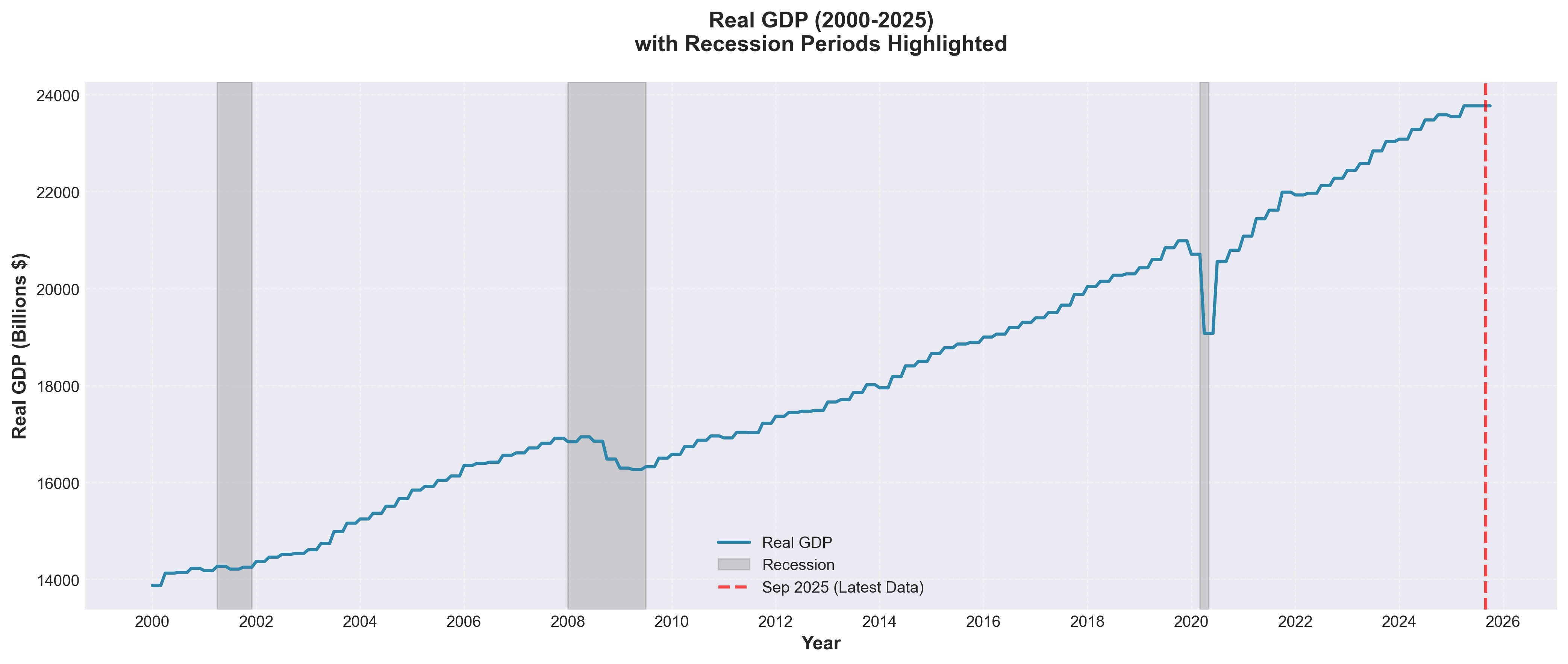 Chart 1: Real GDP (2000-2025)
Looking at Chart 1 above, you can see the first gray shaded area around 2001. The GDP barely dipped—just 0.13%—making this the mildest of our three recessions. The economy was more resilient than many expected.
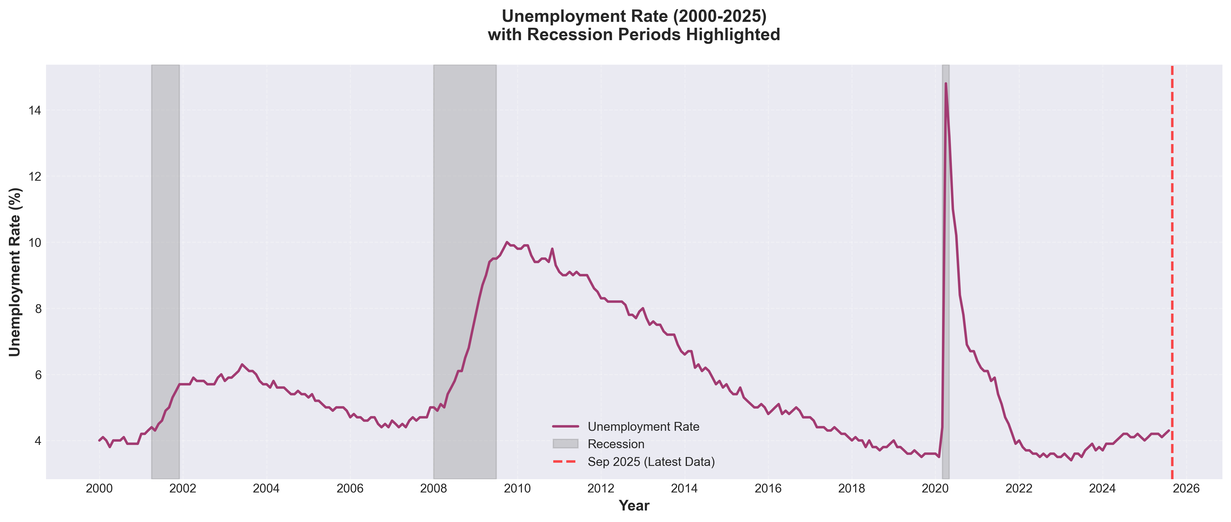 Chart 2: Unemployment Rate (2000-2025)
Chart 2 shows unemployment rising from around 4% to 5.5% during this period. While painful for those who lost jobs, this was relatively contained compared to later recessions.
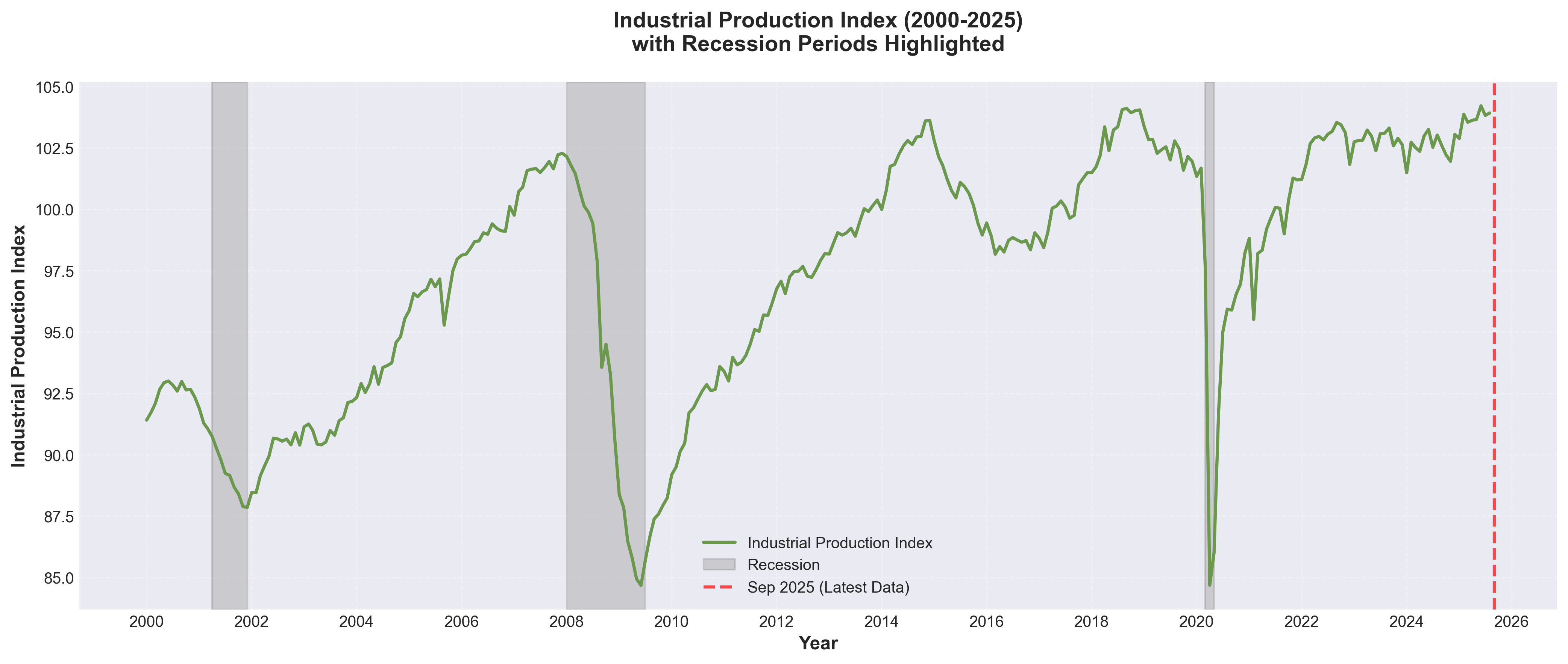 Chart 3: Industrial Production Index (2000-2025)
The industrial sector took a harder hit, as shown in Chart 3. Production fell by 3.14%, reflecting reduced demand for manufactured goods and technology hardware.
Key Takeaway: The 2001 recession was short and relatively shallow. The economy entered recession in April 2001 and was already recovering by November—just 8 months later.
The 2007-2009 Financial Crisis: The Great Recession
Duration: January 2008 - June 2009 (18 months)
The housing bubble burst, banks collapsed, and the world teetered on the edge of financial catastrophe. This was the longest and most severe recession since the Great Depression of the 1930s.
Looking back at Chart 1, the second gray shaded area tells a much darker story. GDP fell by 3.41%—more than 25 times the decline in 2001. The economy contracted for six consecutive quarters.
The human cost was staggering. Chart 2 shows unemployment nearly doubling from 5% to 9.5%. Millions of Americans lost their jobs, homes, and retirement savings.
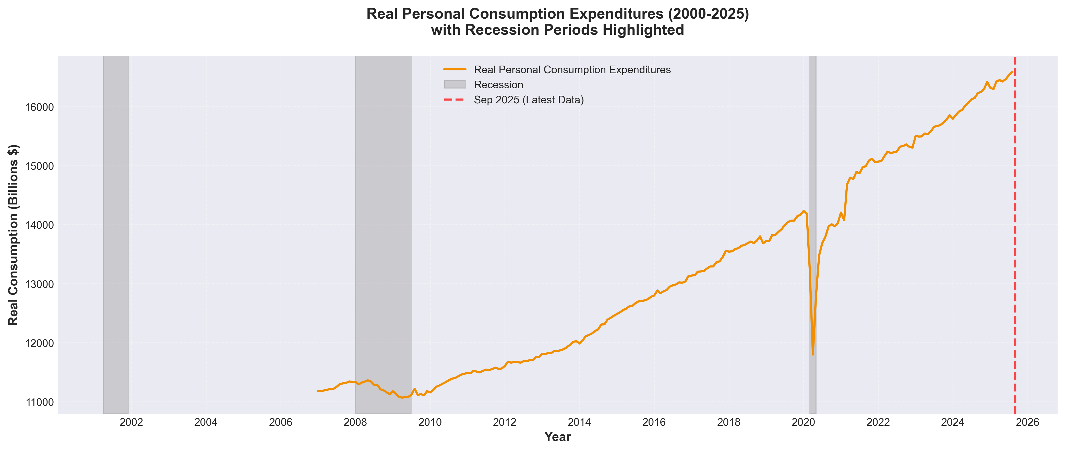 Chart 4: Real Personal Consumption Expenditures (2000-2025)
Chart 4 above reveals a sharp drop in consumer spending during 2008-2009. When people fear losing their jobs, they stop spending—creating a vicious cycle that deepens the recession.
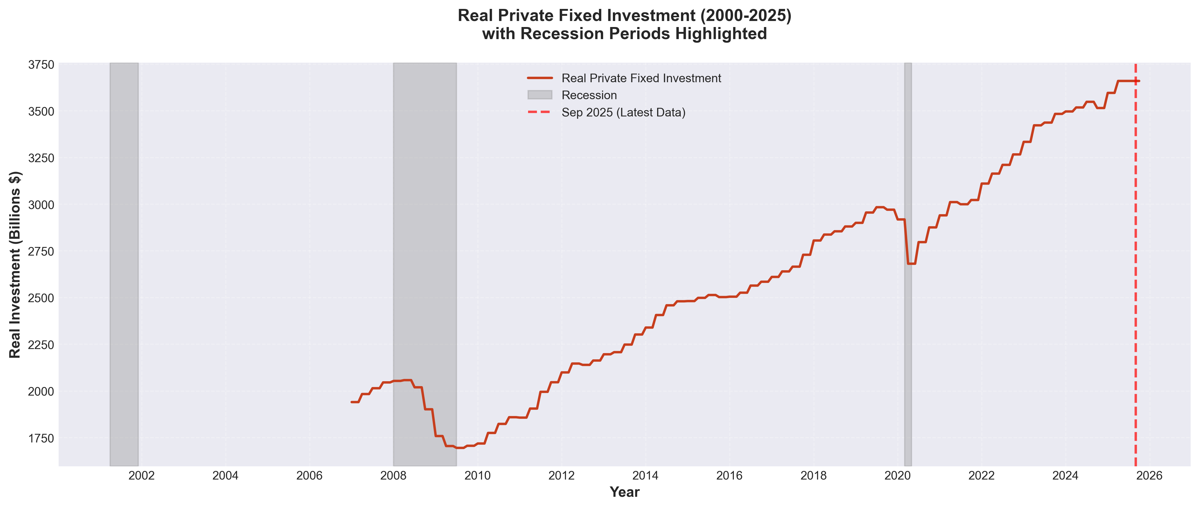 Chart 5: Real Private Fixed Investment (2000-2025)
Perhaps most alarming is Chart 5, which shows business investment plummeting during this crisis. Companies slashed spending on new equipment and expansion, signaling extreme pessimism about the future.
The industrial sector suffered its worst blow. Chart 3 shows a devastating 17.11% decline—factories shut down, production lines went dark, and manufacturing towns across America were hollowed out.
Key Takeaway: The 2007-2009 recession was a crisis of confidence. When the financial system nearly collapsed, both consumers and businesses retrenched dramatically, creating the longest and deepest recession in modern history.
The 2020 COVID-19 Recession: The Shortest but Sharpest
Duration: March 2020 - April 2020 (2 months)
In early 2020, the COVID-19 pandemic forced governments worldwide to implement unprecedented lockdowns. The economy didn't gradually slide into recession—it fell off a cliff.
Chart 1 shows something remarkable in the third gray shaded area: the steepest GDP drop in U.S. history—7.88% in just two months. This is more than double the entire decline during the 2007-2009 crisis, compressed into 60 days.
Chart 2 tells an even more dramatic story. Unemployment rocketed from 3.5% to 14.8%—the highest rate since the Great Depression. Entire industries—restaurants, hotels, airlines, entertainment—essentially shut down overnight.
Yet Chart 3 shows that while production fell sharply (down 13.24%), it rebounded much faster than in previous recessions. The red dotted line marking September 2025 shows we're now producing more than ever.
Look closely at Chart 4. Consumer spending cratered in March-April 2020, but something unexpected happened: massive government stimulus checks and pent-up demand led to a V-shaped recovery. By late 2020, spending was climbing again.
Key Takeaway: The COVID-19 recession was unique—artificially induced by lockdowns rather than fundamental economic weaknesses. This meant the recovery could be equally rapid once restrictions lifted and vaccines arrived.
Comparing the Three Recessions
Let's put the numbers side by side:
| Recession | Duration | GDP Change | Peak Unemployment | Industrial Production |
|---|---|---|---|---|
| 2001 Dot-com | 8 months | -0.13% | 5.5% | -3.14% |
| 2007-2009 Financial Crisis | 18 months | -3.41% | 9.5% | -17.11% |
| 2020 COVID-19 | 2 months | -7.88% | 14.8% | -13.24% |
Different Causes, Different Patterns
The 2001 recession was a classic asset bubble bursting—stocks were overvalued, the bubble popped, and the economy adjusted. The impact was limited primarily to technology and investment sectors.
The 2007-2009 crisis was a systemic financial collapse. When banks stop lending and credit markets freeze, the damage spreads to every corner of the economy. This is why it lasted so long and cut so deep.
The 2020 recession was an external shock—a pandemic forcing economic shutdowns. Because the underlying economy was healthy, recovery could be rapid once the shock passed.
What All Recessions Share
Despite their differences, all three recessions show common patterns across our five indicators:
- GDP always falls - By definition, recessions mean declining output
- Unemployment rises - Companies lay off workers when demand drops
- Consumer spending decreases - People spend less when uncertain about the future
- Business investment plummets - Companies delay expansion plans during uncertainty
- Industrial production drops - Factories produce less when demand falls
The order and severity vary, but these patterns repeat.
Early Warning Signs: Can We See Recessions Coming?
Looking at all five charts, some patterns emerge that might signal trouble ahead:
Inverted patterns between GDP and unemployment: Notice in Charts 1 and 2 that when GDP falls, unemployment rises—they move in opposite directions. When you see GDP growth slowing while unemployment starts ticking up, caution is warranted.
Declining industrial production: In Chart 3, production often starts falling before the official recession begins. Factories respond quickly to weakening demand.
Weakening business investment: Chart 5 shows that companies often cut investment before consumers cut spending. When businesses lose confidence, trouble may be ahead.
However, it's important to note: predicting recessions is notoriously difficult. Even professional economists struggle to call them in real-time.
What This Means for You
Whether you're an investor, a job seeker, or just trying to plan your financial future, understanding recessions helps you make better decisions:
For your career: Industries respond differently to recessions. Healthcare, utilities, and consumer staples tend to be more stable. Technology and luxury goods are more cyclical.
For your investments: Recessions are temporary. Looking at Chart 1, notice that every recession ended and growth resumed. Selling in panic during downturns has historically been a mistake.
For your finances: The best time to prepare for a recession is before it happens. Building an emergency fund, avoiding excessive debt, and diversifying income sources all help weather economic storms.
For perspective: The red dotted line in all our charts marks September 2025—the most recent data available. Despite three major recessions in 25 years, the overall trajectory is upward. The economy has proven resilient.
Looking Ahead
As of September 2025 (marked by the red dotted line across our charts), the U.S. economy has fully recovered from the COVID-19 recession. GDP is at record highs, unemployment is low, and industrial production has rebounded strongly.
But recessions are part of the economic cycle. We don't know when the next one will come or what will trigger it. What we do know, based on 25 years of data, is that:
- Recessions vary dramatically in cause, duration, and severity
- They always end
- The economy has always recovered
- Understanding the indicators helps us navigate uncertain times
The data tells a story of resilience. Despite dot-com crashes, financial catastrophes, and global pandemics, the economy adapts, recovers, and grows. For individuals, the lesson isn't to fear recessions but to understand them—and prepare accordingly.
Data Source: All data from the Federal Reserve Economic Data (FRED) database, covering January 2000 through September 2025. Charts show official NBER recession periods (gray shaded areas) and current data point (red dotted line).
Technical Note: For the 2001 recession analysis, consumer spending and business investment data were not available from FRED. The analysis for this period focuses on GDP, unemployment, and industrial production—three indicators that provide a complete picture of this relatively mild recession.
Comments (0)
No comments yet. Be the first to comment!