The Sharpe Ratio Explained: Your Guide to Smarter Investing
3-minute read
Imagine you're choosing between two investment opportunities. Investment A promises 20% returns, while Investment B offers 15% returns. The choice seems obvious, right? Not so fast. What if I told you that Investment A's returns swing wildly between +50% and -10%, while Investment B delivers a steady 15% year after year? Suddenly, the "obvious" choice isn't so clear anymore.
This is exactly the problem the Sharpe ratio solves—and why every investor should understand it.
What Is the Sharpe Ratio?
The Sharpe ratio is like a report card for investments. But instead of just grading on raw performance, it grades on risk-adjusted performance. In simple terms, it tells you how much extra return you're getting for the extra risk you're taking.
Think of it this way: if two runners finish a race in the same time, but one ran uphill while the other ran on flat ground, who's the better athlete? The Sharpe ratio helps you identify the "uphill runner" in the investment world.
The Formula (Don't Worry, It's Simple)
Sharpe Ratio = (Investment Return - Risk-Free Rate) ÷ Volatility
Let's break this down in plain English:
- Investment Return: How much money your investment made (annually)
- Risk-Free Rate: What you could earn from a "safe" investment like government bonds (usually 2-3%)
- Volatility: How much your investment's value bounces around (the "bumpiness" of the ride)
Higher Sharpe ratio = Better risk-adjusted performance
How Do We Measure Volatility?
You might be wondering: "How exactly do we measure this 'volatility' thing?" Great question! Volatility isn't just a feeling—it's a precise mathematical measurement.
The Simple Explanation
Volatility measures how much an investment's daily returns jump around compared to its average return. Think of it like measuring how bumpy a car ride is:
- Low volatility: Your investment moves up and down gently, like driving on a smooth highway
- High volatility: Your investment jerks up and down dramatically, like driving on a rocky mountain road
The Technical Side (Made Simple)
Here's how volatility is calculated:
- Calculate daily returns: How much did your investment go up or down each day?
- Find the average: What's the typical daily return?
- Measure the spread: How far do the daily returns typically deviate from this average?
- Annualize it: Convert this daily "spread" to a yearly number
For example, if a stock's price bounces between +3% and -3% on most days, it has higher volatility than a stock that typically moves between +0.5% and -0.5%.
A Real Example
Let's say Stock A gained 1%, 2%, -1%, 3%, 0% over five days (average: 1% per day). Stock B gained 8%, -5%, 12%, -3%, 3% over the same five days (average: 3% per day).
Even though Stock B has higher average returns, its volatility is much higher because its daily returns are more spread out. The Sharpe ratio accounts for this by "penalizing" Stock B for being bumpier, even though it had better raw returns.
Key insight: Volatility captures the uncertainty and stress of holding an investment. High volatility means you never know if tomorrow will bring a big gain or a big loss.
Why This Matters: A Tale of Four Investments
To illustrate how return and volatility interact, let's follow four hypothetical investments that build on each other. The chart below shows exactly how these scenarios play out over time:
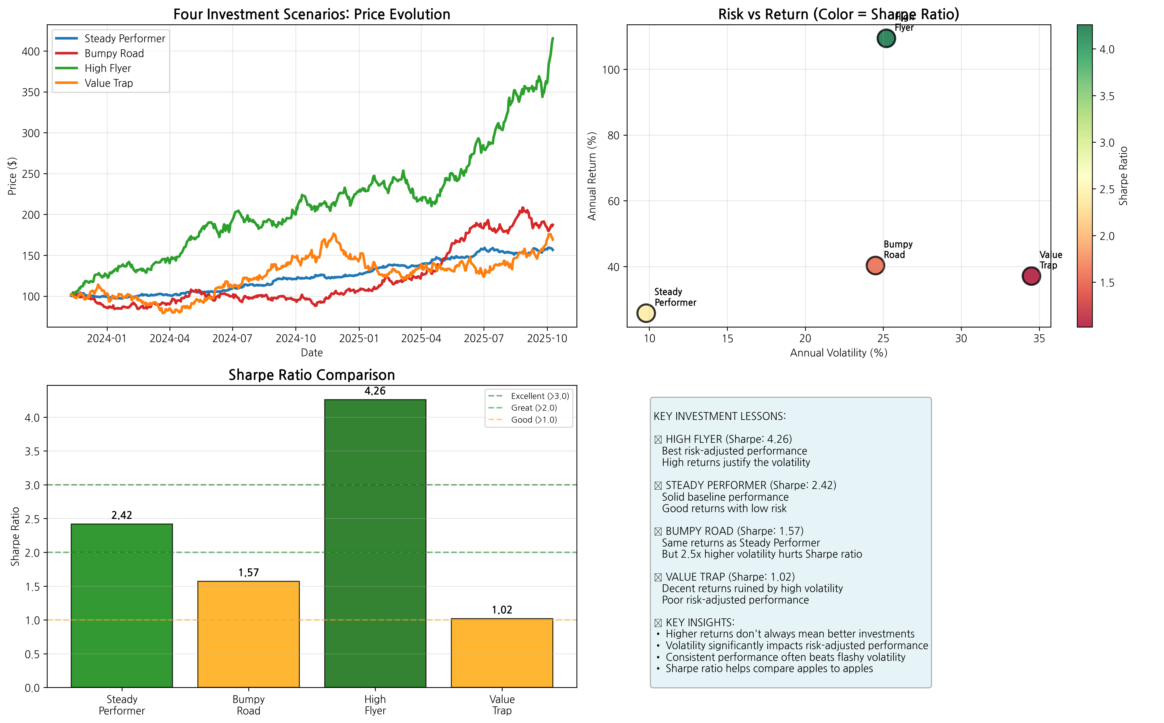 Chart 1: Four Investment Scenarios - Price evolution (top left), risk vs return relationship (top right), Sharpe ratio comparison (bottom left), and key insights (bottom right)
1. The Baseline: "Steady Performer"
- Total Return: 55.9% over two years
- Annual Volatility: 9.8%
- Sharpe Ratio: 2.42 ⭐⭐⭐
Our starting point—decent returns with low, manageable volatility. Look at the blue line in the top-left price chart—it shows steady, consistent growth without dramatic swings. In the risk vs return scatter plot (top right), Steady Performer sits in the lower-left area, representing moderate returns with low risk. The bar chart (bottom left) shows it achieves a solid Sharpe ratio of 2.42.
2. The Bumpy Road: "Same Expected Returns, More Risk"
- Total Return: 84.5% over two years (higher due to volatility)
- Annual Volatility: 24.5% (2.5x higher than Steady Performer!)
- Sharpe Ratio: 1.57 ⭐⭐
Here's the key lesson: Higher volatility hurts your Sharpe ratio. Notice in the price evolution chart how the red Bumpy Road line swings dramatically up and down compared to Steady Performer. While it ended up with higher total returns due to lucky volatility, the scatter plot shows it moved far to the right (higher risk) and the Sharpe ratio bar dropped to 1.57—significantly lower than Steady Performer's 2.42.
3. The High Flyer: "More Returns, Same Risk"
- Total Return: 306.0% over two years (excellent performance)
- Annual Volatility: 25.2% (same as Bumpy Road)
- Sharpe Ratio: 4.26 ⭐⭐⭐
Now we see the flip side: Higher returns can justify higher volatility. The green High Flyer line in the price chart shows dramatic growth that more than compensates for the volatility. In the scatter plot, it sits in the upper-right position—high returns AND high risk—but the bright green color coding shows it has the best Sharpe ratio. The bar chart confirms this with the highest Sharpe ratio at 4.26.
4. The Value Trap: "The Worst of Both Worlds"
- Total Return: 66.2% over two years
- Annual Volatility: 34.5% (highest of all)
- Sharpe Ratio: 1.02 ⭐
Low risk-adjusted returns despite decent absolute performance—this is what poor risk-adjusted performance looks like. The orange Value Trap line shows decent total returns but with extreme volatility. In the scatter plot, it's positioned in the far right (very high risk) but with only moderate returns. The red color coding and lowest bar in the Sharpe ratio chart reveal the poor risk-adjusted performance at just 1.02.
Reading the Sharpe Ratio Scorecard
Looking at our Sharpe ratio bar chart in Chart 1, we can establish clear performance benchmarks:
- Above 3.0: Excellent (High Flyer: 4.26) - Outstanding risk-adjusted performance
- 2.0 to 3.0: Great (Steady Performer: 2.42) - Strong risk-adjusted returns
- 1.0 to 2.0: Good (Bumpy Road: 1.57) - Acceptable performance
- Below 1.0: Poor (Value Trap: 1.02) - Inadequate compensation for risk
Deeper Analysis: Understanding the Patterns
The detailed analysis below reveals the underlying patterns that create these Sharpe ratios:
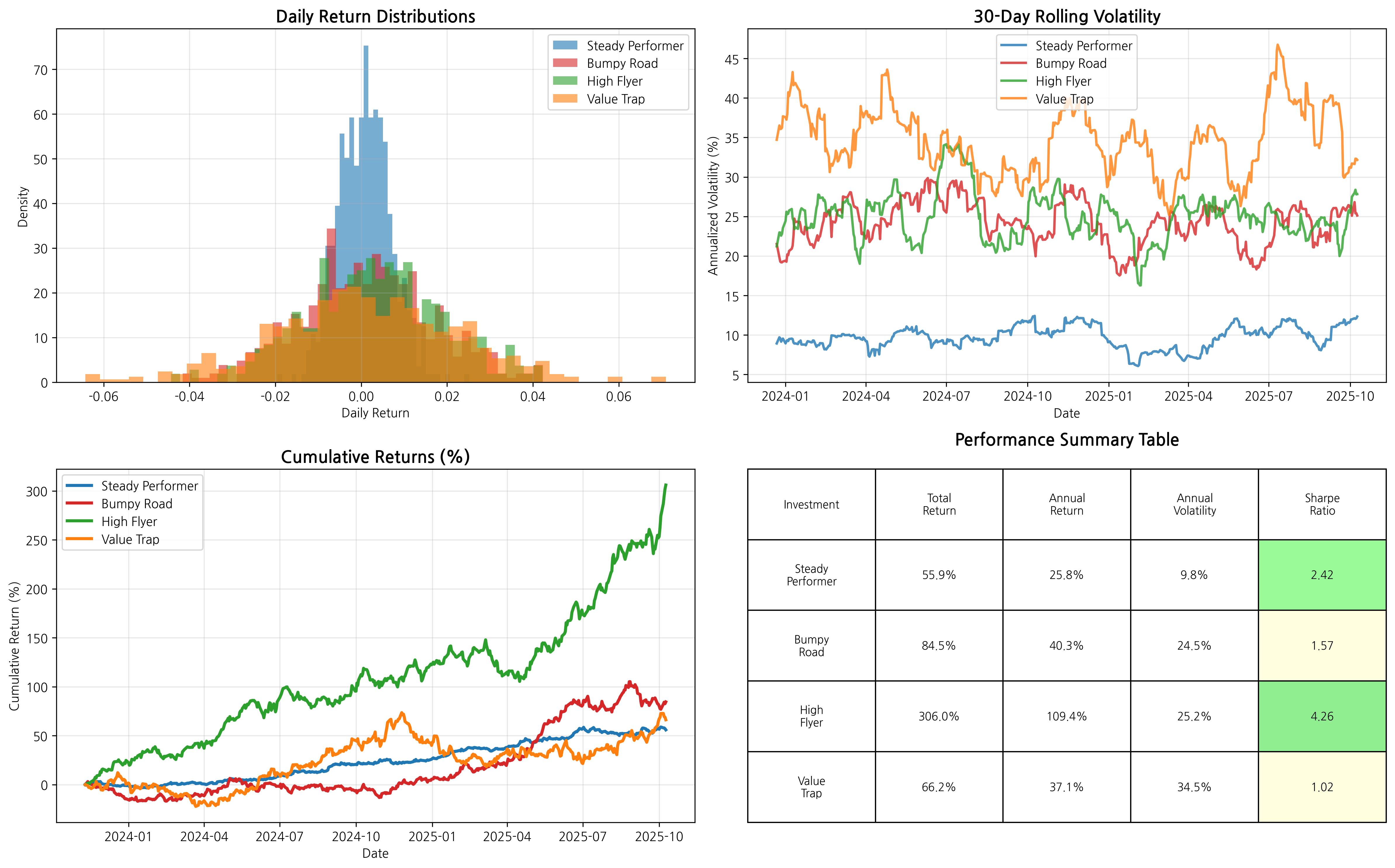 Chart 2: Detailed Risk Analysis - Return distributions (top left), rolling volatility (top right), cumulative performance (bottom left), and performance summary table (bottom right)
What the Distribution Charts Tell Us
The return distribution histograms (top left) reveal the "personality" of each investment:
- Steady Performer (blue): Narrow, tall distribution centered around small positive returns—consistency at work
- High Flyer (green): Wider distribution but shifted toward higher returns—volatility with compensation
- Bumpy Road (red): Wide distribution similar to High Flyer but centered lower—volatility without adequate compensation
- Value Trap (orange): Very wide, flat distribution—high uncertainty with mediocre average returns
Rolling Volatility Insights
The 30-day rolling volatility chart (top right) shows how risk evolves over time. Notice how:
- Steady Performer maintains consistently low volatility (blue line stays low)
- Value Trap shows persistently high volatility (orange line consistently elevated)
- High Flyer and Bumpy Road have similar volatility patterns, but High Flyer's superior returns justify the risk
The Performance Summary Table
The color-coded table (bottom right) provides the complete picture, with Sharpe ratios color-coded from green (excellent) to red (poor). This table perfectly matches our four scenarios and shows why High Flyer earns the top ranking despite its volatility.
From Theory to Practice: Real Stock Market Results
Now that you understand the Sharpe ratio through our synthetic examples, let's see how it works with actual market data. We analyzed five real stocks over the past two years to demonstrate these concepts in action:
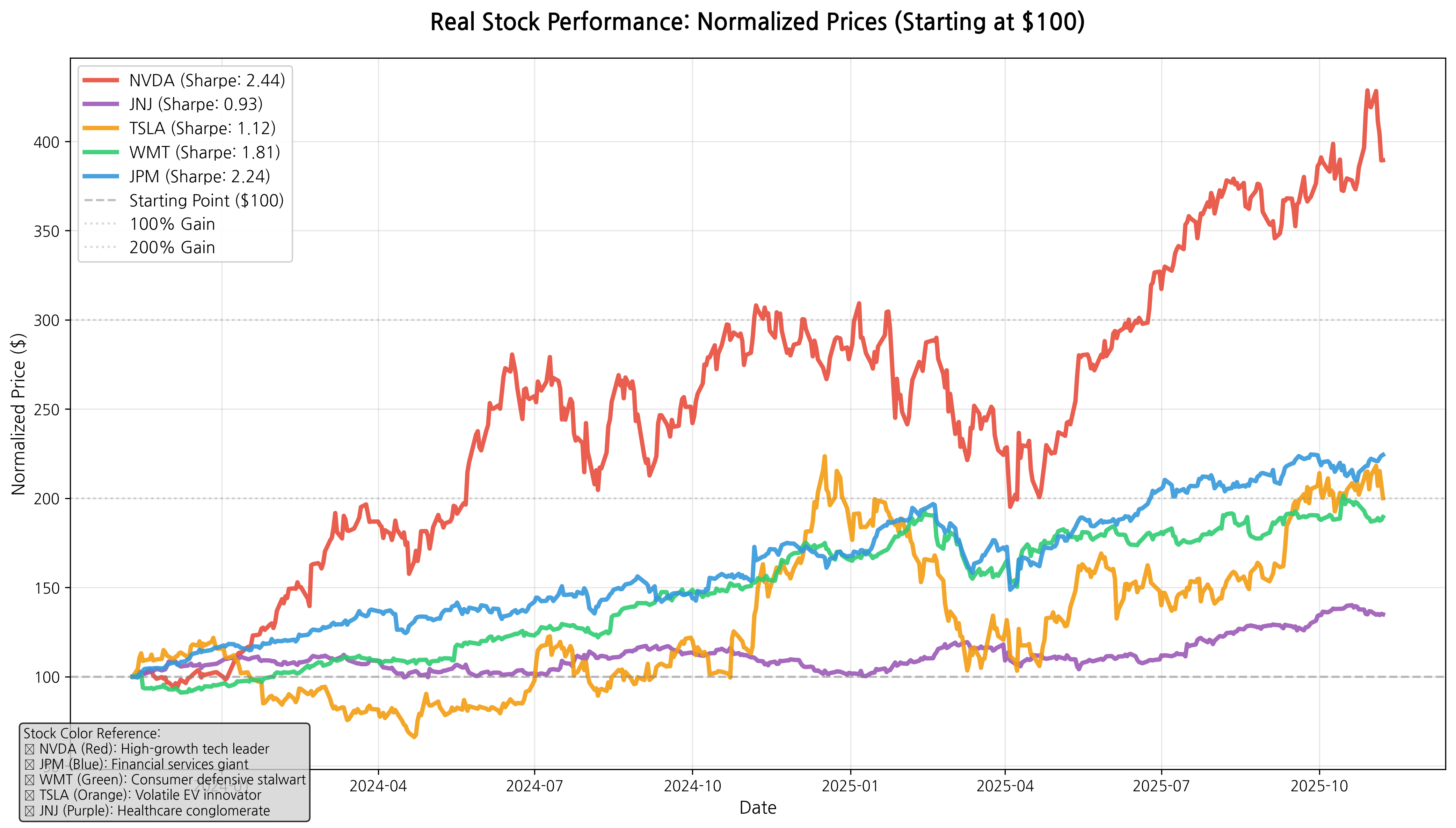 Real Stock Normalized Price Performance - All stocks start at $100 to show relative performance
The Real Market Sharpe Ratio Rankings
Here's how five major stocks performed on a risk-adjusted basis:
1. NVIDIA (NVDA) - Sharpe Ratio: 2.44 🥇
- Total Return: 289.5% over two years
- Annual Volatility: 50.8%
- The red line in our chart shows NVIDIA's dramatic climb to nearly $400 (289% gain)
NVIDIA proves that high returns can justify high volatility. Despite experiencing daily swings of over 50% annually, its massive 289% return delivers excellent risk-adjusted performance. This is our real-world "High Flyer" - similar to our synthetic example but with actual market data.
2. JPMorgan Chase (JPM) - Sharpe Ratio: 2.24 🥈
- Total Return: 124.4% over two years
- Annual Volatility: 23.5%
- The blue line shows steady, consistent growth to about $224
JPMorgan represents the "Goldilocks" investment - not too risky, not too conservative, but just right. Its 124% return with moderate 23.5% volatility demonstrates how financial sector stability can deliver excellent risk-adjusted returns.
3. Walmart (WMT) - Sharpe Ratio: 1.81 🥉
- Total Return: 89.5% over two years
- Annual Volatility: 21.8%
- The green line displays remarkably steady growth to about $190
Walmart surprises many investors! Despite being seen as a "boring" consumer staple, its consistent performance and low volatility create solid risk-adjusted returns. This is our real-world "Steady Performer" - proving that consistency beats flashiness.
4. Tesla (TSLA) - Sharpe Ratio: 1.12
- Total Return: 100.1% over two years
- Annual Volatility: 63.4% (highest of all stocks!)
- The orange line shows the most dramatic swings - up and down repeatedly
Tesla illustrates our "Value Trap" concept perfectly. While doubling your money sounds great, the extreme 63.4% volatility creates a bumpy ride that hurts risk-adjusted performance. Notice how the orange line bounces wildly compared to others - this volatility penalty drops Tesla's Sharpe ratio significantly.
5. Johnson & Johnson (JNJ) - Sharpe Ratio: 0.93
- Total Return: 34.9% over two years
- Annual Volatility: 17.3% (lowest volatility)
- The purple line shows the most conservative, steady growth pattern
J&J demonstrates that low volatility alone doesn't guarantee good Sharpe ratios. Despite having the lowest risk (17.3% volatility), its modest 35% return wasn't enough to achieve strong risk-adjusted performance.
Key Real-World Insights
Looking at our normalized price chart, several patterns emerge:
- The red NVIDIA line shoots highest but with dramatic ups and downs - high risk, high reward
- The blue JPMorgan line climbs steadily with moderate volatility - excellent balance
- The green Walmart line shows the smoothest upward trajectory - consistency wins
- The orange Tesla line demonstrates extreme volatility despite good total returns
- The purple J&J line moves most conservatively but with insufficient returns
Connecting to Our Synthetic Examples
Notice how these real stocks mirror our educational scenarios:
- NVIDIA = Our "High Flyer" (high returns justify high volatility)
- Walmart = Our "Steady Performer" (consistency delivers strong Sharpe ratios)
- Tesla = Our "Value Trap" (decent returns undermined by excessive volatility)
Real-World Application: The Sharpe Ratio in Action
Professional fund managers and financial advisors use the Sharpe ratio to:
- Compare investments fairly: A 10% return with low volatility might be better than a 15% return with high volatility
- Build balanced portfolios: Combine investments with different Sharpe ratios to optimize overall performance
- Make informed decisions: Choose investments that offer the best returns for your risk tolerance
The Key Insight
Here's what the Sharpe ratio teaches us: return without context is meaningless. Both our synthetic examples and real market data perfectly illustrate this principle:
From Our Educational Examples:
- High Flyer's 306% return might sound excessive, but with a Sharpe ratio of 4.26, it's actually delivering excellent risk-adjusted performance
- Value Trap's 66% return sounds decent until you see the Sharpe ratio of 1.02 reveals poor risk compensation
- Steady Performer's "modest" 56% return actually delivers superior risk-adjusted performance (2.42 Sharpe ratio) compared to more volatile alternatives
From Real Market Data:
- Tesla's 100% return looks impressive until you realize its 63.4% volatility drops its Sharpe ratio to just 1.12
- NVIDIA's 289% return seems risky with 50.8% volatility, but it earns a 2.44 Sharpe ratio - excellent risk-adjusted performance
- Walmart's 90% return might seem boring, but its 1.81 Sharpe ratio beats Tesla's flashier performance
Looking at our real stock chart, the orange Tesla line swings much more wildly than the green Walmart line, yet Walmart delivers better risk-adjusted returns. This is the Sharpe ratio in action!
The Sharpe ratio forces us to ask the right question: "Am I being paid enough for the risk I'm taking?"
Your Next Steps
Understanding the Sharpe ratio won't make you a Wall Street expert overnight, but it will make you a more informed investor. The next time someone brags about their investment's amazing returns, you'll know to ask: "But what's the Sharpe ratio?"
Look back at both our charts:
- Our synthetic price evolution chart shows how different risk-return profiles create different investment journeys
- Our real stock normalized chart demonstrates these principles with actual market data - every colored line tells a story about risk-adjusted performance
Whether it's the blue Steady Performer line from our examples or the red NVIDIA line from real data, remember: in investing, it's not just about how high you climb—it's about how smooth the journey is along the way.
Want to explore more? Now that you understand both the theory and practice of Sharpe ratios, you can apply this knowledge to evaluate any investment - from individual stocks to mutual funds to ETFs. Remember: always ask about risk-adjusted returns, not just raw performance!
Key Takeaways:
- The Sharpe ratio measures risk-adjusted returns, not just raw returns
- Higher Sharpe ratios indicate better risk-adjusted performance
- Volatility (risk) is just as important as returns when evaluating investments
- A "boring" steady investment often beats a flashy volatile one on a risk-adjusted basis
Comments (0)
No comments yet. Be the first to comment!