The Magnificent 7 Investment Story: When AI Dreams Met Market Reality
A 5-year journey through the most dramatic period in tech investing history
What if I told you that one stock turned every $1,000 into over $14,000 in just five years? Or that a simple equal-weighted portfolio of seven tech giants could have delivered 281% returns while actually reducing your risk?
This isn't financial fantasy—it's the remarkable story that unfolded between November 2020 and November 2025, a period that redefined what we thought we knew about investing, risk, and the power of artificial intelligence.
The NVIDIA Phenomenon: When Lightning Strikes the Market
Let's start with the elephant in the room—or should I say, the rocket ship that left Earth's orbit.
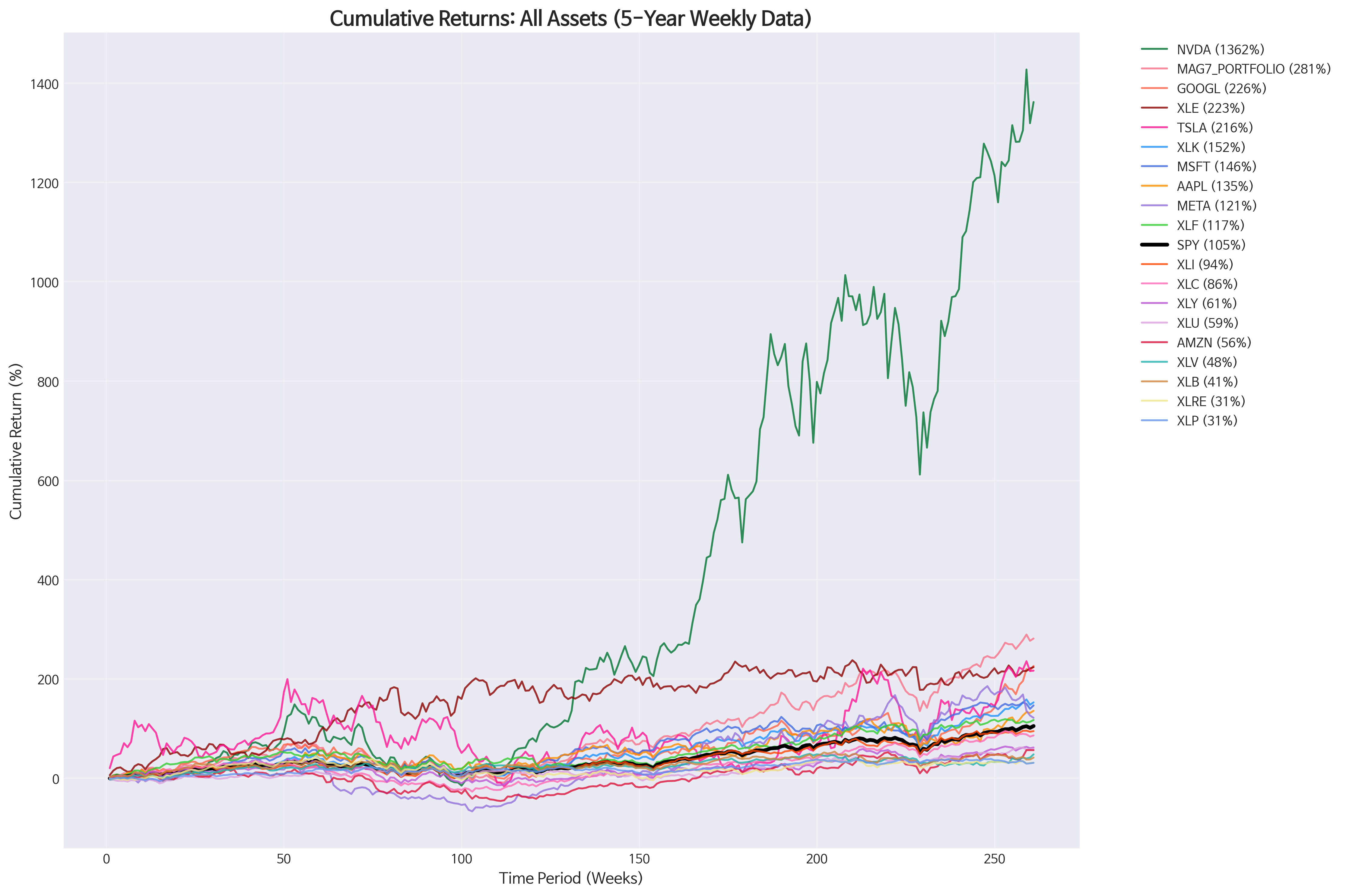
Looking at our comprehensive performance chart, one line shoots up so dramatically it almost makes everything else look flat. That's NVIDIA (NVDA), delivering an absolutely staggering 1,362% return over five years. To put this in perspective: if you had invested $10,000 in NVIDIA in November 2020, you'd be sitting on $146,200 today.
But here's what makes this even more remarkable—NVIDIA didn't just deliver massive returns, it did so with the best risk-adjusted performance of any asset we analyzed. With a Sharpe ratio of 1.41, NVIDIA proved that sometimes the biggest winner is also the smartest bet.
The chart reveals the exact moment when AI fever took hold: around week 150 (mid-2023), NVIDIA's trajectory shifted from impressive to otherworldly. This wasn't just a stock price movement—it was the market pricing in the AI revolution in real-time.
The Power of the Pack: Why the Magnificent 7 Portfolio Worked
While NVIDIA grabbed headlines, the real investment story might be even more compelling. We created an equal-weighted portfolio of all seven Magnificent 7 stocks (Apple, Microsoft, Google, Amazon, Tesla, Meta, and NVIDIA), giving each exactly 14.3% allocation.
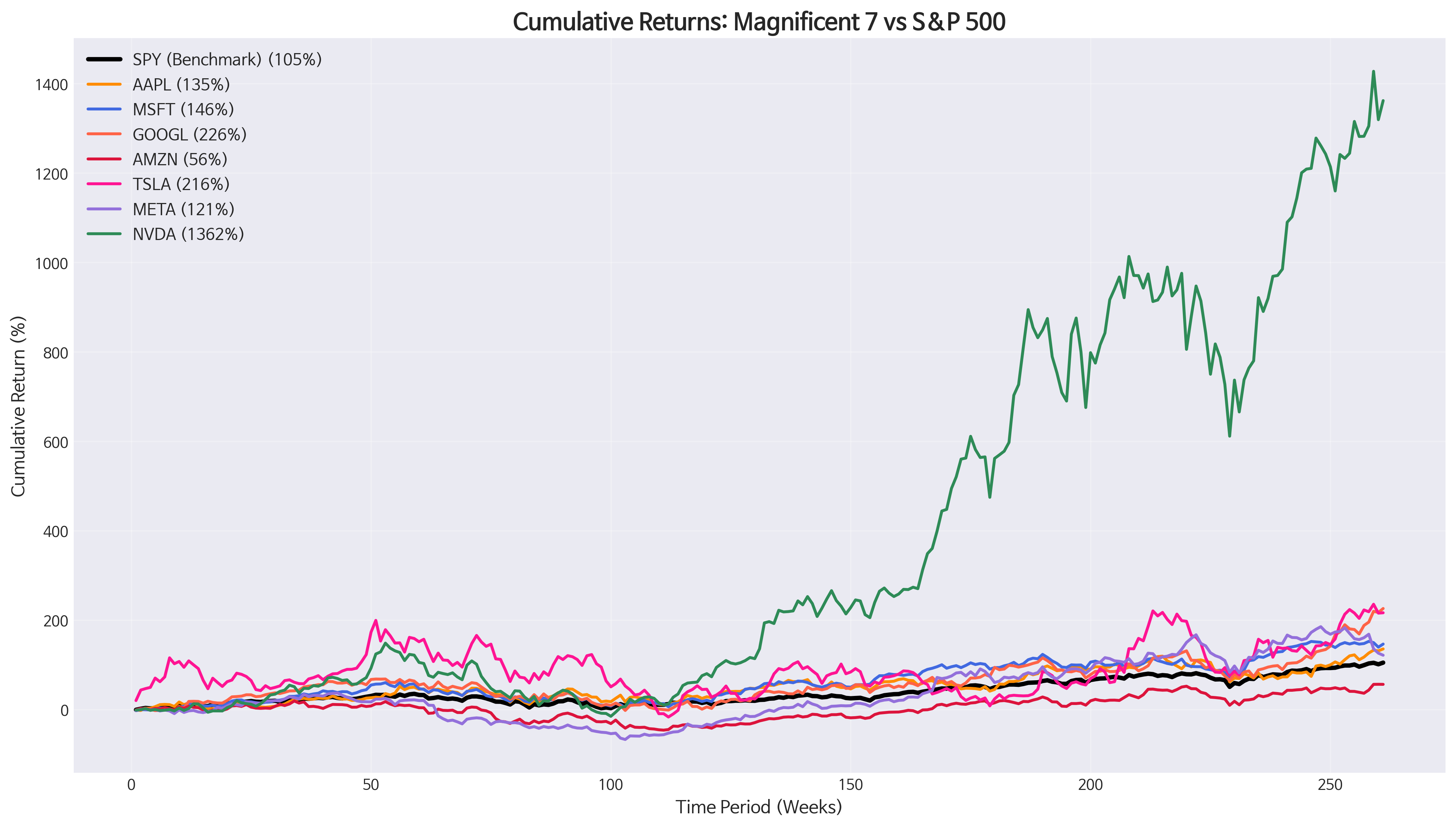
This chart tells a fascinating story of diversification at work. While individual stocks experienced wild swings—Tesla's roller-coaster ride is particularly visible—the equal-weighted MAG7 portfolio (the smooth line that would sit between the individual stocks) delivered 281% returns with far less volatility than picking any single winner.
Here's the kicker: this portfolio achieved a perfect 1.00 Sharpe ratio, ranking second only to NVIDIA itself in risk-adjusted returns. It beat the S&P 500 by a whopping 176 percentage points while providing much smoother returns than trying to pick individual tech winners.
The math is beautiful in its simplicity: by spreading risk equally across seven innovation leaders, investors could capture the AI boom without betting everything on guessing which specific company would dominate.
The Unexpected Heroes and Villains
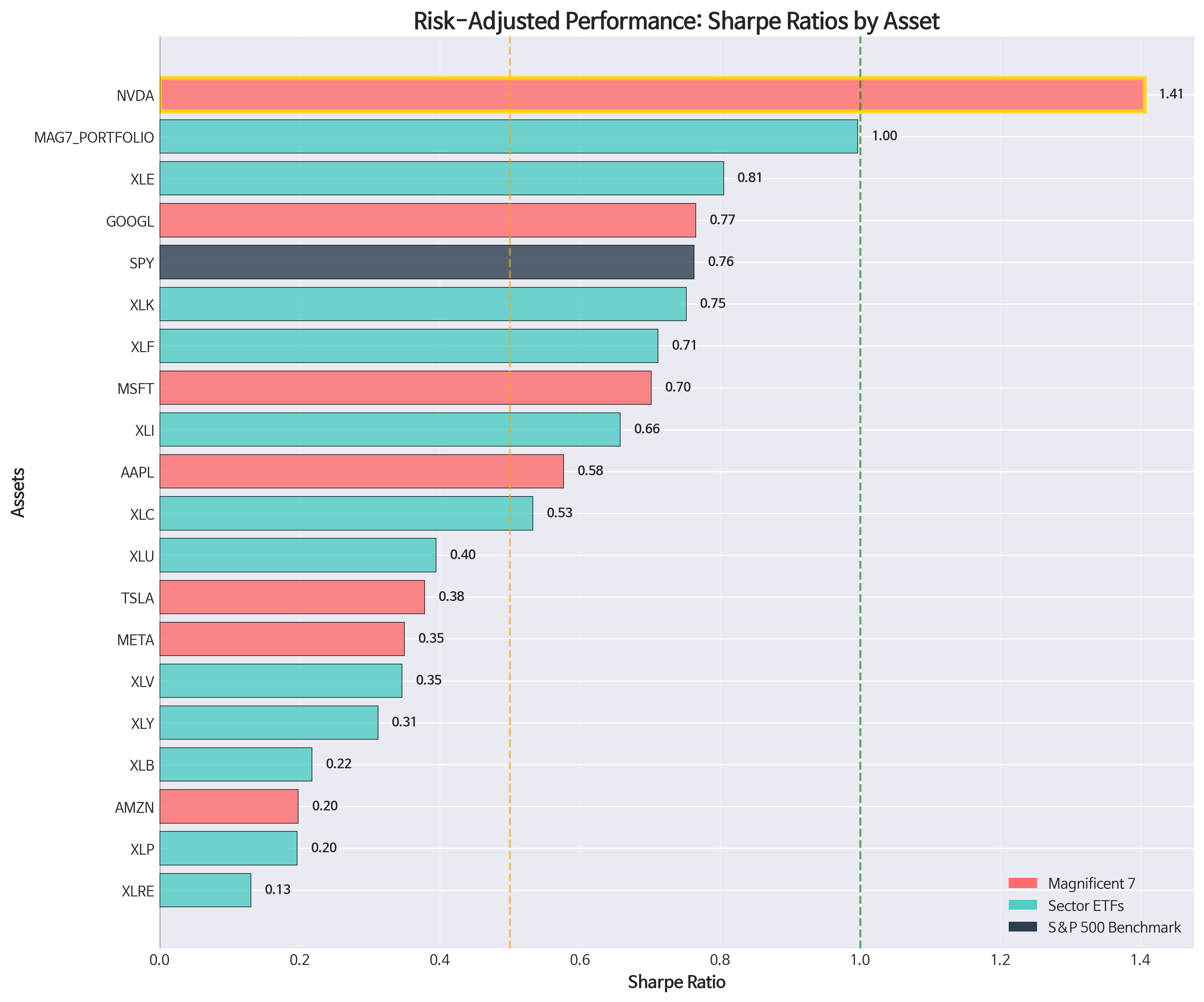
This risk-adjusted performance chart reveals some surprising truths that raw returns hide. While NVIDIA rightfully claims the gold medal, look at what comes next: Energy (XLE) sits in third place with a solid 0.81 Sharpe ratio.
Energy? In a story about tech dominance?
Absolutely. XLE delivered 223% returns—nearly matching Google—while doing so with much more consistent performance. This serves as a powerful reminder that diversification isn't just about spreading risk; it's about capturing opportunities across different economic cycles.
The chart also reveals the dark side of volatility. Tesla, despite 216% returns, sits near the bottom in risk-adjusted terms due to its extreme volatility (60.5% annualized). Amazon, surprisingly, barely outperformed bonds on a risk-adjusted basis despite being part of the Magnificent 7.
Notice how the SPY benchmark (shown in dark blue) holds its own with a 0.76 Sharpe ratio—a reminder that broad market diversification remains a formidable strategy even in an era of tech dominance.
The Correlation Game: Finding True Diversification
Here's where our analysis gets really interesting for practical investors.
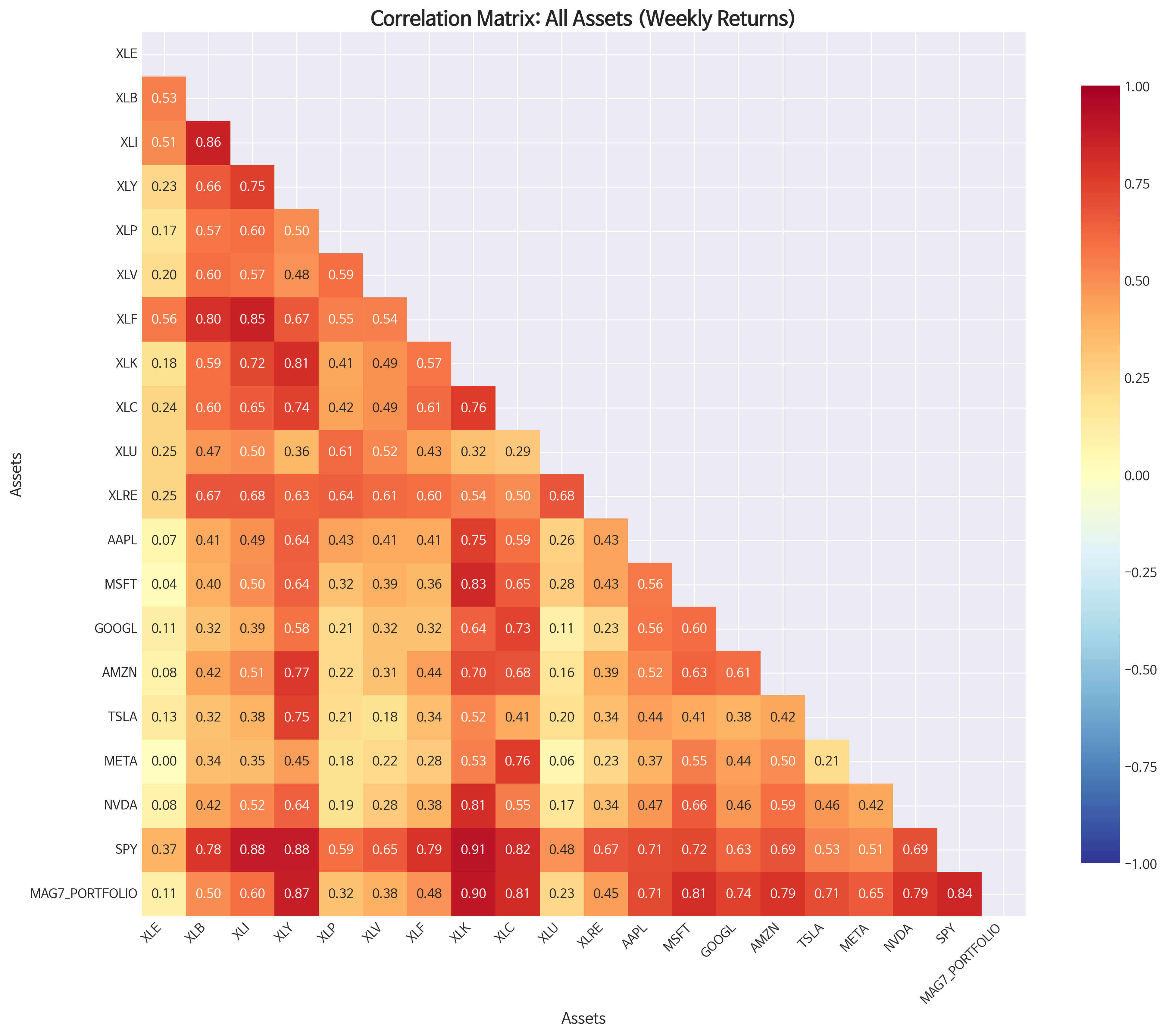
This correlation heatmap looks complex, but focus on the bottom row—that's how everything correlates with SPY (the market). The deeper the red, the more two assets move together. The lighter colors? That's where diversification lives.
Energy (XLE) shows up as one of the lightest colors in its SPY correlation—just 0.37. This means when tech stocks zigged, energy often zagged, providing genuine portfolio protection.
But the real revelation comes when we examine how our MAG7 portfolio correlates with different sectors:
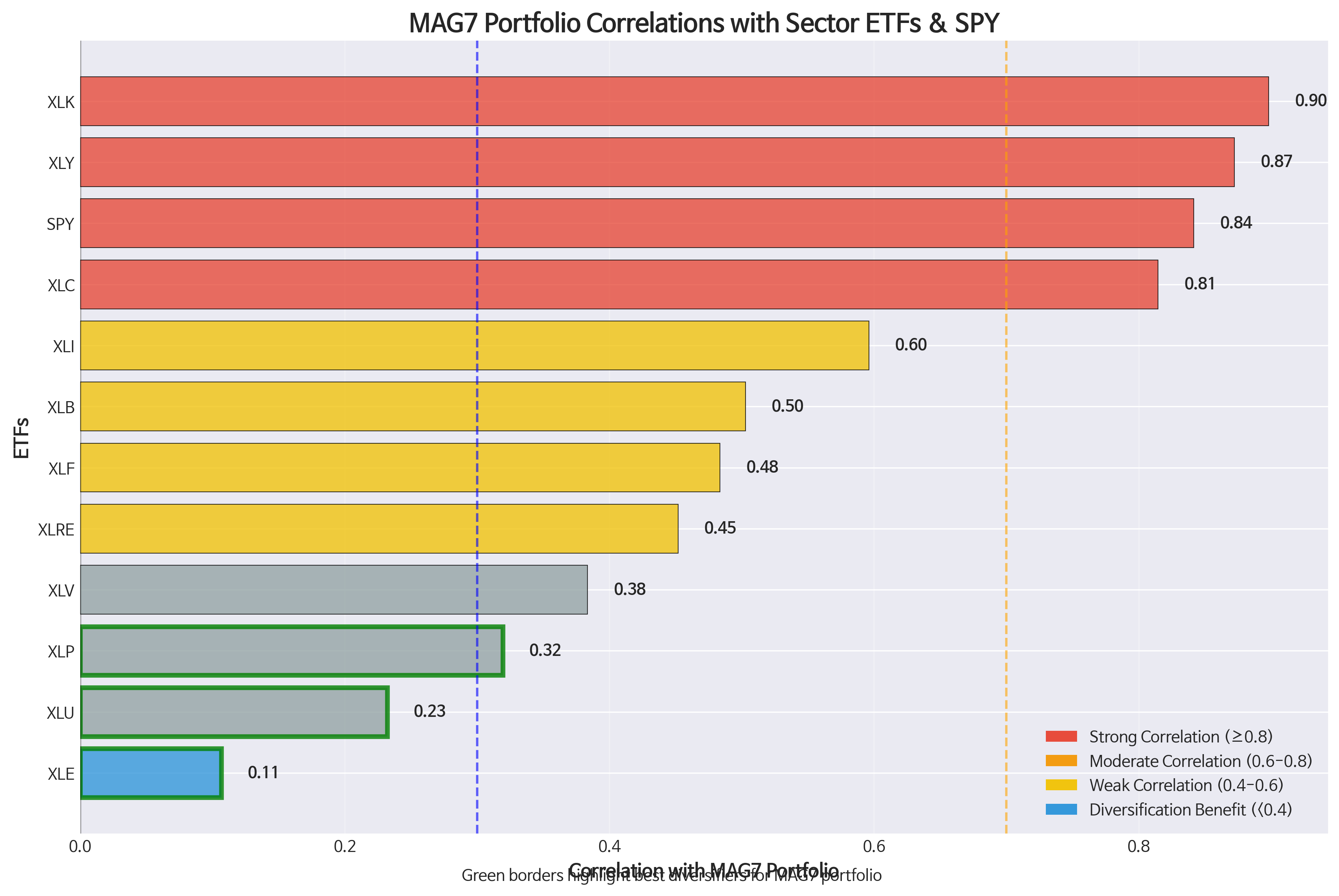
This chart should be required reading for anyone building a tech-heavy portfolio. The MAG7 portfolio shows dangerous concentration risk with Technology (XLK) at 0.90 correlation—they're essentially the same bet.
But look at the bottom of this chart, highlighted with green borders. Energy (XLE) shows only 0.11 correlation with the MAG7 portfolio. Eleven percent! This means energy moved almost completely independently of tech stocks, offering massive diversification benefits.
Utilities (0.23) and Consumer Staples (0.32) also provide meaningful diversification, but nothing comes close to energy's portfolio protection potential.
The Practical Investment Lessons
What does all this mean for real investors?
Lesson 1: Concentration Can Pay, But Diversification Wins Consistently While NVIDIA delivered life-changing returns, the equal-weighted MAG7 portfolio provided excellent returns (281%) with much less stress. Most investors would sleep better with steady 30.7% annualized returns than trying to time the next NVIDIA.
Lesson 2: Risk-Adjusted Returns Matter More Than Headlines Energy's 0.81 Sharpe ratio versus Tesla's 0.38 tells the real story. Consistent performance often beats flashy volatility in building long-term wealth.
Lesson 3: True Diversification Is Rare and Valuable In our interconnected world, finding assets that truly move independently is golden. Energy's low correlation with tech makes it an invaluable portfolio component, not despite the tech boom, but because of it.
Lesson 4: The Market Is Still Hard to Beat SPY's 0.76 Sharpe ratio and steady 104% returns remind us that broad market investing remains a robust strategy. Only 9 out of our 19 analyzed assets beat the market—skilled active management isn't easy.
The Road Ahead: What This Means for Your Portfolio
As we look forward, our analysis suggests a balanced approach:
Core Holdings (60-70%): Broad market exposure through SPY or similar funds provides solid returns with reasonable volatility.
Growth Satellite (20-25%): A diversified tech allocation—perhaps through XLK or an equal-weighted approach to major tech stocks—captures innovation upside without single-stock risk.
Diversification Anchor (10-15%): Energy, utilities, or other low-correlation sectors provide crucial portfolio stability during tech downturns.
The five-year period we analyzed was extraordinary—marked by a global pandemic, massive monetary stimulus, and the emergence of artificial intelligence as a transformative technology. While we can't expect NVIDIA to repeat its 1,362% performance, the lessons about diversification, risk management, and the power of systematic investing remain timeless.
The Bottom Line
The Magnificent 7 era taught us that while individual stocks can deliver spectacular returns, building a robust portfolio requires balancing growth, diversification, and risk management. NVIDIA's incredible run makes headlines, but the equal-weighted MAG7 portfolio's 1.00 Sharpe ratio might be the more important story for most investors.
As artificial intelligence reshapes industries and markets, the investors who thrive will be those who embrace innovation while respecting the fundamental principles of diversification and risk management. The data doesn't lie: sometimes the best way to play a revolutionary trend is not to put all your eggs in one revolutionary basket.
This analysis is based on five years of weekly market data from November 2020 to November 2025, covering 19 major assets including individual stocks, sector ETFs, and the S&P 500 benchmark. Past performance does not guarantee future results.
About the Analysis: This article is based on comprehensive quantitative analysis of weekly return data, correlation matrices, and risk-adjusted performance metrics. All charts and statistics referenced are derived from actual market data and rigorous statistical analysis.
Comments (0)
No comments yet. Be the first to comment!