MAG7 Financial Analysis: A Deep Dive into Tech Giants' 2025 Q3 Performance
Published: November 23, 2025
Introduction
The "Magnificent 7" (MAG7) - Apple (AAPL), Microsoft (MSFT), Google (GOOGL), Amazon (AMZN), Nvidia (NVDA), Meta (META), and Tesla (TSLA) - represent the most influential technology companies shaping our digital future. Together, these giants account for trillions in market capitalization.
In this analysis, we'll examine their most recent quarterly performance, breaking down key metrics that matter to investors.
Analysis Period: Latest quarter (2025-09-30) through 2024-12-31
Quarter Notation Guide
Throughout this analysis, we reference quarters using the following notation:
- Latest: The most recent quarter ending 2025-09-30
- Latest-1Q: One quarter before Latest (2025-06-30)
- Latest-2Q: Two quarters before Latest (2025-03-31)
- Latest-3Q: Three quarters before Latest (2024-12-31)
This notation allows us to track quarter-over-quarter (QoQ) changes and identify trends across time.
Understanding Key Metrics
Revenue
Total money from sales before expenses. Shows market demand and growth potential.
Margins (Gross, Operating, Net)
- Gross Margin: Revenue minus cost of goods sold (shows production efficiency)
- Operating Margin: Profit after operating expenses (shows operational efficiency)
- Net Margin: Bottom-line profit percentage (what shareholders care about)
Higher margins = better pricing power and efficiency.
Earnings Per Share (EPS)
Profit per share. Directly affects shareholder value.
Quarter-over-Quarter (QoQ) Growth
Percentage change vs. previous quarter. Shows momentum and trends.
Revenue Performance: Who's Leading the Pack?
Let's start by examining revenue - the total sales each company generates. This is the top line of any income statement and shows how much customers are paying for these companies' products and services.
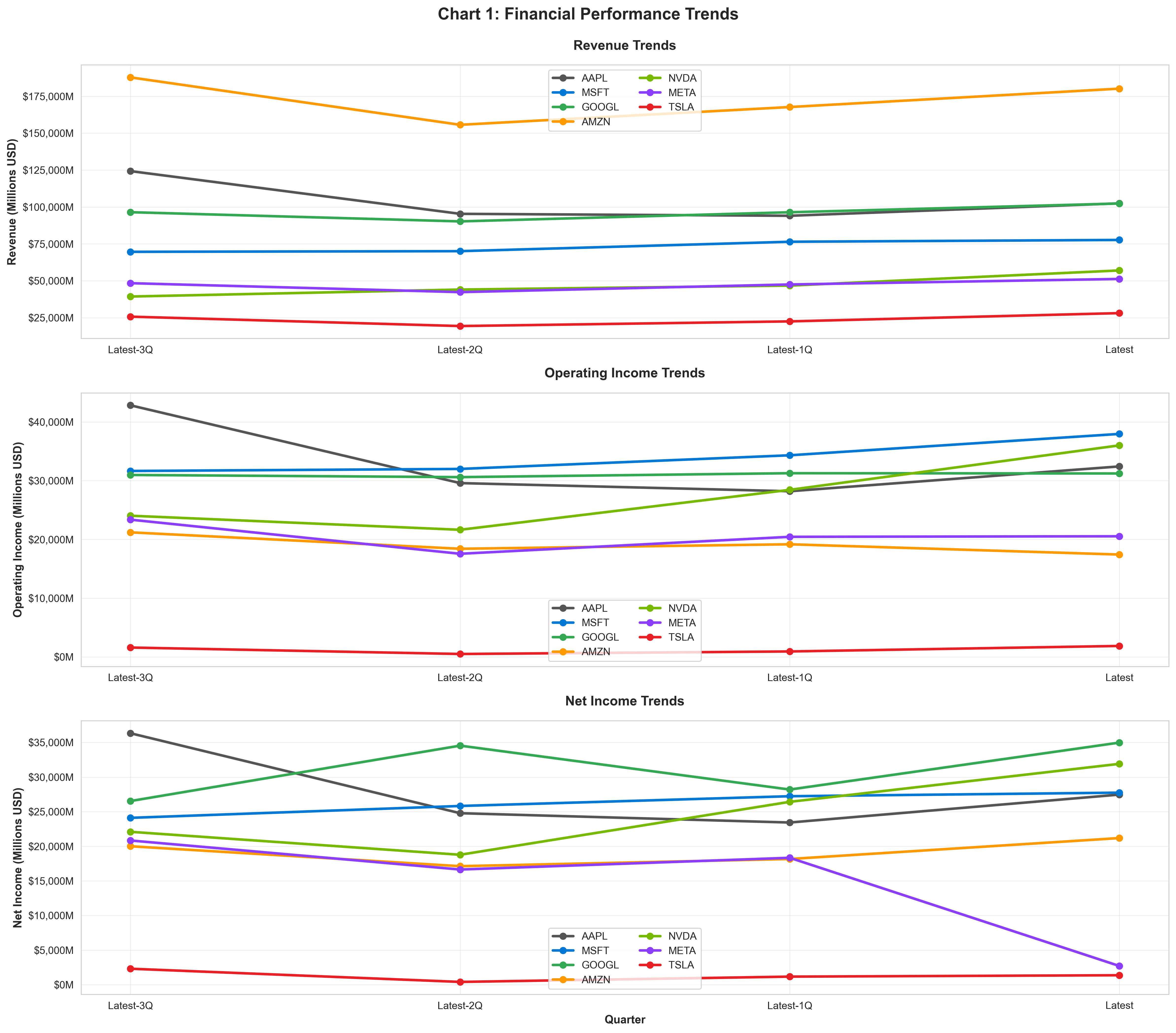 Figure 1: Financial Performance Trends - Revenue (top), Operating Income (middle), Net Income (bottom)
How to read Figure 1: This comprehensive chart shows three levels of income statement performance. Focus on the top panel first - that's revenue. Notice how the lines spread across different revenue scales. Amazon's orange line towers above the others, while Tesla's red line sits at the bottom. Also observe the slopes - are companies growing (lines going up from left to right) or declining?
The Revenue Leaders
The scale of these companies' businesses is staggering:
- AMZN: $180,169M in latest quarter
- AAPL: $102,466M in latest quarter
- GOOGL: $102,346M in latest quarter
Amazon's dominance is clear in the chart - its orange line sits well above competitors, driven by its diverse business including e-commerce, AWS cloud services, and advertising. Apple and Google's lines run close together near the top, each surpassing the $100 billion quarterly revenue mark.
Revenue Growth: Who's Accelerating?
Now let's look beyond absolute size and examine who's growing fastest:
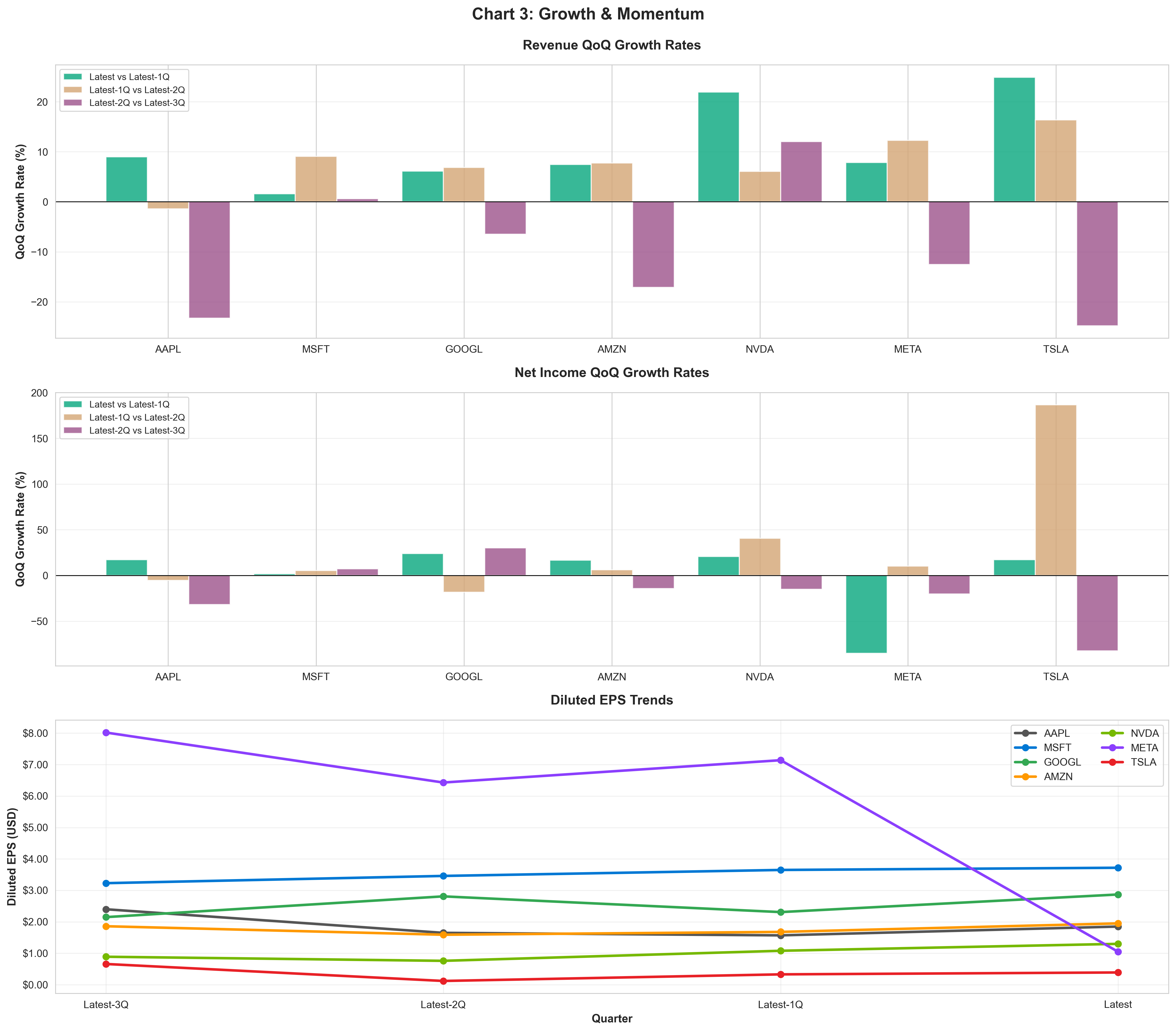 Figure 2: Growth & Momentum Analysis - Revenue Growth (top), Net Income Growth (middle), EPS Trends (bottom)
How to read Figure 2: Look at the top panel showing revenue QoQ growth. This chart shows percentage growth, not absolute dollars. Taller bars mean faster growth. Notice we have three sets of bars for each company - these show growth across different quarter comparisons. Focus on the green bars (Latest vs Latest-1Q) for the most recent momentum.
Quarter-over-quarter growth reveals which companies are gaining momentum:
- TSLA: 24.9% growth ($28,095M revenue)
- NVDA: 22.0% growth ($57,006M revenue)
- AAPL: 9.0% growth ($102,466M revenue)
Look at the chart: Tesla's red bar and Nvidia's green bar stand tallest in the latest quarter comparison. This impressive QoQ growth reflects strong demand in electric vehicles and AI computing respectively. While their absolute revenue (shown in Figure 1) is smaller than the giants, their growth rates are exceptional.
Profitability: The Bottom Line That Matters
Revenue is important, but profit is what investors ultimately care about. Let's examine who's actually making money and how efficiently.
Return to Figure 1 and look at the middle and bottom panels - these show operating income and net income trends.
Key observation from Figure 1's middle panel (Operating Income): Notice how the lines are more tightly grouped than revenue. This tells us something important: companies with lower revenue can still generate strong operating profits through efficiency.
Critical insight from Figure 1's bottom panel (Net Income): Here's where things get interesting. Notice Meta's purple line in the net income panel - it dramatically drops in the latest quarter, while in the operating income panel above it, Meta's line remains strong. This divergence signals a non-operational issue (we'll explore this below).
Absolute Profit Leaders
Here's who's generating the most actual profit:
- GOOGL: $34,979M net income (34.2% margin)
- NVDA: $31,910M net income (56.0% margin)
- MSFT: $27,747M net income (35.7% margin)
Google leads in absolute profitability despite Amazon's revenue dominance. This reveals a crucial insight: revenue size doesn't automatically translate to profit - efficiency matters.
The Meta Anomaly: When Operating Performance Diverges from Net Income
Back to Figure 1 - compare Meta's middle and bottom panels:
Meta presents a fascinating case study visible in Figure 1:
- Middle panel (Operating Income): Meta's purple line shows $20,535M - steady and healthy
- Bottom panel (Net Income): Meta's purple line crashes to just $2,709M - an 85% drop!
What happened? This isn't an operational problem. The gap between operating income and net income reveals an exceptional tax provision of approximately $16.8 billion in the latest quarter. While Meta's business generated $20,535M in operating profit, a one-time tax event reduced final net income to $2,709M.
Investor takeaway: When analyzing Meta, focus on operating income (which remains strong at 40.1% margin) rather than the tax-distorted net income. This is a non-recurring accounting event, not a business deterioration.
Profit Efficiency: Margin Analysis
Now let's examine margins - what percentage of each dollar of revenue becomes profit:
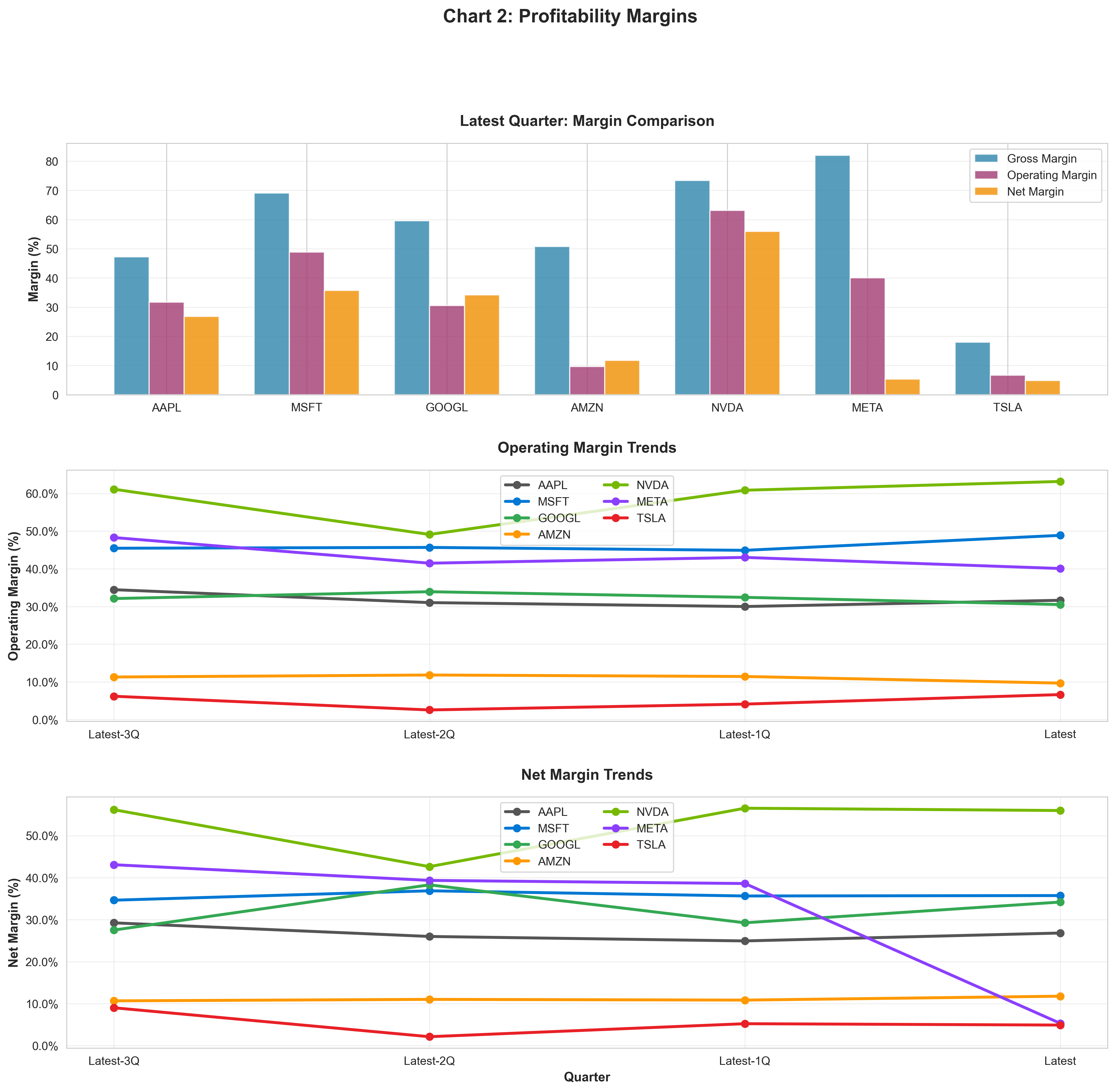 Figure 3: Profitability Margin Analysis - Latest Quarter Comparison (top), Operating Margin Trends (middle), Net Margin Trends (bottom)
Understanding Figure 3's top panel: Each company has three bars showing different profit stages:
- Blue (Gross Margin): Profit after production costs
- Purple (Operating Margin): Profit after operating expenses like R&D and marketing
- Orange (Net Margin): Final profit after all expenses and taxes
The gap between bars shows how much each company spends on operations and other costs.
Profit margins tell us how efficiently companies convert revenue into profit:
- NVDA: 56.0% net margin, 63.2% operating margin
- MSFT: 35.7% net margin, 48.9% operating margin
- GOOGL: 34.2% net margin, 30.5% operating margin
Look at Figure 3's top panel: Nvidia's bars are the tallest across all three margin types. This exceptional efficiency reflects the high-value nature of its AI chips and strong pricing power. Microsoft and Google's software businesses also show strong margins with relatively small gaps between their bars, indicating lean operations.
Notice Meta's orange bar (Net Margin) - it's unusually short at 5.3%, but look at its purple bar (Operating Margin) at 40.1%. This gap confirms our earlier observation about Meta's tax issue.
Figure 3's middle panel (Operating Margin Trends): Watch the evolution over time. Nvidia's bright green line shows dramatic improvement (climbing upward from left to right), signaling expanding margins as their AI business scales. Meta's purple line remains high and stable around 40-48%, confirming the business is healthy despite the latest quarter's net income drop.
Figure 3's bottom panel (Net Margin Trends): Here you can see Meta's purple line cliff-dive in the latest quarter - visual proof of the tax impact. In contrast, companies like Nvidia and Microsoft show steady or improving trends.
Understanding Margin Differences: What They Tell Us
The variation in margins across MAG7 companies reveals fundamental differences in their business models:
Software vs. Hardware vs. Retail
High-Margin Businesses (>30% net margin): MSFT, GOOGL, NVDA
- These companies have asset-light, software-focused, or high-value product business models
- Strong pricing power and minimal marginal costs
- Highly scalable operations
Mid-Margin Businesses (10-30% net margin): AAPL, AMZN
- Mix of products and services
- More operational complexity
- Still healthy margins showing competitive strength
Lower-Margin Businesses (<10% net margin): META, TSLA
- Retail, manufacturing, or high-volume/low-margin models
- Compensate with massive scale
- Require operational excellence to remain profitable
Earnings Per Share: What You Earn as a Shareholder
EPS is arguably the most important metric for shareholders because it represents your proportional share of the company's profit. If a company earns $3.72 per share, that's your slice of the profit for each share you own.
Look at Figure 2's bottom panel - this shows diluted EPS trends.
How to interpret this panel: Each line shows the earnings allocated to one share of stock. Rising lines mean shareholders are earning more per share over time - a key driver of stock price appreciation. Look for both the absolute level (how high the line is) and the trend (is it going up or down?).
Highest EPS
- MSFT: $3.72 per share (QoQ: 1.9%)
- GOOGL: $2.87 per share (QoQ: 24.2%)
- AMZN: $1.95 per share (QoQ: 16.1%)
In Figure 2's bottom panel, Microsoft's blue line sits at the top, meaning each share earns more profit than competitors. But don't stop there - also notice which lines are trending upward, showing growing earnings power.
Meta's EPS impact: Notice Meta's dramatic drop in the latest quarter (purple line) - from around $7-8 to just $1.05. This reflects the tax issue we discussed earlier. Excluding that one-time tax charge, Meta's normalized EPS would be approximately $7.16, in line with recent trends.
Important caveat: Higher EPS doesn't automatically mean a better investment. You need to consider the stock price (P/E ratio), growth trajectory, and sustainability of earnings.
Size vs. Efficiency: The Trade-Off Analysis
This analysis helps us understand the relationship between size and profitability:
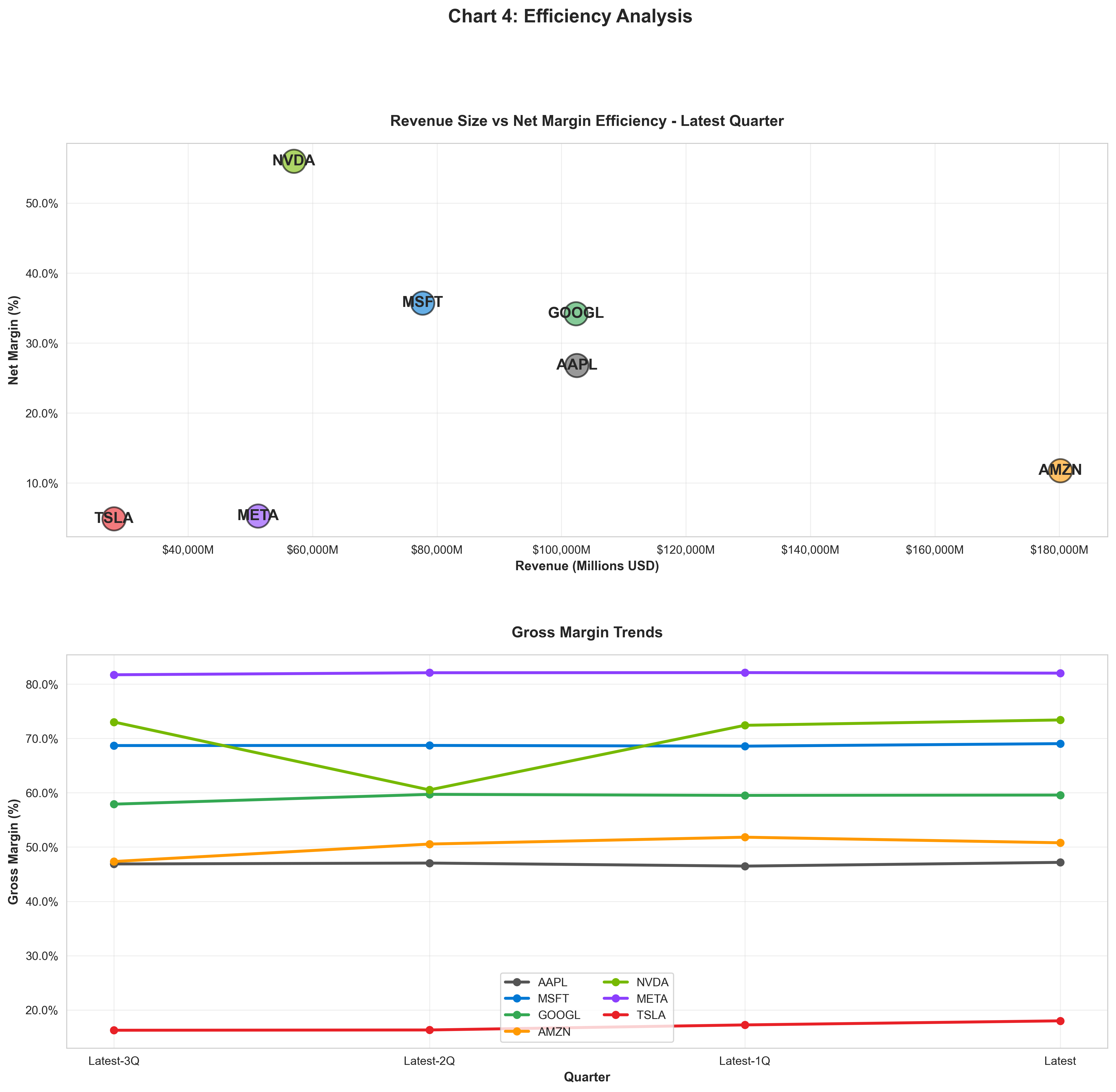 Figure 4: Efficiency Analysis - Revenue vs Margin Scatter (top), Gross Margin Trends (bottom)
Reading Figure 4's top panel: Each bubble represents a company positioned by its revenue (horizontal axis - further right means more revenue) and net margin (vertical axis - higher means more efficient). The ideal position is top-right: large revenue with high margins.
This reveals an important insight: the biggest companies aren't always the most profitable on a margin basis.
The Four Quadrants:
- Top Right (Large + High Margin): The sweet spot - massive scale with excellent profitability
- Bottom Right (Large + Lower Margin): Winning through volume and scale
- Top Left (Smaller + High Margin): Efficient, high-value businesses with room to grow
- Bottom Left (Smaller + Lower Margin): Need either scale or margin expansion to compete
Where does each company sit?
- AAPL: Bottom Right - Large + Lower Margin (scale play)
- MSFT: Top Left - Smaller + High Margin ✓ (efficiency leader)
- GOOGL: Top Right - Large + High Margin ✓✓ (the sweet spot)
- AMZN: Bottom Right - Large + Lower Margin (scale play)
- NVDA: Top Left - Smaller + High Margin ✓ (efficiency leader)
- META: Bottom Left - Smaller + Lower Margin (needs improvement)
- TSLA: Bottom Left - Smaller + Lower Margin (needs improvement)
Find each company's colored bubble in Figure 4's top panel to visualize these positions.
Meta's special note: Meta appears in the bottom-right quadrant due to the tax-impacted net margin. However, if we used operating margin instead (40%), Meta would be in the top-right quadrant with Microsoft and Google - a more accurate representation of its business quality.
Figure 4's bottom panel (Gross Margin Trends): This shows how efficiently companies produce their products/services over time. Notice how most lines are relatively flat and high (70-85% range), indicating these companies have strong pricing power and don't compete primarily on price. Tesla and Amazon have lower gross margins (~50-55%), reflecting their more asset-intensive, competitive businesses.
Key Takeaways for Investors
1. Diversification Within MAG7
Even within this elite group, business models vary dramatically. Some are volume players (Amazon, Tesla), others are margin champions (Nvidia, Microsoft). This diversity can actually benefit a portfolio.
2. Margin Trends Matter More Than Absolute Levels
A company with 10% margins that's expanding is often more attractive than one with 30% margins that's contracting. Watch the trends in the charts above.
3. Scale Has Its Own Advantages
Companies like Amazon and Apple may have lower margins, but their massive revenue base and market power create formidable competitive moats.
4. Growth vs. Profitability Balance
The best investments often combine reasonable growth with strong profitability. Pure growth without profits is risky; pure profits without growth may signal maturity.
5. QoQ Trends Signal Momentum
Quarter-over-quarter changes can signal inflection points before they become obvious in year-over-year comparisons. Pay attention to acceleration and deceleration.
6. Context Is Everything
Don't judge companies in isolation. Compare them to industry peers and their own historical performance. A 5% margin might be excellent for retail but poor for software.
7. Distinguish Operating vs. Non-Operating Issues
Meta's case teaches us to separate core business performance from one-time events. Operating income and operating margin are more reliable indicators of business health than net income, which can be distorted by tax events, asset sales, or accounting changes.
Putting It All Together
Now that we've examined each metric in detail across our 4 comprehensive charts, let's synthesize the insights:
Use all 4 figures together for complete analysis:
- Figure 1 (Financial Performance): Shows the income statement cascade from revenue → operating income → net income
- Figure 2 (Growth & Momentum): Reveals which companies are accelerating or decelerating
- Figure 3 (Profitability Margins): Displays efficiency and pricing power
- Figure 4 (Efficiency Analysis): Connects size with profitability
Quick exercise: Pick a company and trace its story across all four charts:
- Figure 1: Is revenue growing? Does operating income grow proportionally? Any divergence with net income?
- Figure 2: Are growth rates accelerating (good) or decelerating (concerning)?
- Figure 3: Are margins stable, expanding, or compressing?
- Figure 4: Is the company positioned for scale, efficiency, or both?
For example, tracing Nvidia's bright green line: Strong revenue growth (Figure 1), accelerating QoQ rates (Figure 2), expanding margins (Figure 3), and high efficiency despite smaller scale (Figure 4) - a complete growth story.
For Meta: Healthy revenue and operating income (Figure 1 upper panels), but net income distorted by tax (Figure 1 bottom panel). When you focus on operating metrics (Figures 3 middle panel), Meta shows strong business fundamentals.
Conclusion
The MAG7 companies showcase different paths to success in the technology sector. From Nvidia's exceptional margins driven by AI chip demand to Amazon's massive scale in e-commerce and cloud computing, each company has found its competitive edge.
For investors, understanding these metrics provides crucial context for valuation and portfolio decisions:
- Revenue tells you about market position and growth
- Margins reveal competitive strength and business quality
- EPS shows what you actually earn as a shareholder
- QoQ trends indicate momentum and inflection points
By analyzing these metrics together rather than in isolation, you can build a more nuanced understanding of each company's strengths, weaknesses, and investment potential.
Remember: Past performance doesn't guarantee future results, but understanding the fundamentals puts you in a better position to make informed investment decisions.
About This Analysis
This analysis is based on the most recent quarterly financial data from each company's official earnings reports. All metrics are calculated from publicly available financial statements.
Data Sources: Company 10-Q/10-K filings via Yahoo Finance Analysis Tools: Python, Pandas, Matplotlib Last Updated: {datetime.now().strftime('%B %d, %Y')}
Disclaimer: This analysis is for educational purposes only and should not be considered investment advice. Always conduct your own research and consult with financial professionals before making investment decisions.
Comments (0)
No comments yet. Be the first to comment!