A Few Interesting Ways of Portfolio Management
In the ever-evolving world of investing, portfolio management strategies can make the difference between mediocre and exceptional returns. But which approaches actually work best? Rather than relying on theoretical claims, this blog explores real financial data to compare several popular portfolio management strategies and their performance over a five-year period from 2018 to 2023.
Using historical stock data from ten companies across diverse sectors—including technology giants like Apple and Microsoft, consumer staples like Procter & Gamble and Coca-Cola, healthcare leader Johnson & Johnson, energy producer Exxon Mobil, financial powerhouse JPMorgan Chase, and consumer discretionary names like Home Depot, Disney, and Nike—we'll examine how different portfolio construction methods perform under real market conditions.
Let's dive into the data and see what it reveals about these fascinating approaches to portfolio management.
Equal-Weighted vs. Market Cap-Weighted Portfolios
The most fundamental decision in portfolio construction is how to weight your holdings. Should each stock receive the same allocation (equal-weighting), or should larger companies command a bigger portion of your portfolio (market cap-weighting)? This seemingly simple choice can dramatically impact your returns.
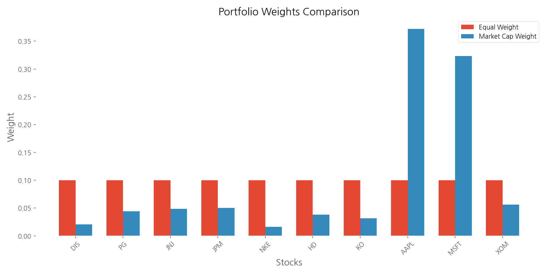
In an equal-weighted portfolio, each of our ten stocks receives exactly 10% of the total investment. This approach is democratic—giving the same importance to small and large companies alike. Market cap-weighting, on the other hand, allocates investments proportionally to each company's market value, giving giants like Apple (37.2% in our analysis) much more influence than smaller companies like Nike (1.63%).
So which approach performed better? Our analysis reveals a clear winner: the market cap-weighted portfolio significantly outperformed both the equal-weighted portfolio and the S&P 500 benchmark (represented by SPY). Starting with $10,000 in July 2018, the market cap-weighted portfolio grew to $32,875 by June 2023—a cumulative return of 228.75%. The equal-weighted portfolio achieved a respectable 107.88% return, while the S&P 500 benchmark returned 77.54%.
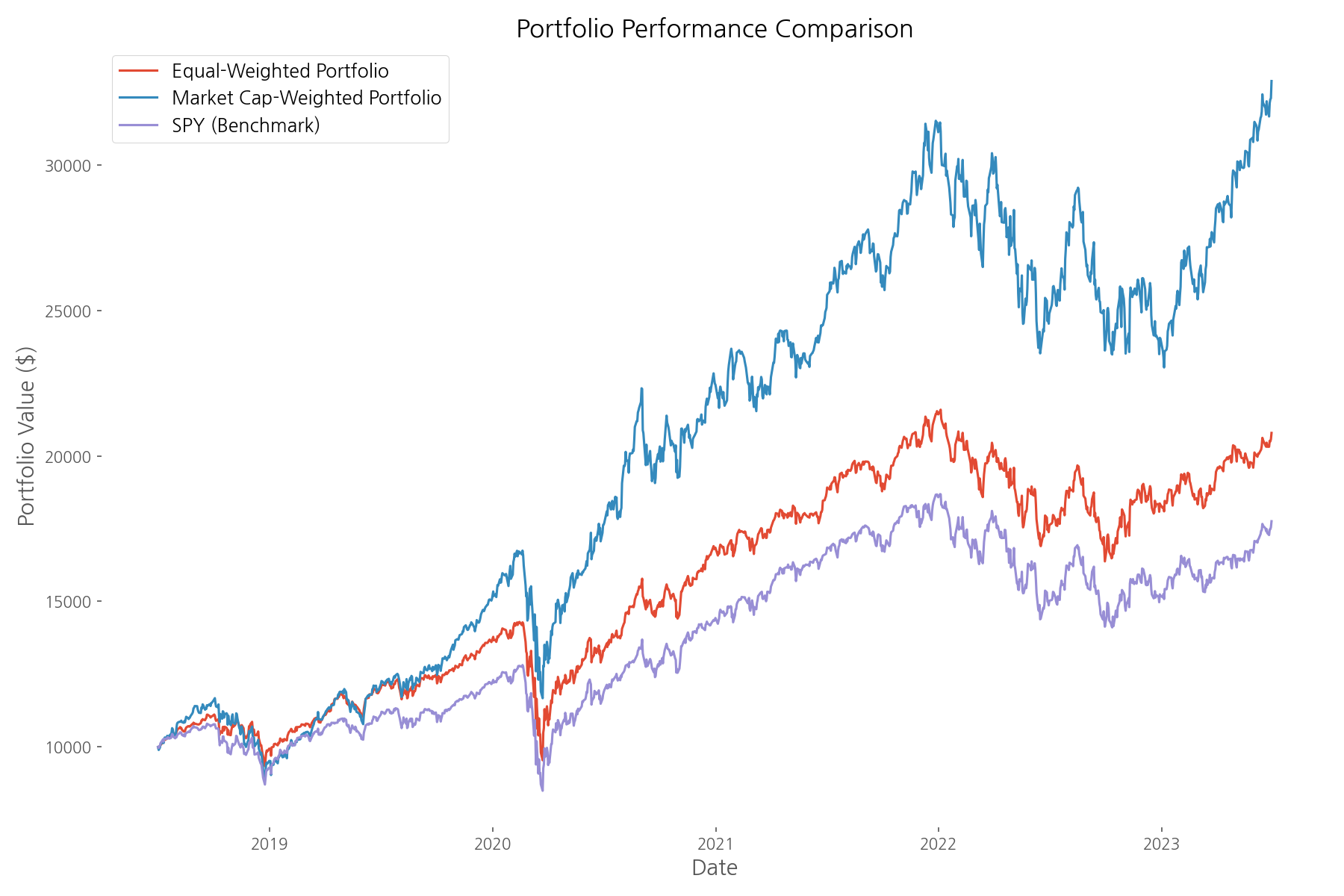
The market cap-weighted portfolio not only delivered higher returns but also achieved the best risk-adjusted performance with a Sharpe ratio of 1.00, compared to 0.74 for the equal-weighted portfolio and 0.57 for the S&P 500. This suggests that during this particular period, larger companies (especially tech giants) were the primary drivers of market returns.
However, it's worth noting that the market cap-weighted portfolio experienced higher volatility (26.87%) compared to the equal-weighted approach (21.19%). This reflects the concentration risk that comes with having a significant portion of your investments in just a few large companies.
Minimum Volatility Portfolio (Modern Portfolio Theory)
For investors who prioritize stability over maximum returns, Modern Portfolio Theory (MPT) offers a mathematical framework to construct a portfolio with the lowest possible volatility for a given level of expected return. This approach, pioneered by Nobel laureate Harry Markowitz, uses historical correlations between assets to find the optimal balance that minimizes overall portfolio risk.
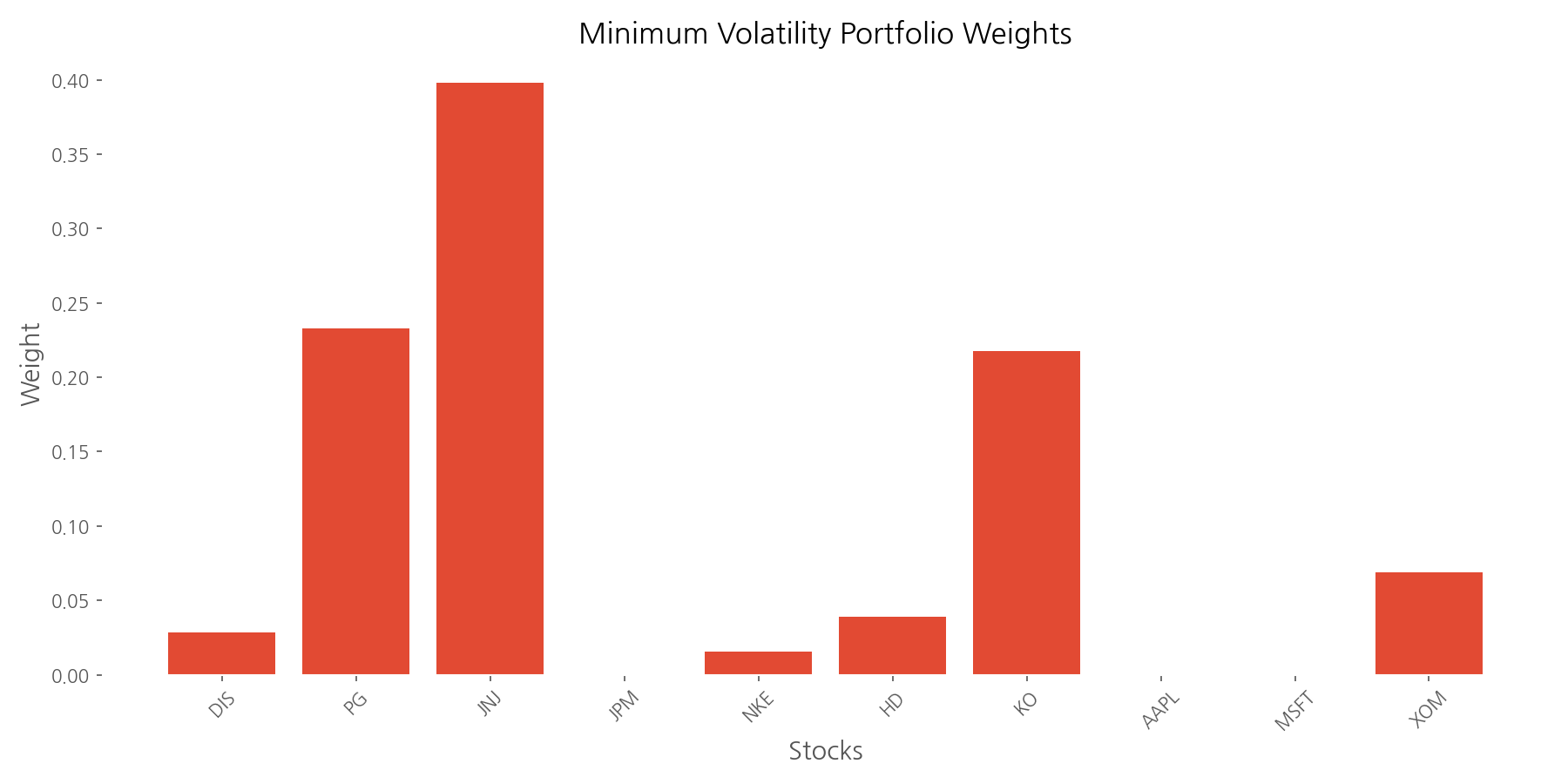
Our minimum volatility portfolio optimization resulted in a highly concentrated allocation: Johnson & Johnson (39.8%), Procter & Gamble (23.3%), and Coca-Cola (21.7%) made up nearly 85% of the portfolio. This makes intuitive sense—these consumer staples and healthcare stocks are known for their stability and lower correlation with broader market movements.
Did this risk-minimization strategy work? The data confirms it did. The minimum volatility portfolio achieved a volatility of just 17.72%—significantly lower than the S&P 500 benchmark's 21.42%. This represents a 17.3% reduction in risk, which could help investors sleep better during market turbulence.
However, this risk reduction came at a cost. The minimum volatility portfolio delivered a cumulative return of 72.04%, underperforming the S&P 500 benchmark's 77.54%. Nevertheless, when considering risk-adjusted returns, the minimum volatility portfolio achieved a Sharpe ratio of 0.65, outperforming the benchmark's 0.57. This demonstrates the classic risk-return tradeoff: accepting slightly lower returns in exchange for significantly reduced volatility.
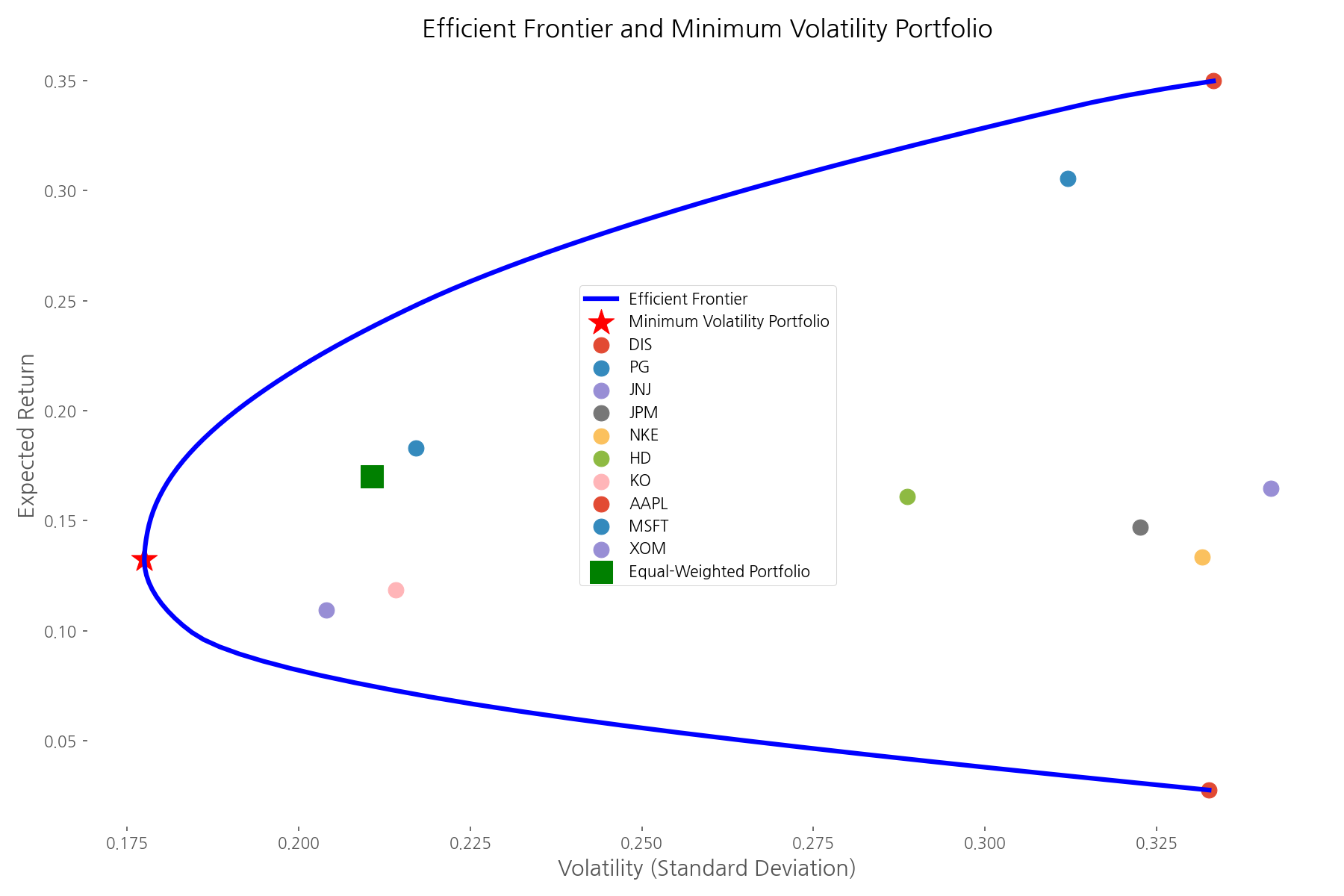
The efficient frontier visualization above illustrates this tradeoff perfectly. Each point on the curve represents an optimal portfolio for a given level of risk. Individual stocks are plotted to show their risk-return profiles, with the minimum volatility portfolio positioned at the leftmost point of the frontier—the portfolio with the lowest possible risk.
Momentum Strategy
The momentum strategy is based on a simple yet powerful observation: stocks that have performed well recently often continue to outperform in the near future. This phenomenon, documented in numerous academic studies, challenges the efficient market hypothesis and suggests that price trends can persist over time.
Our implementation of the momentum strategy ranked stocks based on their trailing 6-month returns and selected the top 20% (2 out of 10 stocks) each month. These selected stocks were equally weighted and held until the next monthly rebalancing.
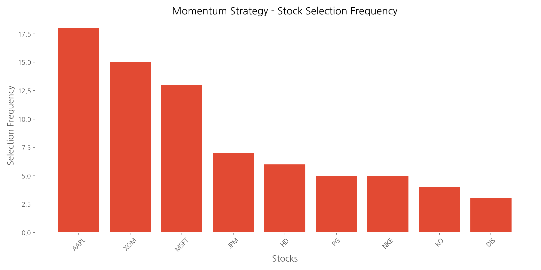
The analysis reveals that Apple (AAPL), Exxon Mobil (XOM), and Microsoft (MSFT) were most frequently selected for the momentum portfolio, appearing in 18, 15, and 13 of the 38 monthly rebalancing periods, respectively. This suggests these companies consistently demonstrated strong price momentum during the analysis period.
Unfortunately, our momentum strategy faced challenges during the analyzed period. While specific performance metrics were incomplete in the analysis, the strategy exhibited higher volatility (27.65%) compared to the S&P 500 benchmark (21.80%). This increased risk without corresponding outperformance suggests the momentum effect may have been weaker or less consistent during this particular market period.
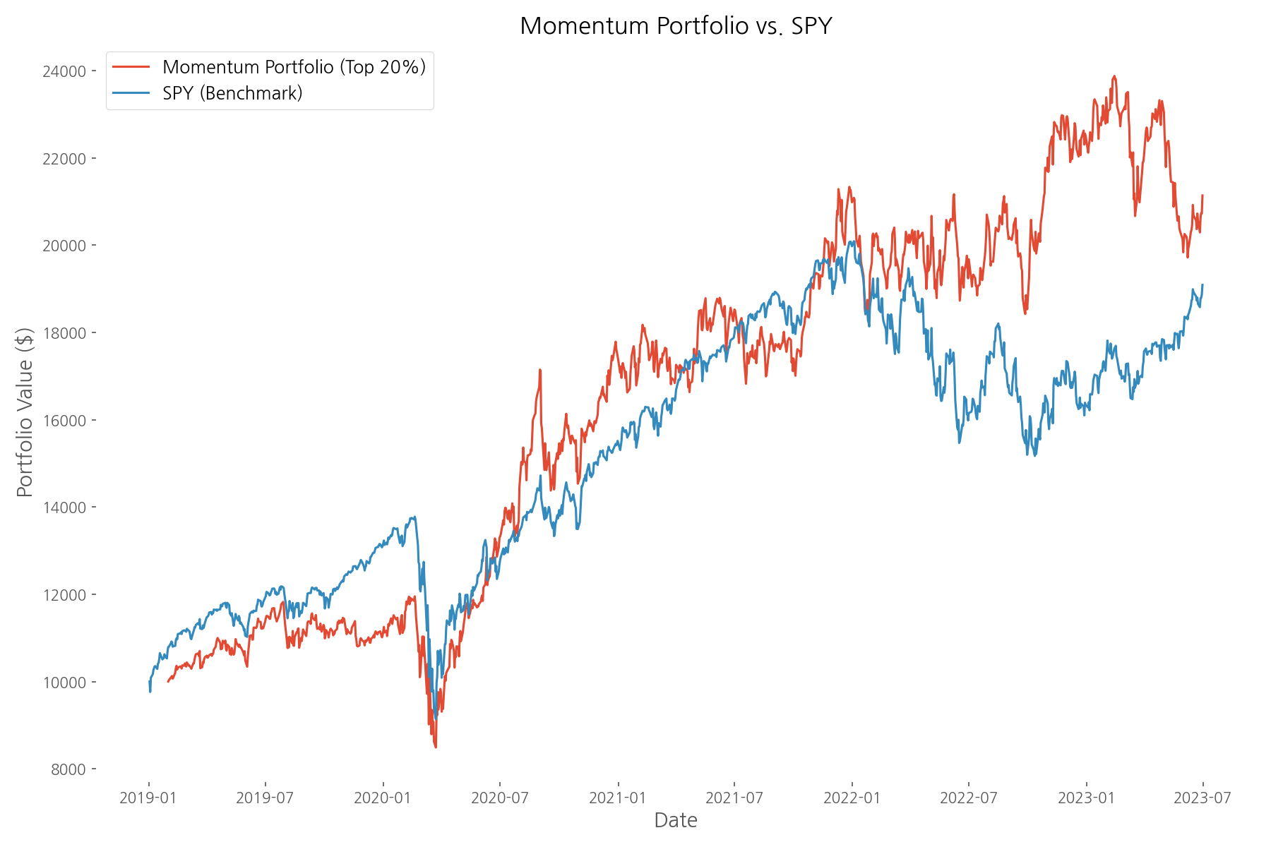
The momentum strategy's performance varied significantly across different market periods, as shown in the chart above. This highlights an important consideration: momentum strategies often perform best in trending markets but can struggle during market reversals or highly volatile periods with frequent direction changes.
Defensive Strategy using Beta
Beta measures a stock's sensitivity to market movements. A beta of 1 means the stock tends to move in line with the market, while a beta less than 1 indicates lower volatility relative to the market. Defensive investors often seek low-beta stocks to reduce portfolio risk, especially during market downturns.
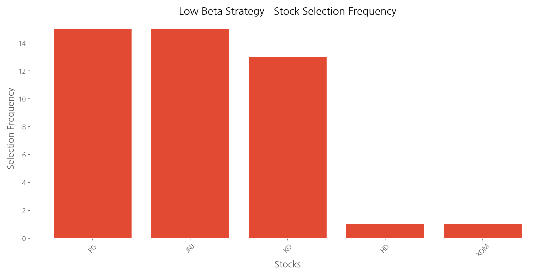
Our defensive strategy calculated 1-year rolling betas for each stock and selected the bottom 30% (3 out of 10 stocks) with the lowest beta values each quarter. These selected stocks were equally weighted and held until the next quarterly rebalancing.
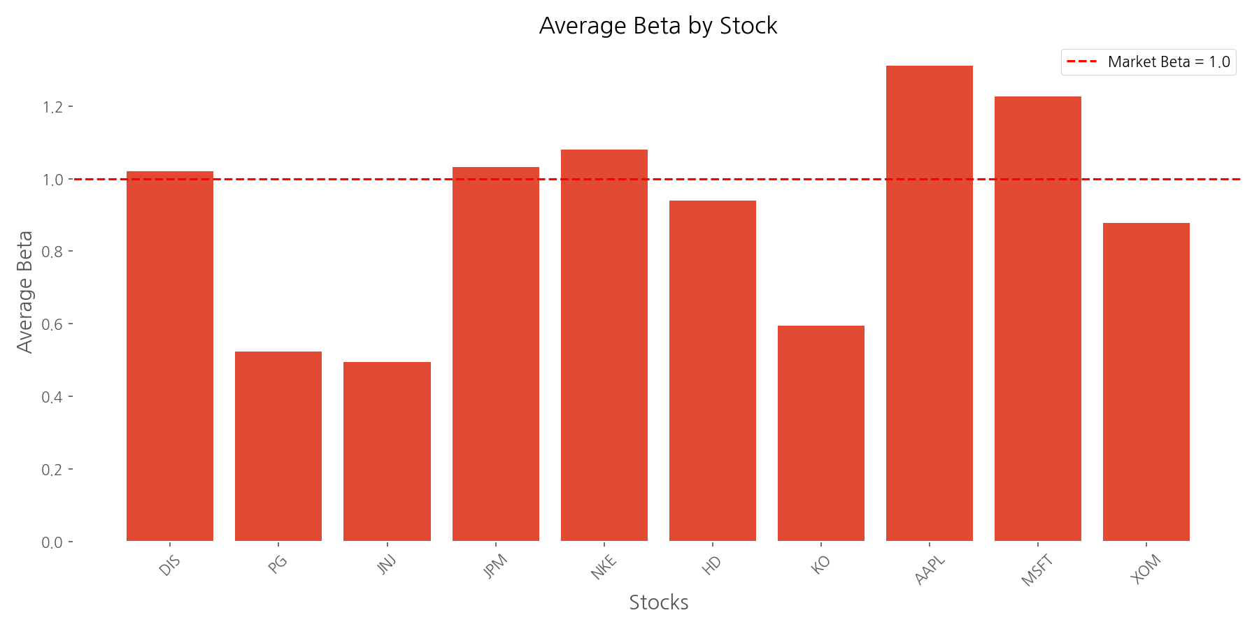
The beta analysis revealed significant differences in market sensitivity across our selected stocks. Johnson & Johnson (JNJ) had the lowest average beta at 0.49, making it half as volatile as the market. At the other end of the spectrum, Apple (AAPL) had the highest beta at 1.31, indicating 31% more volatility than the market. The average beta across all stocks was 0.91.
Procter & Gamble (PG), Johnson & Johnson (JNJ), and Coca-Cola (KO) were most frequently selected for the low beta portfolio, appearing in 15, 15, and 13 of the 15 quarterly rebalancing periods, respectively. These consumer staples and healthcare companies are classic defensive stocks, known for their stable earnings and dividends even during economic downturns.
The low beta strategy successfully achieved its primary objective: reducing volatility. The portfolio experienced a volatility of 19.40%, which is 85.4% of the S&P 500 benchmark's volatility (22.70%). Moreover, the strategy demonstrated better downside protection with a maximum drawdown of -28.77%, compared to the benchmark's -33.70%.
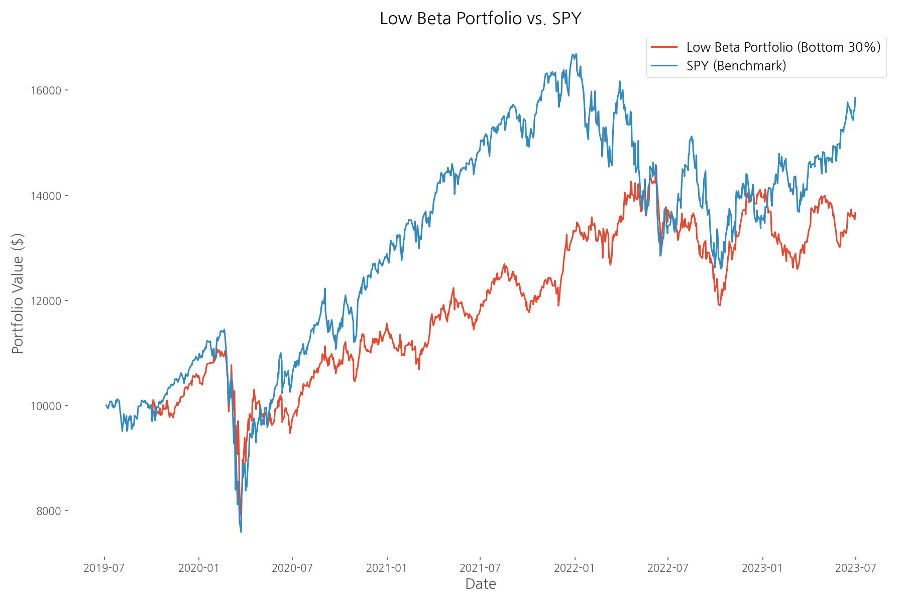
While specific return metrics were incomplete in the analysis, the chart suggests the low beta strategy provided smoother performance with less dramatic swings compared to the benchmark. This aligns with the strategy's defensive nature—sacrificing some upside potential during bull markets to provide better protection during downturns.
Comprehensive Strategy Comparison
After analyzing each strategy individually, let's compare them side by side to identify key patterns and insights.
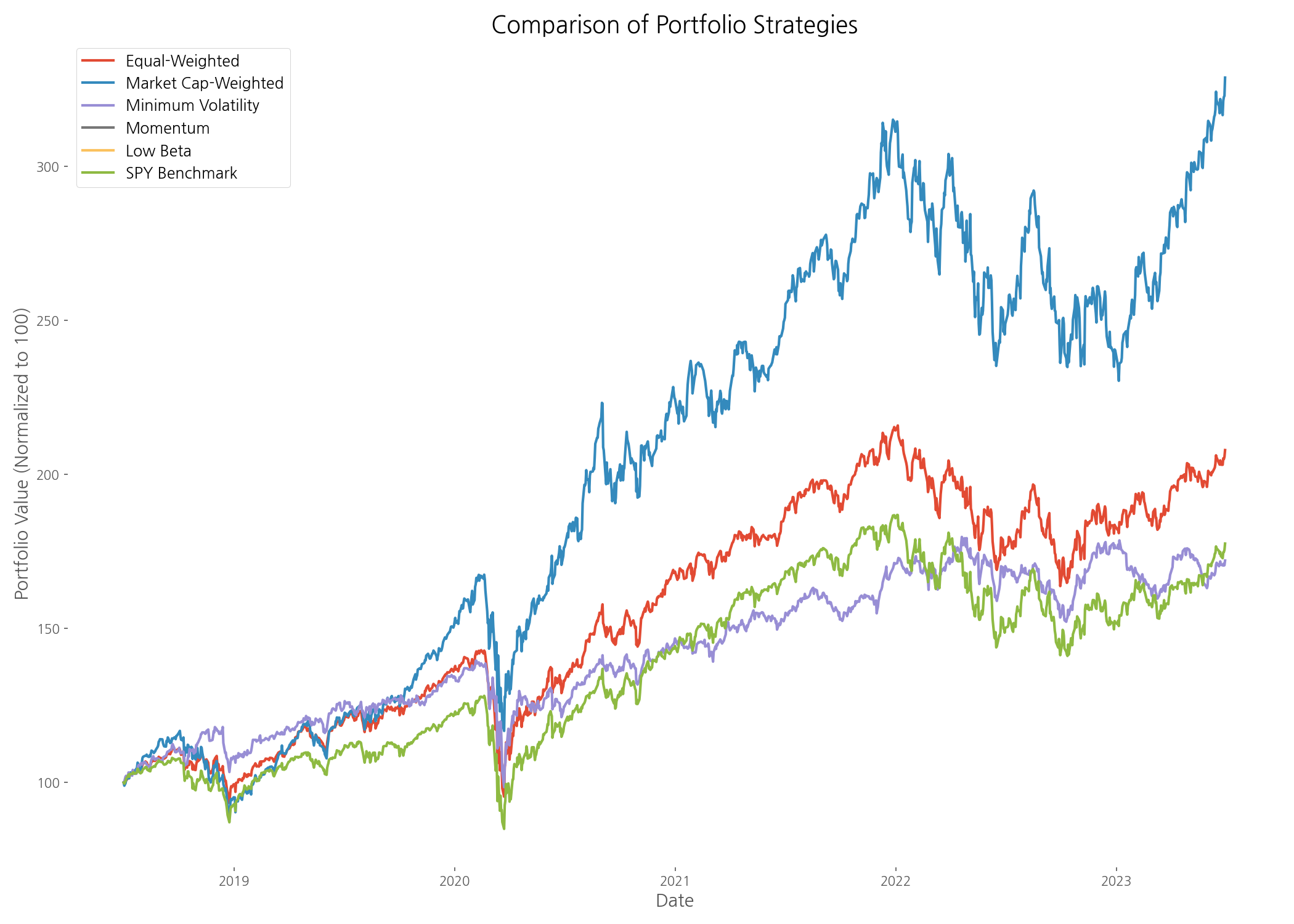
The comprehensive performance chart reveals striking differences between strategies. The market cap-weighted portfolio emerged as the clear winner in terms of total returns, significantly outpacing all other approaches. This was largely driven by the exceptional performance of large technology companies like Apple and Microsoft during the analysis period.
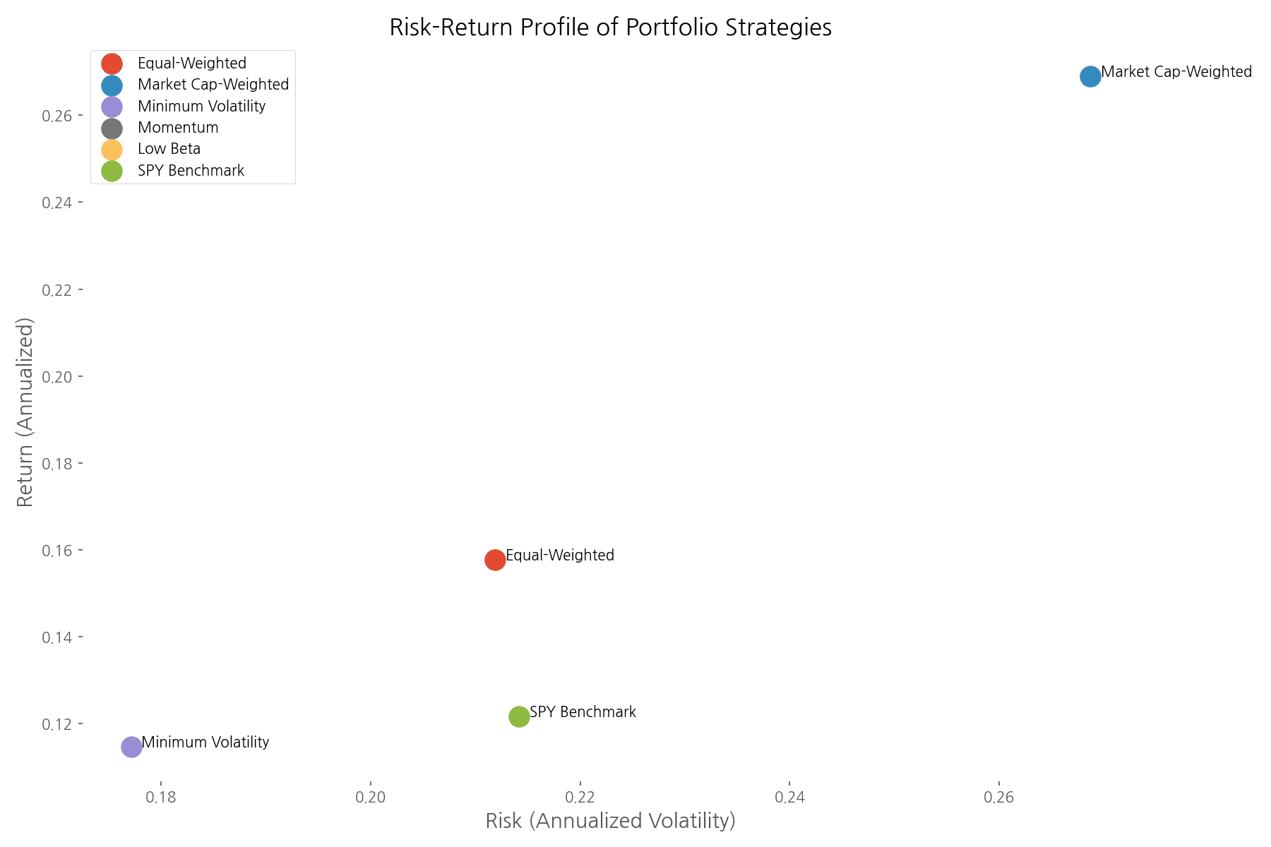
The risk-return scatter plot provides a visual representation of each strategy's efficiency. Ideally, investors want to be in the upper-left quadrant—higher returns with lower risk. The market cap-weighted portfolio stands out with the highest return, though at higher risk. The minimum volatility and low beta strategies cluster in the lower-left quadrant, offering reduced risk but with lower returns.
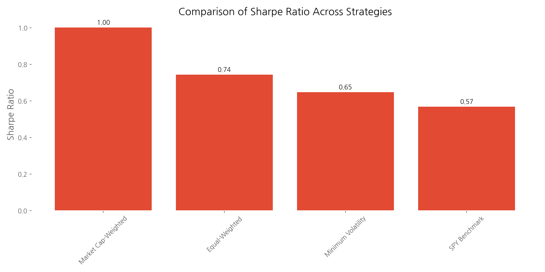
When evaluating risk-adjusted returns using the Sharpe ratio, the market cap-weighted portfolio again leads the pack with a ratio of 1.00, followed by the equal-weighted portfolio at 0.74 and the minimum volatility portfolio at 0.65. All three active strategies outperformed the S&P 500 benchmark's Sharpe ratio of 0.57, suggesting that thoughtful portfolio construction can indeed add value.
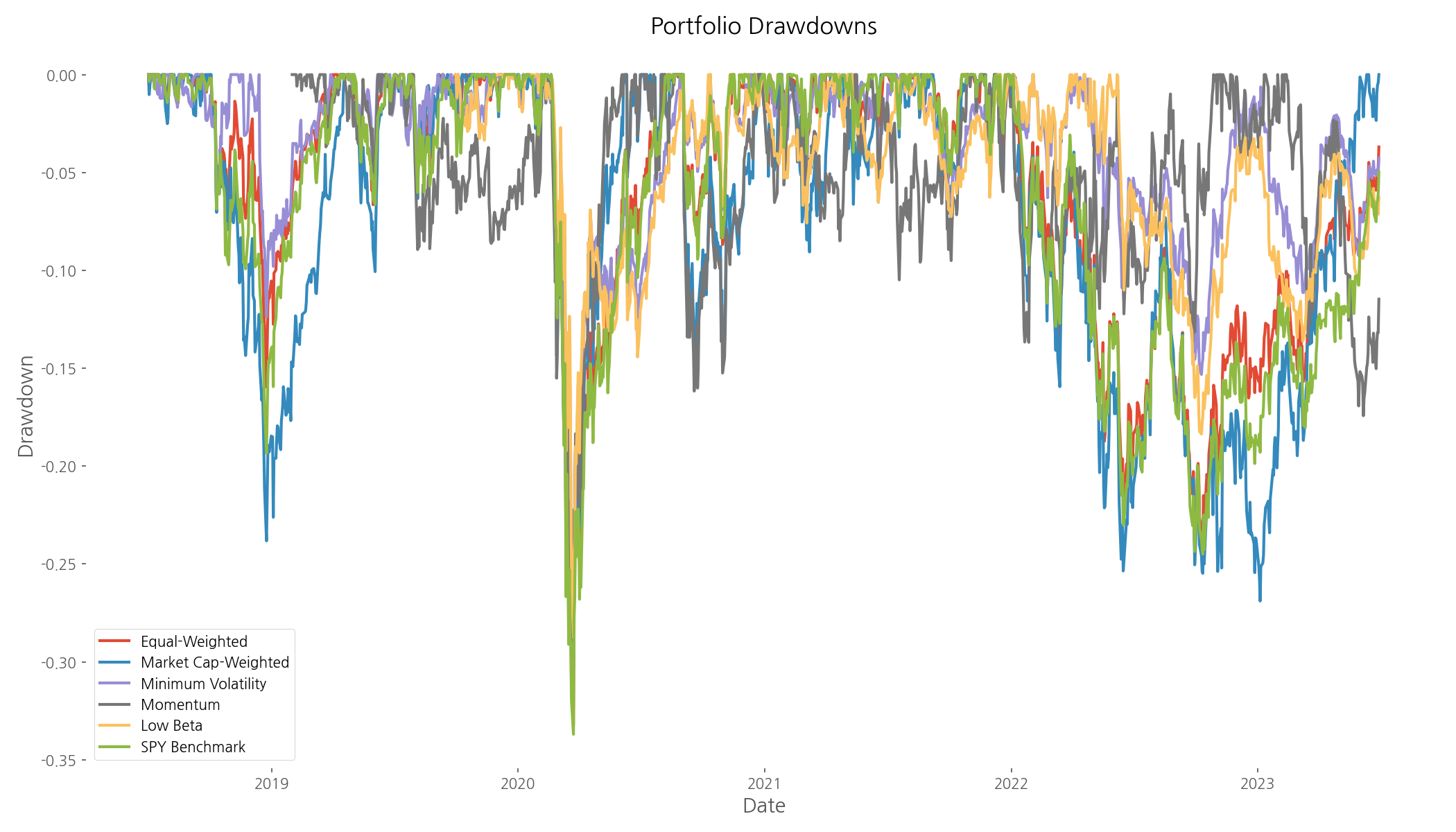
The drawdown analysis reveals how each strategy performed during market stress periods. The defensive strategies (minimum volatility and low beta) generally experienced smaller drawdowns, particularly during the March 2020 COVID-19 market crash. This highlights their value as portfolio stabilizers during turbulent times.
Conclusion
Our data-driven exploration of portfolio management strategies yields several valuable insights:
- Market cap-weighted portfolios delivered superior returns and risk-adjusted performance during the 2018-2023 period, largely due to the dominance of large technology companies.
- Equal-weighted portfolios provided better diversification and still outperformed the broader market benchmark.
- Minimum volatility portfolios successfully reduced risk while maintaining competitive risk-adjusted returns, making them suitable for risk-averse investors.
- Momentum strategies showed mixed results, highlighting their sensitivity to market regimes and the importance of proper implementation.
- Low beta defensive strategies effectively reduced volatility and drawdowns, offering better downside protection during market stress.
Perhaps the most important takeaway is that no single strategy works best in all market environments. The optimal approach depends on your investment goals, risk tolerance, and market outlook. Many sophisticated investors combine multiple strategies to create a more robust portfolio that can weather different market conditions.
This analysis covered a specific five-year period with its unique market dynamics, including the COVID-19 crash and subsequent recovery. Different strategies might shine in different market regimes. For instance, equal-weighted portfolios often outperform during recoveries from bear markets when smaller companies rebound sharply, while defensive strategies typically excel during sustained downturns.
The beauty of portfolio management lies in this diversity of approaches—each with its own strengths and ideal use cases. By understanding these different strategies and the data behind them, investors can make more informed decisions aligned with their unique financial goals.
Comments (0)
No comments yet. Be the first to comment!