Was MAG7 Really Dominant? Two Years of Data Reveals the Truth
"All Eggs in One Basket?" - What the Data Actually Says
Over the past two years, there's been one keyword that constantly comes up when discussing the stock market: "MAG7". Microsoft, Apple, Alphabet (Google), Amazon, Nvidia, Meta (Facebook), Tesla - you've probably heard that these seven companies have essentially dominated the S&P 500 index.
"Are the other 493 companies just background noise?" is a half-joking question that's become common. Many investors have even thought, "Why not just buy MAG7?"
But do the numbers really tell that story?
After analyzing two years of S&P 500 data, I found some interesting facts that challenge conventional wisdom. Let me share what I discovered.
1. Was MAG7 Really Overwhelming?
First, let's check what we're most curious about: How did MAG7 actually perform?
📊 Two-Year Return Results
| Stock | 2-Year Return | Annual Volatility |
|---|---|---|
| Nvidia | +289.5% | 48.3% |
| Alphabet | +111.7% | 29.6% |
| Tesla | +100.1% | 58.0% |
| Meta | +90.3% | 35.4% |
| Amazon | +70.2% | 27.5% |
| Apple | +45.4% | 28.0% |
| Microsoft | +36.4% | 20.9% |
| S&P 500 Average | +52.9% | 23.7% |
Looking at these numbers, I thought "Wait, what?"
Nvidia is truly on another level. Nearly tripling in 2 years. Alphabet (Google) and Tesla also doubled. This was within expectations.
But what about Microsoft and Apple?
Microsoft at 36.4%, Apple at 45.4%. These aren't bad returns by any means. But they're below the S&P 500 average (52.9%). Microsoft especially recorded the lowest return among MAG7.
This paints a different picture from the conventional wisdom that "MAG7 always beats the S&P 500."
📈 Looking at the Timeline
Tables alone might not give you the full picture, so let's visualize how these stocks moved over 2 years. For readability, I've split the chart into two parts.
Part 1: High-Growth MAG7 Stocks vs Major Sectors
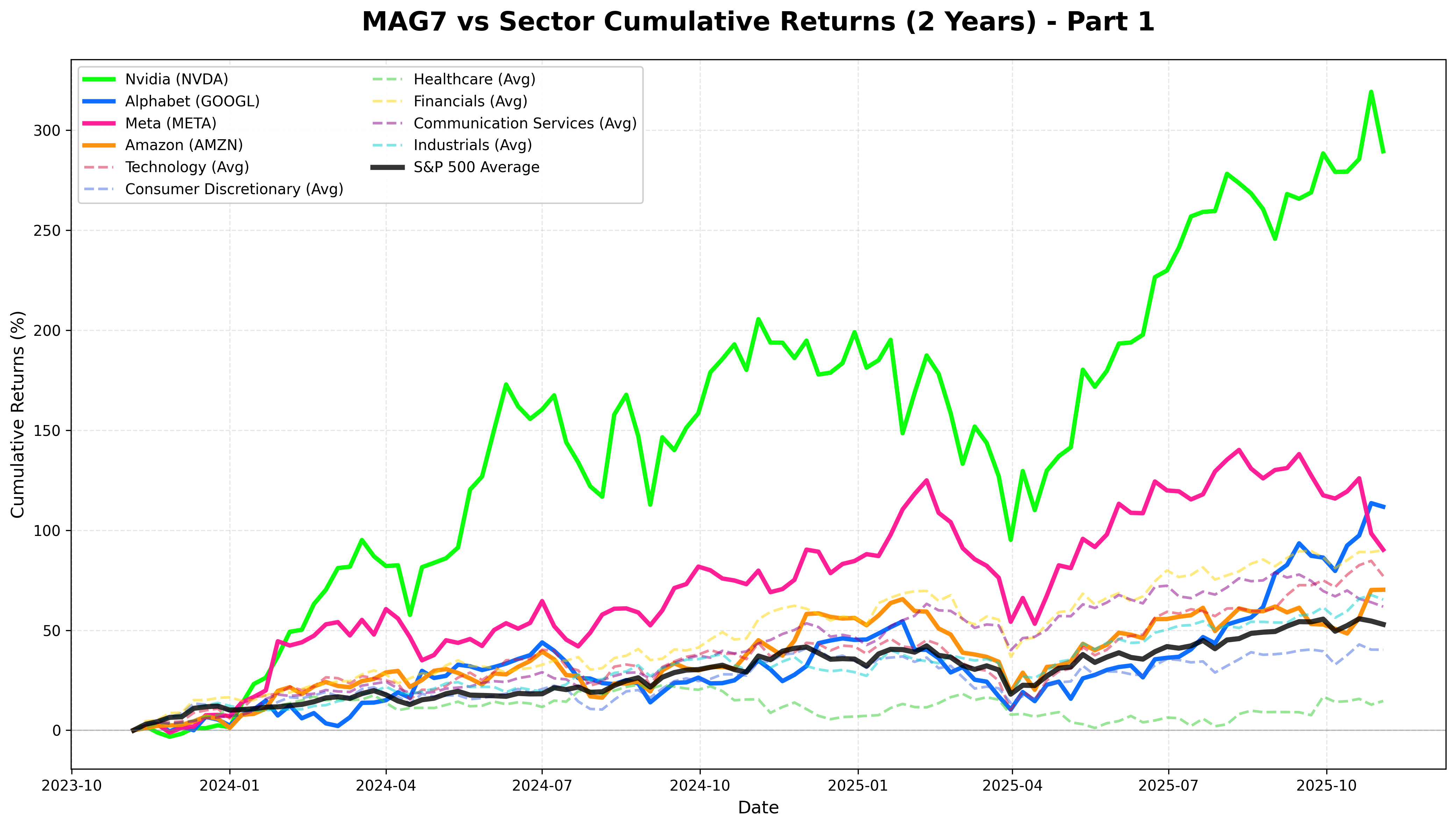
The first chart compares Nvidia, Alphabet, Meta, Amazon with six major sectors (Technology, Consumer Discretionary, Healthcare, Financials, Communication Services, Industrials).
Part 2: Stable MAG7 Stocks vs Traditional Sectors
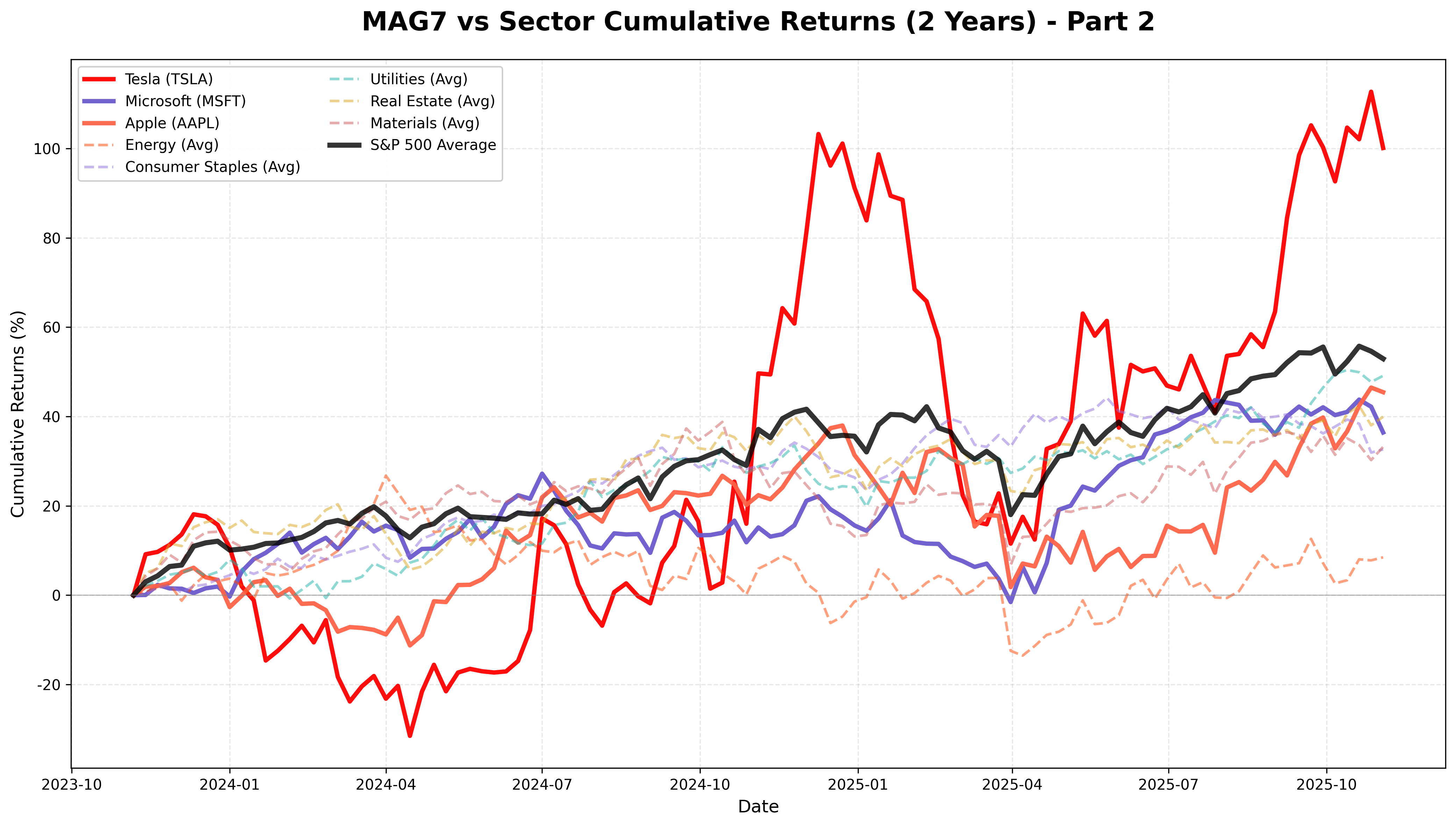
The second chart shows Tesla, Microsoft, Apple alongside five traditional sectors (Energy, Consumer Staples, Utilities, Real Estate, Materials).
These charts reveal several interesting patterns:
-
Nvidia's Overwhelming Rise - The green line dominates everything else. It accelerated from mid-2024.
-
Divergence Within MAG7 - Part 1's Nvidia, Alphabet, Meta, and Amazon show steep upward trajectories, while Part 2's Tesla, Microsoft, and Apple are relatively modest. Not all MAG7 stocks are created equal.
-
Sectors' Steady Climb - Look at the sector averages shown with dotted lines. Technology, Financials, and Industrials sectors showed quite solid performance. Notably, Financials outperformed several MAG7 stocks.
-
S&P 500 Holding Strong - The thick black line representing the S&P 500 average in both charts is positioned higher than expected. Contrary to the narrative "everything except MAG7 is dead," the rest of the companies did quite well.
2. Market Cap Concentration: How Serious Is It?
"But MAG7 still dominates the market, right?" might be your counterargument. Fair point. Returns may be similar, but the size is different.
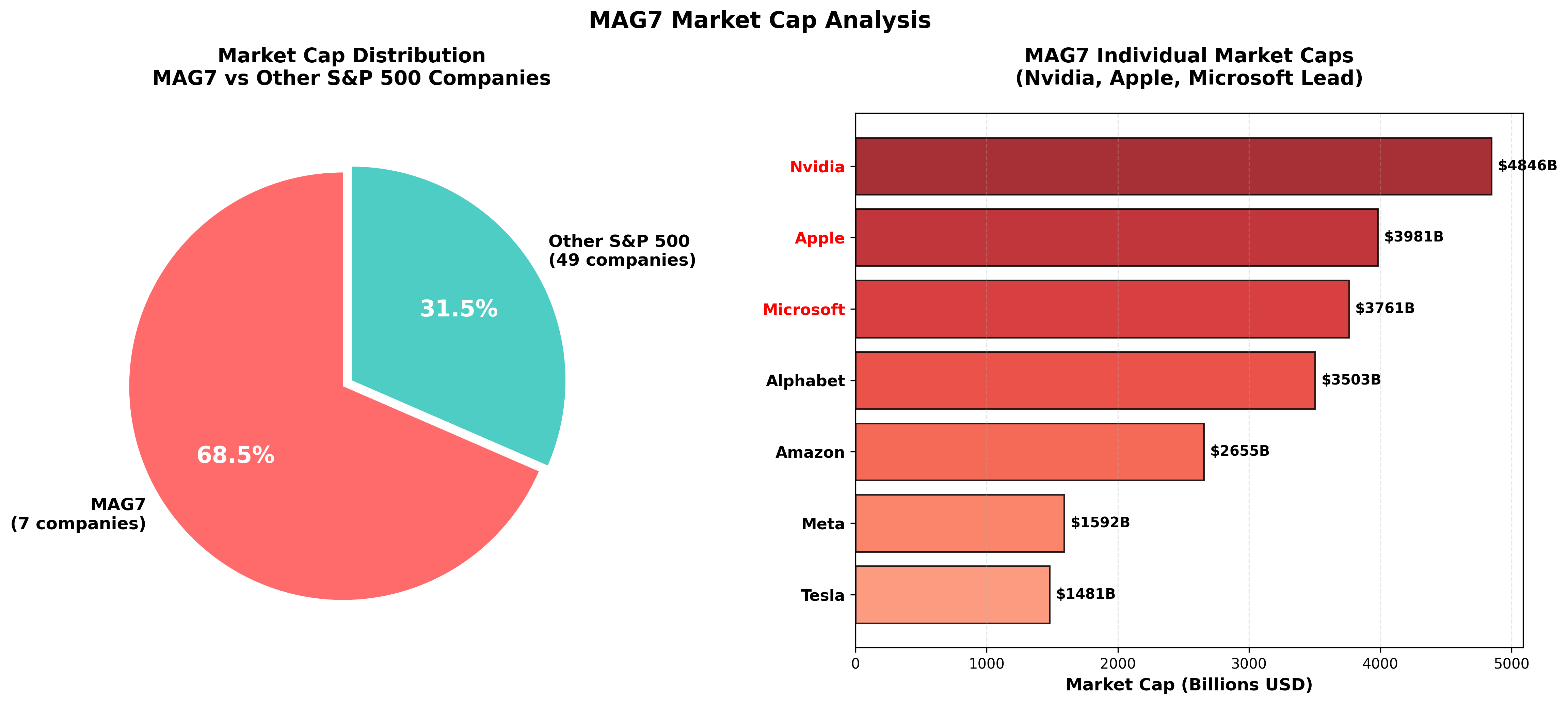
The left pie chart shows that MAG7 occupies a staggering 68.5% of market cap compared to 50 randomly sampled S&P 500 companies. Seven companies ($21.8 trillion) match nearly 70% of the weight of 50 other companies ($10.0 trillion).
The right bar chart displays individual MAG7 market caps. Nvidia ($4.8T), Apple ($4.0T), and Microsoft ($3.8T) are overwhelming. These three alone total $12.6 trillion - more than all 50 other companies combined!
The important question here:
"Does a large market cap mean it's a good investment?"
Not necessarily. A large market cap also means "it's already gone up a lot." Future growth potential might actually be limited.
3. High Returns, At What Cost?
There's no free lunch in investing. High returns usually come with high risk. How was it for MAG7?
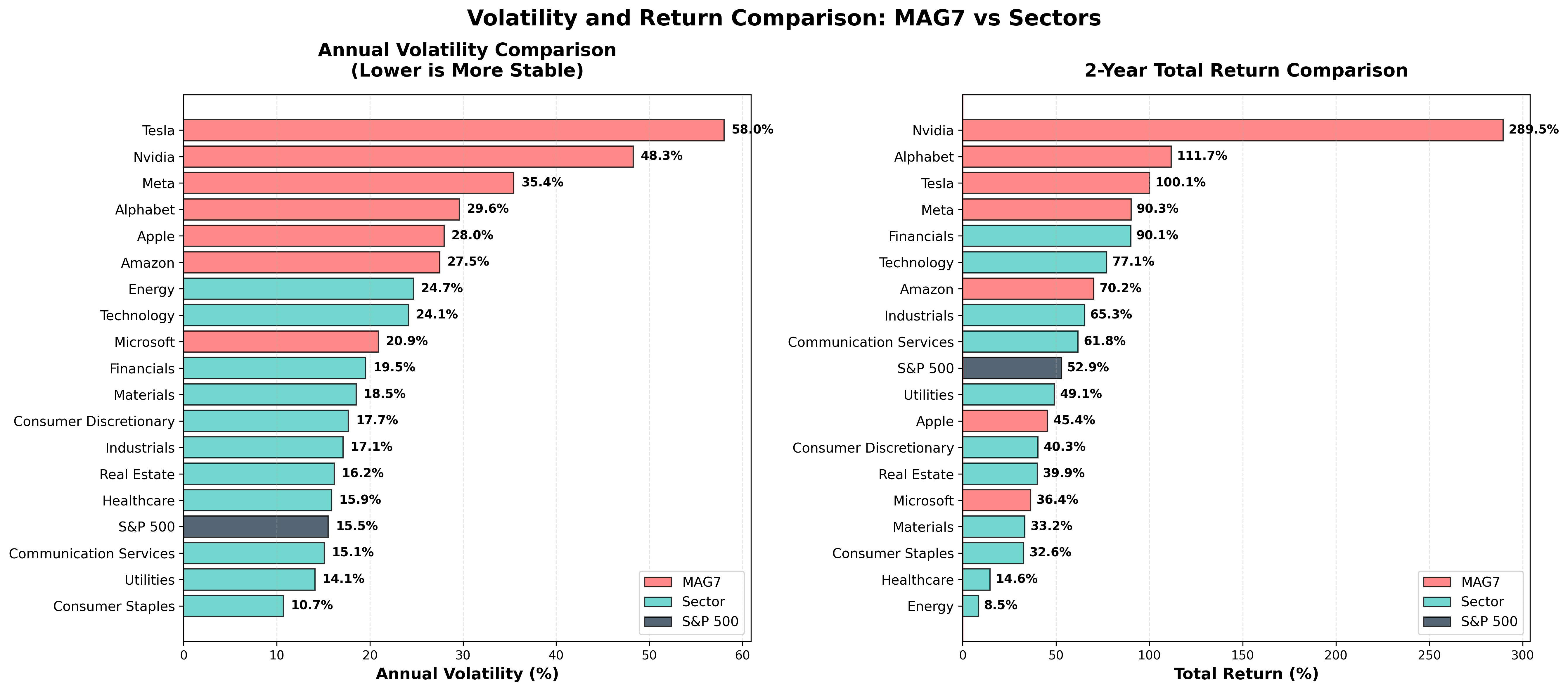
The left chart shows annual volatility. High volatility means stock prices swing like a rollercoaster. This can be heart-stopping for investors.
Tesla: 58% volatility - The highest among MAG7. If you invest $100,000, it could be $130,000 one day and $70,000 the next. Not for the faint of heart.
Nvidia: 48% volatility - The returns were the highest, but so was the fluctuation. To earn 2x, you had to endure 2x the swings.
In contrast, sector averages show lower volatility in the 15-20% range. Returns might be somewhat lower, but you can sleep peacefully.
Interestingly, the right return chart shows the Financials sector recording over 90% returns. Higher than Meta and Amazon.
"Low volatility but high returns?"
That's the holy grail investors seek. There's a metric for this: the Sharpe Ratio.
4. Who's the Real Winner? - Risk-Adjusted Returns
The Sharpe Ratio shows "how much return you earned per unit of risk". Higher numbers mean more "efficient" investing.
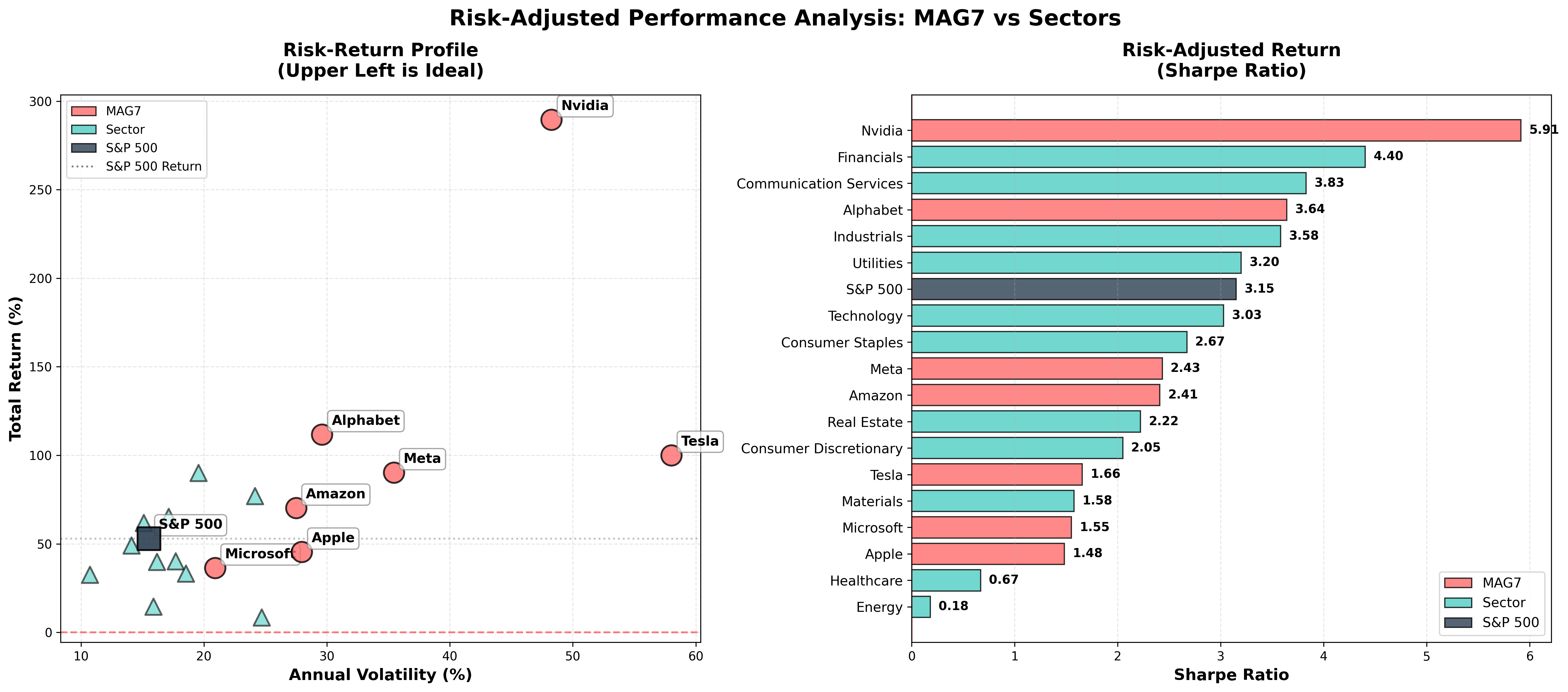
Looking at the left scatter plot, the ideal position is upper left. Low volatility (left) and high returns (top).
- Nvidia is at the upper right. High returns but also high volatility.
- S&P 500 average is in the middle. A balanced position.
- Sectors (triangle markers) cluster on the left. They're stable.
The right Sharpe Ratio chart is truly interesting.
🏆 Sharpe Ratio Top 5
-
Nvidia: 5.92 - Still #1. Despite high volatility, returns were so overwhelming that efficiency is also the best.
-
Financials: 4.40 - This is key! The Financials sector beat most of MAG7 for #2.
-
Communication Services: 3.83 - The communications sector also performed well.
-
Alphabet: 3.64 - Second among MAG7 after Nvidia.
-
Industrials: 3.58 - Traditional industries were also efficient.
Tesla, Meta, and Amazon didn't even make the Top 5. Returns were high, but they rode a rollercoaster to get there.
5. So What's the Conclusion?
The message from two years of data is clear:
✅ What's True
- Nvidia was truly exceptional: Dominant by any metric.
- MAG7 deserved attention: Alphabet, Tesla, and Meta's performance was clearly outstanding.
- Market cap concentration is real: A small number of companies occupying a large portion of the market is fact.
❌ What's False
- "Just buy MAG7": Microsoft and Apple underperformed the market average.
- "Everything else is dead": Financials, Industrials, and Communication Services sectors were excellent.
- "MAG7 is the most efficient": Looking at risk-adjusted returns, diversified sector investing might be wiser.
Next Episode Preview: "The Hidden Story of Traditional Sectors"
"So where should we have invested?"
In the next episode:
- We'll find the hidden winners in each sector
- We'll dig deeper into risk-adjusted returns
- We'll identify investments with low correlation to MAG7
- We'll analyze which sectors shined in 2023 vs 2024 vs 2025
"What if you put all your eggs in one basket?"
If that basket was Nvidia, you'd have hit the jackpot. If it was Tesla, your heart would be weakened. If it was Microsoft, you'd have underperformed the market average.
The most important thing in investing isn't "getting lucky" but having a "sustainable strategy".
Let's find that strategy together in the next episode.
Methodology Notes
This analysis is based on 2 years of S&P 500 weekly data from November 2023 to November 2025.
Data Sampling:
- S&P 500 Average Calculation: Approximately 100 companies were sampled to estimate the overall market average.
- Market Cap Comparison Chart: Compared 7 MAG7 stocks with approximately 50 other companies.
- Sector Analysis: Used actual data for all companies included in each sector.
Past performance does not guarantee future returns. This analysis is for informational purposes only and is not investment advice.
Comments (0)
No comments yet. Be the first to comment!