The 10 Most Popular Dividend ETFs in 2025: A Data-Driven Analysis During Market Uncertainty
Why Dividend ETFs Are Getting Attention Right Now
DISCLAIMER: This article is for educational and informational purposes only. It is NOT investment advice, and the author is not a certified financial advisor. All investment decisions should be made in consultation with a qualified financial professional.
With AI stocks trading at historic valuations, interest rates still elevated at 4%+, and growing concerns about a potential market correction, many investors are reexamining their portfolios. Search interest for "dividend ETFs" has surged as investors look for:
- Income-generating alternatives to cash savings accounts
- Defensive positions that may weather market volatility better
- Value exposure versus high-valuation growth stocks
- Portfolio diversification beyond the "Magnificent Seven" tech concentration
But not all dividend ETFs are created equal. Some actually lost dividend value during our analysis period (2019-2025), while others grew dividends by 6% annually even through COVID, inflation spikes, and rate hikes.
This educational analysis examines 10 popular dividend ETFs using real market data to help you understand:
- Which strategies performed during the last major correction (COVID 2020)
- How different approaches handled 9% inflation (2022)
- What happened when rates jumped from 0% to 5.5% (2023-2024)
- Which metrics actually matter versus marketing terminology
Current market context (November 2025):
- S&P 500 tech concentration at decade highs
- 10-Year Treasury paying 4.1% (competing with dividend yields)
- AI sector valuations raising bubble concerns
- Inflation cooling but still above Fed's 2% target
This article explains the data and frameworks for evaluating dividend ETFs - it does not recommend any specific investments. Always consult with a licensed financial advisor before making investment decisions.
What Are Dividend ETFs? (And Why They Matter During Market Uncertainty)
A dividend ETF is a basket of stocks from companies that regularly pay dividends (share profits with shareholders). Instead of betting on individual stocks or chasing growth at any price, you get instant diversification across dozens or hundreds of dividend-paying companies.
Why investors consider them during volatile markets:
- Income generation: Quarterly or monthly cash payments (3-4% yields typical) regardless of stock price movement
- Lower volatility: Historically, dividend-paying stocks have shown less extreme price swings than growth stocks
- Downside protection: During the 2020 COVID crash, the best dividend ETF in our analysis dropped 31.7% vs. 52.7% for the worst
- Forced discipline: Companies paying consistent dividends typically have stable business models and cash flow
- Total return potential: Price appreciation + dividends (not just one or the other)
The defensive appeal in 2025: When tech stocks trade at 40-50x earnings and AI valuations raise bubble concerns, dividend ETFs offer exposure to profitable, cash-generating companies trading at lower valuations (often 15-20x earnings). They're not guaranteed to avoid corrections, but they provide a different risk profile than pure growth strategies.
The 10 ETFs We're Comparing
-
VYM - Vanguard High Dividend Yield Strategy: Focuses on high dividend payers
-
SCHD - Schwab U.S. Dividend Equity Strategy: Quality dividend stocks with growth
-
DVY - iShares Select Dividend Strategy: High dividend yield selection
-
VIG - Vanguard Dividend Appreciation Strategy: Companies that grow their dividends
-
SDY - SPDR S&P Dividend Strategy: Dividend consistency over 20+ years
-
DGRO - iShares Core Dividend Growth Strategy: Dividend growth focus
-
HDV - iShares Core High Dividend Strategy: High dividend with quality screen
-
NOBL - ProShares S&P 500 Dividend Aristocrats Strategy: 25+ years of dividend increases
-
DIV - Global X SuperDividend Strategy: Ultra-high yield focus
-
SPHD - Invesco S&P 500 High Div Low Vol Strategy: High dividend with low volatility
Chart Analysis: What Really Matters
1. Dividend Yield & Growth: The Income Story
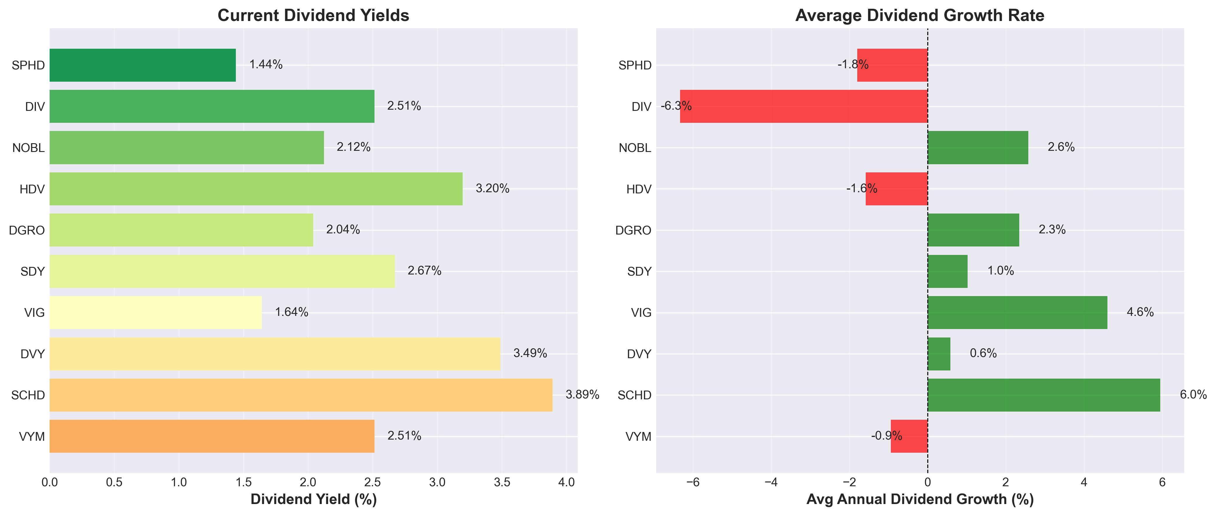
What This Chart Shows:
- Left panel: Current dividend yield - If you invest $100 today, this percentage shows how much income you'll receive this year
- Example: SCHD at 3.89% means you get $3.89 per year for every $100 invested
- Right panel: Historical dividend growth rate - How much the dividend payment has increased on average each year (past 6 years)
- Example: SCHD at 6.0% average growth means dividends grew from $0.58 (2019) to $1.00 (2024)
- If this trend continues: $3.89 this year → $4.12 next year → $4.37 the year after, etc.
Why It Matters:
This is the classic "yield vs. growth" trade-off. Some ETFs give you more income NOW, while others grow your income FASTER over time.
Key Insights:
- SCHD is the sweet spot: 3.89% yield WITH 6.0% annual growth – best of both worlds
- VIG focuses on growth: Lower yield (1.64%) but solid 4.6% growth – your income compounds faster
- DIV and SPHD are warning signs: High yield but NEGATIVE growth means your income is actually shrinking
- Red bars = dividend cuts: VYM, HDV, DIV, and SPHD have decreased dividends over time – not what you want
Data Observation: ETFs with both decent yield AND positive growth (like SCHD and VIG in this analysis) show different characteristics than high-yield funds with negative growth.
2. Dividend History: Are Payments Reliable?
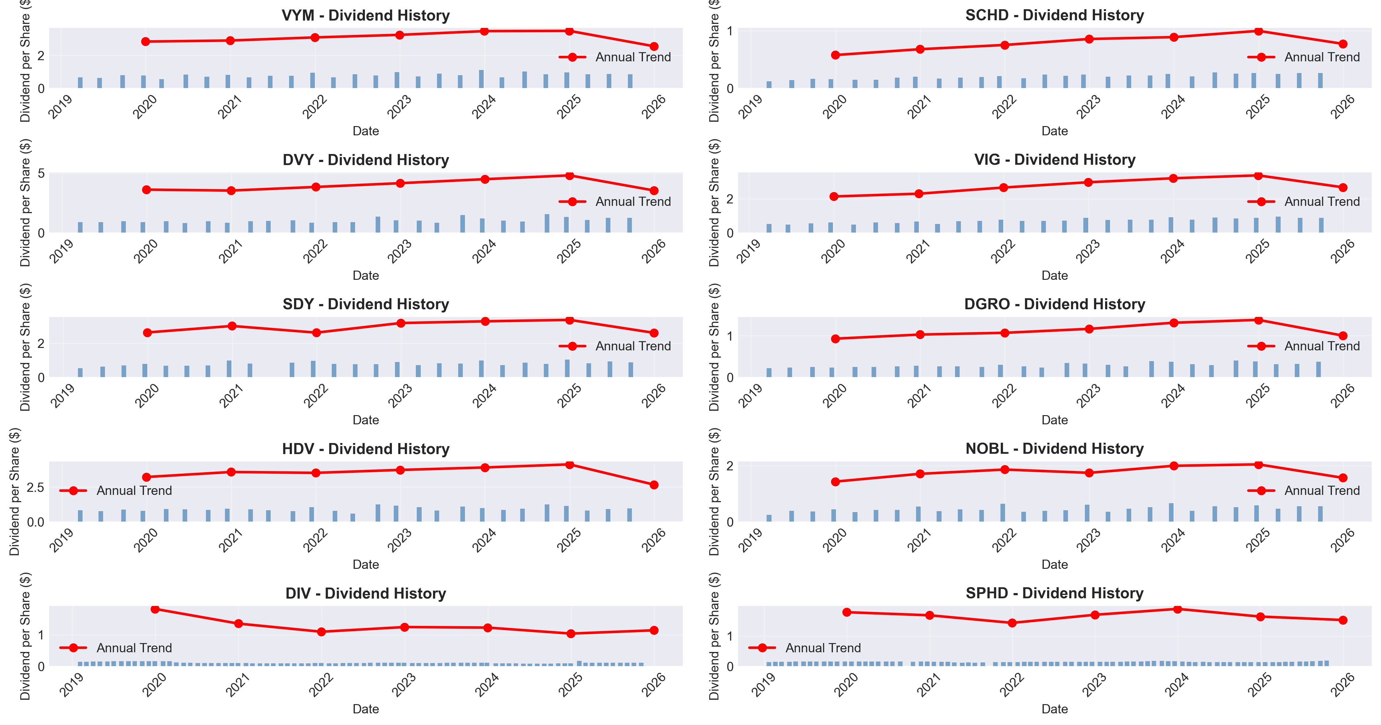
What This Chart Shows:
Each small panel shows one ETF's dividend payment history over 6+ years:
- Blue bars = Individual dividend payments (each bar is one payment, usually every 3 months)
- Height of bar = amount paid per share that quarter
- Evenly spaced bars = reliable payment schedule
- Red line with dots = Total annual dividends (sum of all payments that year)
- Line going UP = your income is growing
- Line going DOWN = your income is shrinking
- Flat line = no growth
Why It Matters:
You're looking at the ETF's "payment track record." Reliable ETFs show:
- Regular blue bars (not missing payments)
- Red line trending upward (your income increases each year)
How to Read Each Panel:
Look at SCHD (top right):
- Blue bars appear like clockwork every quarter ✓
- Red line climbs from ~$0.60 (2019) to ~$1.00 (2024) ✓
- Translation: Dependable payments that grow 10%+ per year
Compare to VYM (top left):
- Blue bars are regular (good) ✓
- Red line is nearly FLAT (bad) ✗
- Translation: Reliable payments but NO income growth for 6 years
Compare to DIV (bottom left):
- Blue bars are tiny and vary in height
- Red line actually declining
- Translation: Small, shrinking, unreliable income
Key Insights:
- Best growth trajectories (red line steeply rising): SCHD, VIG, DGRO, NOBL
- Stagnant (red line flat): VYM, DVY, HDV – you're getting the same income for 6 years while inflation erodes its value
- Declining (red line going down): DIV, SDY – you're actually earning LESS than you did years ago
Data Observation: ETFs where the red line consistently points upward (such as SCHD, VIG, and DGRO in this dataset) demonstrate historical dividend growth patterns, though past performance does not guarantee future results.
3. Total Return Performance: The Complete Picture
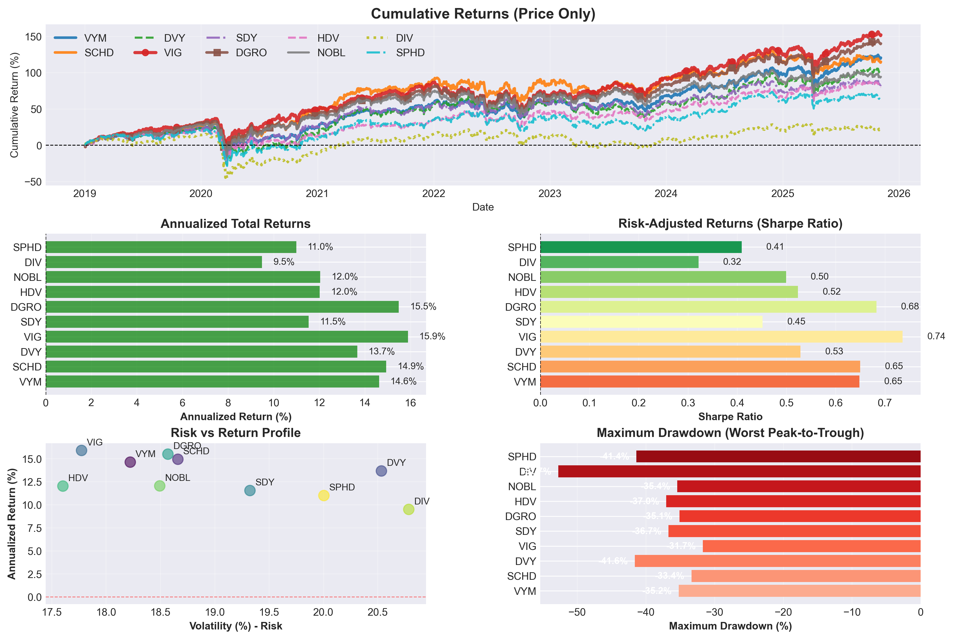
This comprehensive dashboard shows SIX different performance metrics. Let's break them down:
Panel 1: Cumulative Returns (Top)
What it shows: How much your investment would have grown since 2019
How to read it: Each line represents one ETF's growth over time. Higher lines = better performance.
Visual guide:
- VIG (thick red line with circles) - Clear winner at the top
- DGRO (brown line with squares) - Right behind VIG
- SCHD (orange solid line) - Strong performer in top cluster
- DIV (yellow-green dotted line) - Lagging at the bottom
Key insights:
- All ETFs crashed in March 2020 (COVID) - visible sharp dip
- VIG and DGRO (top two lines) recovered fastest and climbed highest (~150% gain)
- Middle pack (VYM, SCHD, DVY, SDY) show solid 100-120% gains
- DIV (bottom dotted line) barely recovered – only ~20% gain in 6 years – huge red flag
Panel 2: Annualized Returns (Middle Left)
What it shows: Average yearly return over the entire period
Key insights:
- Winners: VIG (15.9%), DGRO (15.5%), SCHD (14.9%)
- Losers: DIV (9.5%), SPHD (11.0%)
- Even a few percentage points make a HUGE difference over decades
Panel 3: Sharpe Ratio (Middle Right)
What it shows: Risk-adjusted returns – how much return you get per unit of risk
Why it matters: A higher Sharpe ratio means better returns WITHOUT taking excessive risk
Key insights:
- VIG has the highest Sharpe ratio (0.74) – best risk-adjusted returns
- DGRO and SCHD also excel (0.68 and 0.65)
- Think of this as "efficiency" – VIG gives you the most bang for your buck
Panel 4: Risk vs. Return Scatter (Bottom Left)
What it shows: Each dot represents an ETF plotted by volatility (risk) vs. returns
How to read it: Upper-left is ideal (high return, low risk)
Key insights:
- VIG is in the best position – high returns with relatively low volatility
- DIV and SPHD are in the worst spot – high risk, low returns
Panel 5: Maximum Drawdown (Bottom Right)
What it shows: The worst peak-to-trough decline – how much you could have lost at the worst moment
Why it matters: This tests your ability to "hold on" during crashes
Key insights:
- VIG had the smallest drawdown (-31.7%) – easier to stomach
- DIV crashed -52.7% – more than half your money disappeared temporarily
- This is why risk matters: can you handle watching your account drop 40-50%?
Data Observation: In this historical period, VIG, DGRO, and SCHD ranked at the top across multiple performance metrics, while DIV and SPHD showed lower performance. Past performance does not guarantee future results.
4. Real Returns: What About Inflation?
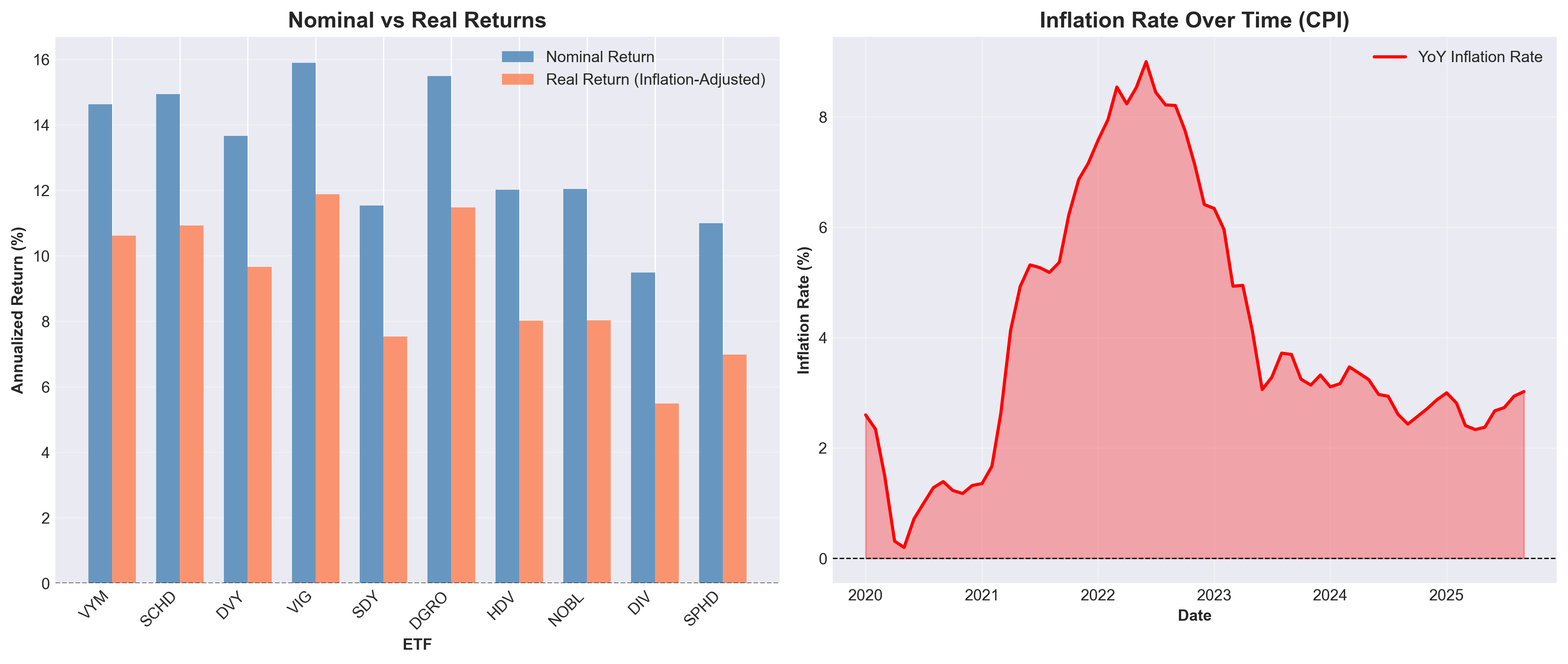
What This Chart Shows:
- Left panel: Two bars for each ETF comparing nominal vs. real returns
- Blue bars (Nominal Return) = Total annualized return INCLUDING EVERYTHING:
- Price appreciation (stock price going up)
- PLUS all dividend payments received
- Averaged per year over the 6+ year period
- Example: VIG's 15.89% = (price gain + dividends) per year
- Orange bars (Real Return) = Same total return BUT adjusted for inflation
- Shows what you actually gained in purchasing power
- The gap between bars = How much inflation stole from your returns
- Blue bars (Nominal Return) = Total annualized return INCLUDING EVERYTHING:
- Right panel: Inflation rate timeline from Federal Reserve (CPI data)
How The Numbers Are Calculated:
Example with VIG (2019 to 2025):
Step 1: Calculate Total Return
- Starting price: $85.82
- Ending price: $216.26
- Price gain: 152.0%
- Total dividends received: $19.33 per share (22.5% of original price)
- Total return: 152.0% + 22.5% = 174.5% over 7 years
Step 2: Annualize It
- Spread 174.5% over 7 years = 15.89% per year
- This is the blue bar (nominal return)
Step 3: Subtract Inflation
- Average inflation: 4.01% per year
- Real return: 15.89% - 4.01% = 11.88% per year
- This is the orange bar (real return)
What this means in dollars:
- Invest $10,000 in 2019
- By 2025: Worth $27,450 (15.89% annual growth)
- But $10,000 in 2019 dollars = $13,000 in 2025 dollars (inflation)
- True wealth gain: $27,450 - $13,000 = $14,450 (11.88% real annual growth)
Why It Matters:
If your investment grows 10% but inflation is 8%, you only gained 2% in purchasing power. Real returns are what actually matter for building wealth - they tell you if you can buy more things tomorrow than you could yesterday.
Key Insights:
- The inflation spike (2021-2022) hit 9% – visible in the red chart on the right
- All ETFs show a gap between nominal and real returns – inflation eats into gains
- VIG and DGRO maintain the strongest real returns (11-12%) even after inflation
- In high-inflation environments, dividend GROWTH becomes even more important
Data Observation: When adjusted for inflation, some ETFs like VIG and DGRO showed 11%+ real annual returns in this historical period. Inflation-adjusted returns provide different perspective than nominal returns.
5. Liquidity & Fund Size: Can You Trade Easily?
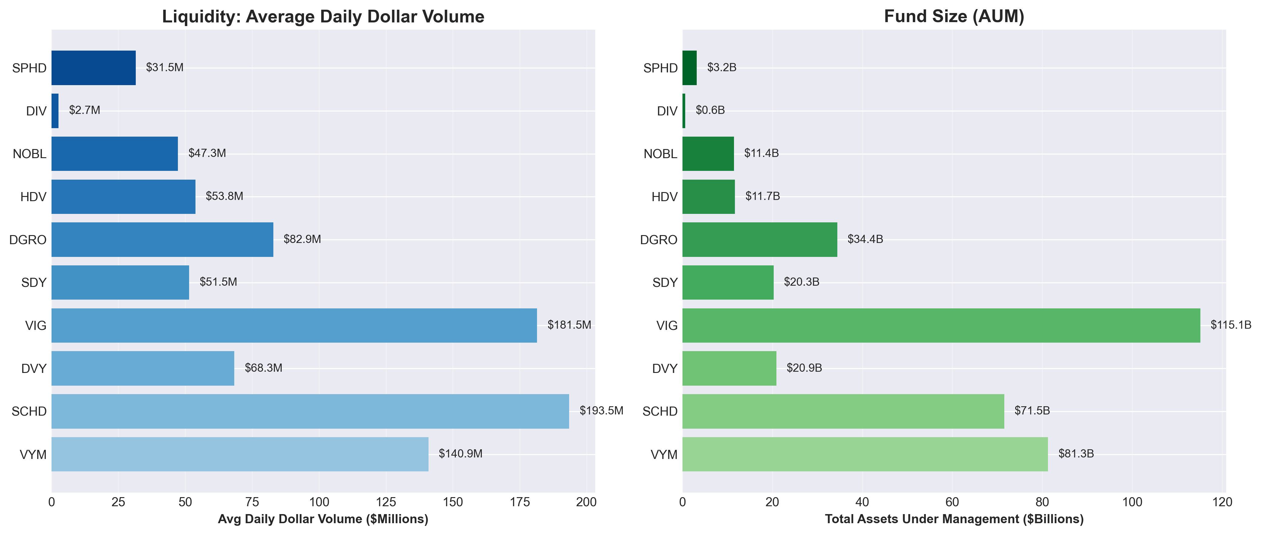
What This Chart Shows:
- Left panel: Average daily trading volume (in dollars)
- Right panel: Total assets under management (fund size)
Why It Matters:
- Liquidity ensures you can buy or sell without moving the price
- Fund size indicates popularity and lower chance of closure
Key Insights:
- SCHD and VIG are the most liquid – easy to trade without affecting price
- VIG is the largest fund ($115B) followed by VYM and SCHD – these aren't going anywhere
- DIV is tiny ($0.6B) – less liquid and higher closure risk
- Larger funds also tend to have better tracking and lower hidden costs
Data Observation: Larger funds like VIG, VYM, and SCHD demonstrated higher liquidity and trading volumes. Smaller funds like DIV had lower liquidity in this period. Fund size and liquidity are factors to consider when evaluating ETFs.
6. Distribution Frequency: How Often Do You Get Paid?
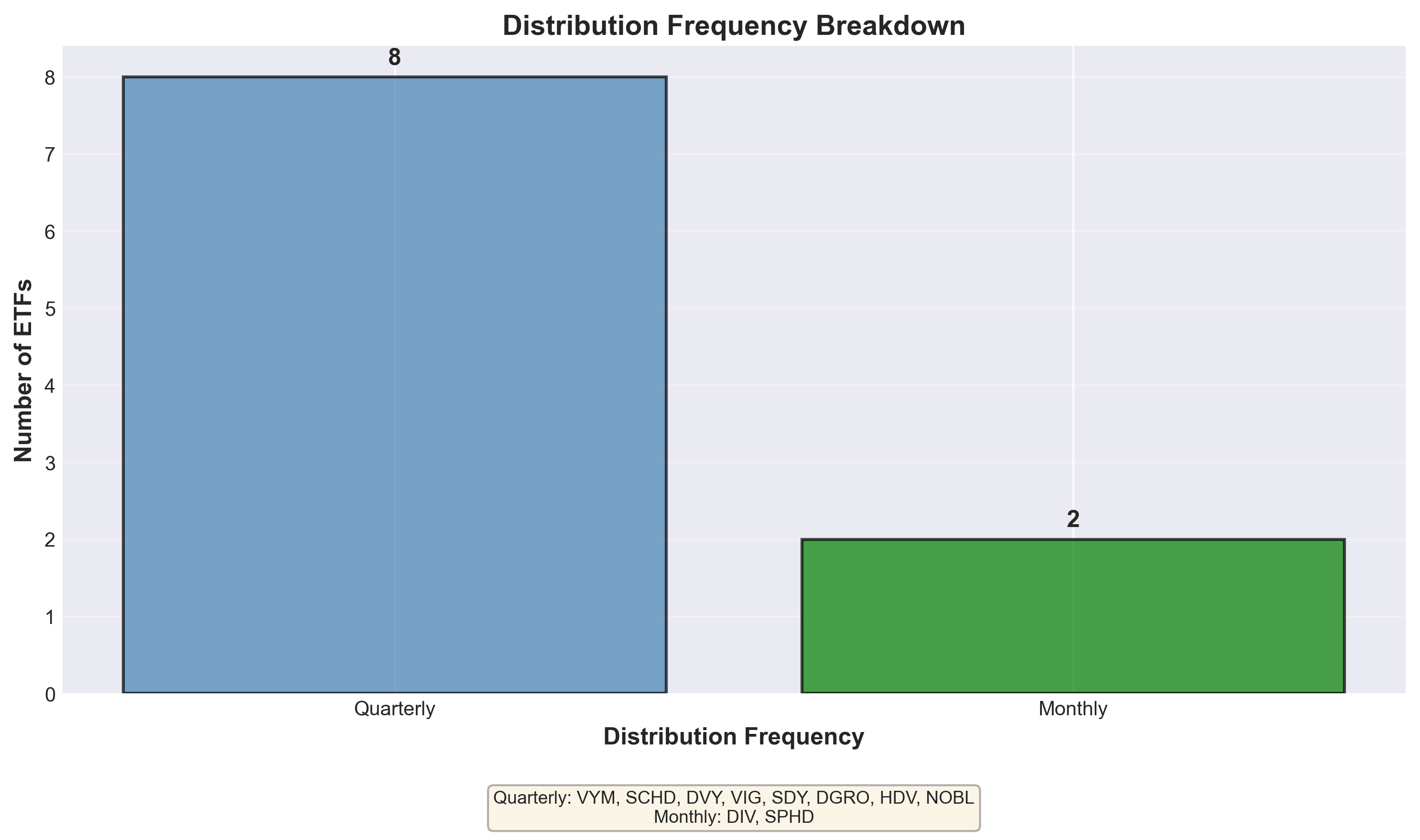
What This Chart Shows:
How often each ETF pays dividends – quarterly vs. monthly
Why It Matters:
If you're living off dividends in retirement, monthly payments make budgeting easier. For wealth building, frequency doesn't matter much.
Key Insights:
- Most pay quarterly (SCHD, VYM, VIG, DVY, SDY, DGRO, HDV, NOBL) – standard practice
- DIV and SPHD pay monthly – useful for retirees needing regular cash flow
- Frequency alone doesn't make an ETF better – focus on total return
Data Observation: Monthly vs. quarterly payment frequency is a personal preference based on cash flow needs. Frequency alone doesn't determine investment quality.
7. Macroeconomic Context: The Big Picture
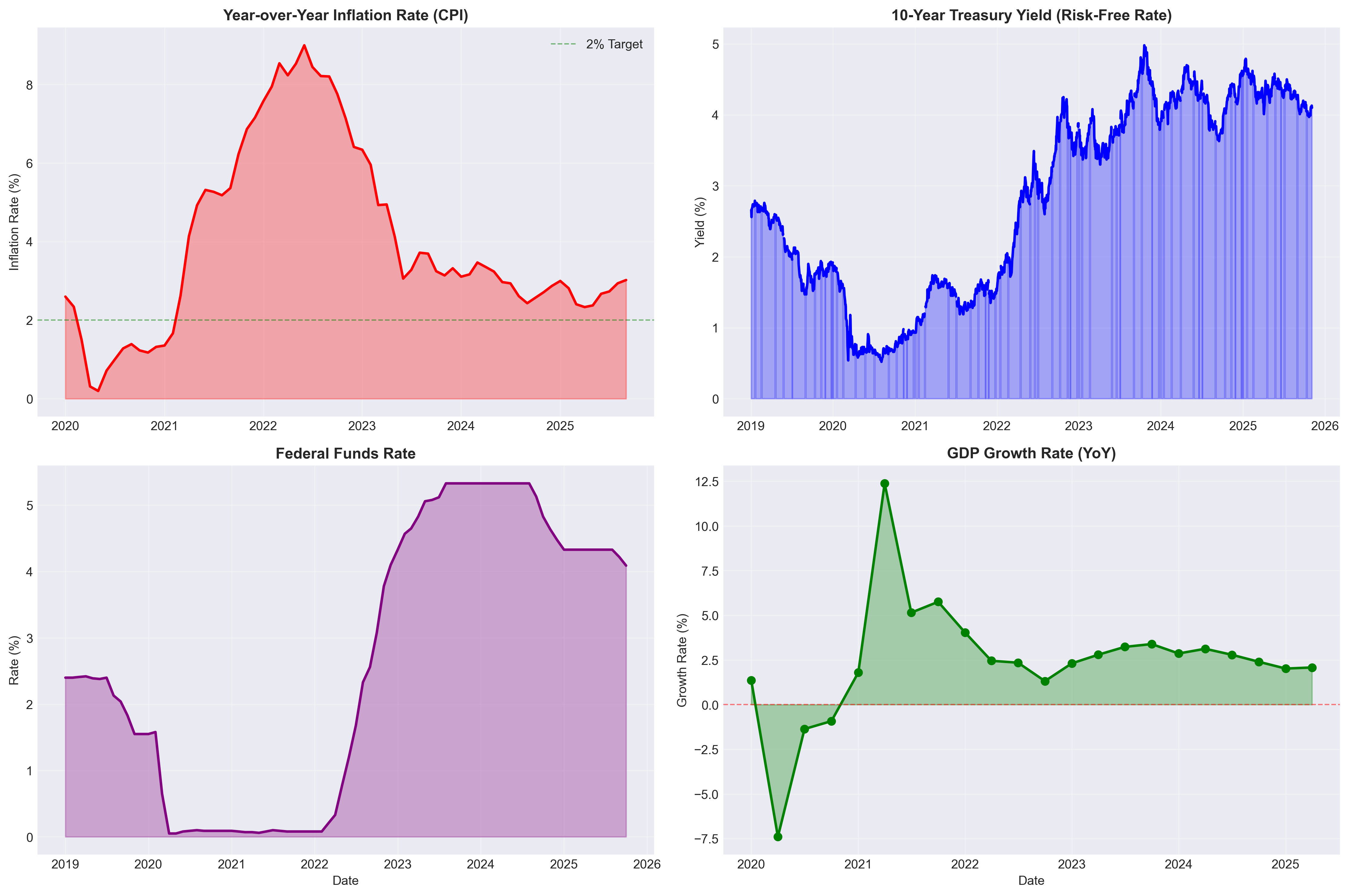
What This Chart Shows:
Four charts showing the economic environment these ETFs operated in from 2019-2025. Think of these as the "weather conditions" for investments.
Understanding Each Chart:
Chart 1: Inflation Rate (Top Left) - "How expensive is everything getting?"
- Shows how fast prices rise for everyday things (groceries, gas, rent)
- The huge spike to 9% in 2022 = everything suddenly cost way more
- Now back down to 3% = prices still rising but slower
- Why it matters: If your dividends grow 2% but inflation is 5%, you're actually LOSING purchasing power
Chart 2: 10-Year Treasury Rate (Top Right) - "What can you earn with zero risk?"
- This is what the U.S. government pays you to lend them money (super safe, boring investment)
- Currently at 4.1%
- Why it matters: If you can get 4% safely from government bonds, why take stock market risk for a 3% dividend? This is the "competition" for dividend ETFs
- When this number is high (like now), dividend ETFs need to offer MORE than 4% total return to be worth the extra risk
Chart 3: Federal Funds Rate (Bottom Left) - "How expensive is borrowing money?"
- The interest rate banks charge each other (set by the Federal Reserve)
- Went from near 0% (2020-2021) to 5.5% (2023-2024)
- Why it matters:
- High rates = companies pay more to borrow → less money left for dividends
- High rates = bonds become more attractive (see Chart 2)
- When rates jumped from 0% to 5.5%, it created pressure on all stocks
Chart 4: GDP Growth (Bottom Right) - "Is the economy growing or shrinking?"
- GDP = total value of everything produced in the U.S. economy
- The huge DIP in 2020 = COVID lockdowns
- The spike in 2021 = economy reopening
- Now stable at 2-3% = healthy, normal growth
- Why it matters: Growing economy = companies make more money = bigger dividends
How These Connect to Your Dividends:
The Inflation Problem (2021-2022):
- Inflation hit 9% in 2022
- If your ETF paid 3% dividends, you LOST 6% in real purchasing power
- Lesson: In high inflation times, you need dividends that GROW, not just high static yields
The Interest Rate Problem (2023-2024):
- Government bonds now pay 4%+ with zero risk
- A dividend ETF paying 3% looks unattractive
- Lesson: Your ETF needs price appreciation + dividends to beat 4%+ total return
- This is why VIG (15.9% total return) outperformed DIV (9.5% total return)
The Relationship:
High Inflation → Federal Reserve raises rates →
→ Bonds pay more → Stocks must perform better to compete →
→ ETFs with dividend GROWTH (SCHD, VIG) more attractive than flat high-yield (DIV)
What This Means for ETF Performance:
During this period (2019-2025):
- 2020: Rates dropped to 0%, inflation low → All dividend stocks did well
- 2021-2022: Inflation spiked to 9% → Stocks with dividend growth protected you better
- 2023-2024: Rates jumped to 5.5% → ETFs needed strong total returns to beat bonds
- 2025: Rates still 4%+, inflation cooling to 3% → Growth-oriented dividend ETFs (VIG) showed relative strength
Data Observation: The macroeconomic environment significantly impacted which dividend strategies performed better. During high inflation, ETFs with dividend growth (SCHD: +6.0% annual dividend growth) helped maintain purchasing power better than flat dividends. During high interest rates, ETFs with strong total returns (VIG: 15.9%) were needed to compete with bonds paying 4%+.
8. Comprehensive Dashboard: Everything at a Glance
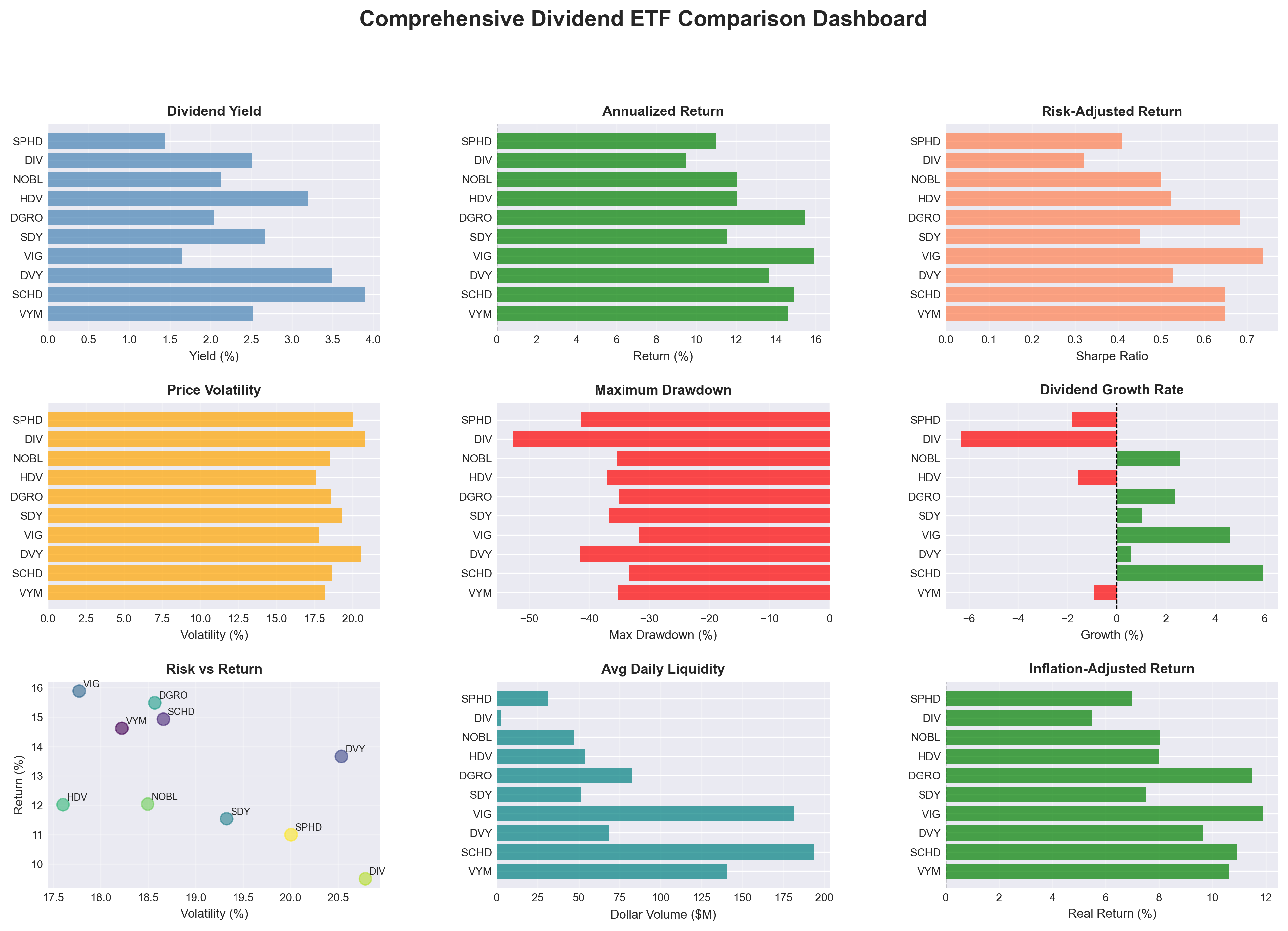
This is your "command center" – nine metrics in one view.
How to Use This Chart:
Look for ETFs that consistently appear in the top half across multiple panels:
Top Performers Across Most Metrics:
- ✅ VIG: Best Sharpe ratio, top returns, strong real returns, low volatility
- ✅ DGRO: Second-best Sharpe, strong growth, good returns
- ✅ SCHD: Highest yield WITH growth, excellent liquidity, strong returns
Consistent Underperformers:
- ❌ DIV: Lowest returns, highest drawdown, negative dividend growth, tiny liquidity
- ❌ SPHD: Below-average across most metrics
The Risk vs. Return Scatter (bottom left) is particularly revealing:
- VIG, DGRO, and SCHD cluster in the upper-left – maximum efficiency
- DIV is isolated in the bottom-right – high risk, low reward
Data Observation: This dashboard allows for quick comparison across nine metrics. In this historical period, VIG, SCHD, and DGRO showed strong performance across multiple dimensions, each with different characteristics (growth-focused, income-focused, or balanced).
Summary: Understanding the Data Patterns
Based on historical market data from 2019-2025, here are the observed performance patterns:
Historical Top Performers by Different Metrics:
VIG (Vanguard Dividend Appreciation)
- Highest risk-adjusted returns (Sharpe ratio: 0.74)
- Strong dividend growth (4.6% annually)
- Lowest maximum drawdown (-31.7%)
- Largest fund size ($115B)
SCHD (Schwab U.S. Dividend Equity)
- Highest current yield (3.89%)
- Best dividend growth (6.0% annually)
- Excellent liquidity
- Strong overall returns (14.9% annualized)
DGRO (iShares Core Dividend Growth)
- Second-best risk-adjusted returns (Sharpe: 0.68)
- Strong total returns (15.5% annualized)
- Good dividend growth (2.3% annually)
Historical Underperformers:
- DIV: 9.5% returns, -52.7% max drawdown, -6.3% dividend growth
- SPHD: 11.0% returns, -41.4% max drawdown, -1.8% dividend growth
Note: Past performance does not guarantee future results. These observations are for educational purposes only.
Key Educational Takeaways from This Analysis
1. Yield vs. Total Return
In this dataset, the highest-yielding ETF (DIV) had among the lowest total returns. This demonstrates the importance of considering total return, not just current yield.
2. The Power of Dividend Growth
Historical data shows how dividend growth compounds over time. A lower starting yield with consistent growth can potentially outpace a higher starting yield with flat or negative growth.
3. Understanding Risk-Adjusted Returns
The Sharpe ratio measures return per unit of risk. In this analysis, VIG's 0.74 Sharpe ratio indicates it achieved strong returns with lower volatility compared to some peers.
4. Fund Size and Liquidity Considerations
Larger funds (>$10B assets) in this analysis showed higher daily trading volumes, which can affect ease of trading and bid-ask spreads.
5. Macroeconomic Context Matters
Interest rate environments affect the relative attractiveness of different dividend strategies. The data shows how inflation and rates impact real returns.
6. Historical Patterns Are Not Predictions
While some ETFs showed consistent dividend growth in this period, past performance does not indicate future results. Market conditions change.
Questions to Ask When Evaluating Dividend ETFs
When conducting your own research (with the guidance of a financial advisor), consider examining:
Performance Metrics:
- What is the fund's historical total return (price + dividends)?
- How does it compare to relevant benchmarks?
- What is the risk-adjusted return (Sharpe ratio)?
- What was the maximum drawdown during market crashes?
Dividend Characteristics:
- What is the current dividend yield?
- What has been the historical dividend growth rate?
- How consistent are the dividend payments?
- What is the distribution frequency?
Fund Fundamentals:
- What is the fund's size (AUM)?
- What is the average daily trading volume?
- What is the expense ratio?
- How long has the fund been operating?
Historical Data Points That May Warrant Further Research:
- Yields significantly above 5% (examine sustainability)
- Negative dividend growth trends
- Very small fund size (<$1B)
- Maximum drawdowns exceeding 50%
- Low Sharpe ratios (<0.4)
Remember: These are data points to research and discuss with your financial advisor, not investment recommendations.
Conclusion
This educational analysis examined 10 dividend ETFs using real market data from 2019-2025. The data shows clear performance differences across multiple metrics including returns, dividend growth, risk-adjusted performance, and liquidity.
Key Observations:
- VIG, SCHD, and DGRO demonstrated strong performance across multiple metrics during this historical period
- DIV and SPHD showed weaker performance despite marketing language suggesting otherwise
- Marketing terminology doesn't always correlate with performance outcomes
What This Analysis Demonstrates:
- The importance of examining multiple metrics, not just dividend yield
- How different ETFs serve different investment objectives
- The value of historical data analysis in understanding investment characteristics
Important Reminders:
- This analysis is educational only - it is NOT investment advice
- Past performance does not guarantee future results
- Market conditions change, and historical patterns may not repeat
- Always consult with a qualified, licensed financial advisor before making any investment decisions
- Consider your personal financial situation, risk tolerance, time horizon, and investment goals
Data Sources & Methodology
All data in this analysis comes from:
- Market Data: Yahoo Finance (yfinance API) – historical prices, dividends, and volume
- Economic Data: Federal Reserve Economic Data (FRED) – CPI, Treasury rates, Fed Funds, GDP
- Analysis Period: January 2019 to November 2025 (6+ years)
- Verification: All charts use real downloaded data – no estimates or synthetic data
For the complete code and data verification, see the project repository.
Legal Disclaimer
IMPORTANT: This article is for educational and informational purposes ONLY. It is NOT investment advice, and should NOT be construed as a recommendation to buy, sell, or hold any security.
- The author is NOT a licensed financial advisor, broker, or investment professional
- This analysis does NOT constitute professional investment advice
- Past performance does NOT guarantee or predict future results
- All investment decisions should be made ONLY after consultation with a qualified, licensed financial professional
- The author may or may not hold positions in any ETFs discussed
- No representation is being made that any account will or is likely to achieve results similar to those shown
- Investing involves risk, including possible loss of principal
Before making any investment decision, consult with your own financial advisor, tax professional, and legal counsel.
Last Updated: November 2025 Data Period: January 2019 - November 2025
Comments (0)
No comments yet. Be the first to comment!