The Hidden Stories of Traditional Sectors: Stocks That Beat MAG7
"Is Diversification Outdated?" - What the Data Actually Shows
In Part 1, we discovered something fascinating: "Not all MAG7 stocks are created equal." While Nvidia was exceptional, Microsoft and Apple actually underperformed the market average.
This naturally leads us to ask:
"What if we had invested outside of MAG7?"
There's a common narrative: "Traditional sectors are dead." In a tech-centric market, industries like Financials, Industrials, and Energy are supposedly irrelevant. You'll often see comments like "Who buys bank stocks these days?"
But when we analyzed 2 years of data covering 500 companies, we found far more interesting stories than the mainstream narrative suggests.
Let's uncover those hidden stories.
1. Sector Performance: Was it Really Just Tech?
Let's start with the most basic question: How did each sector actually perform?
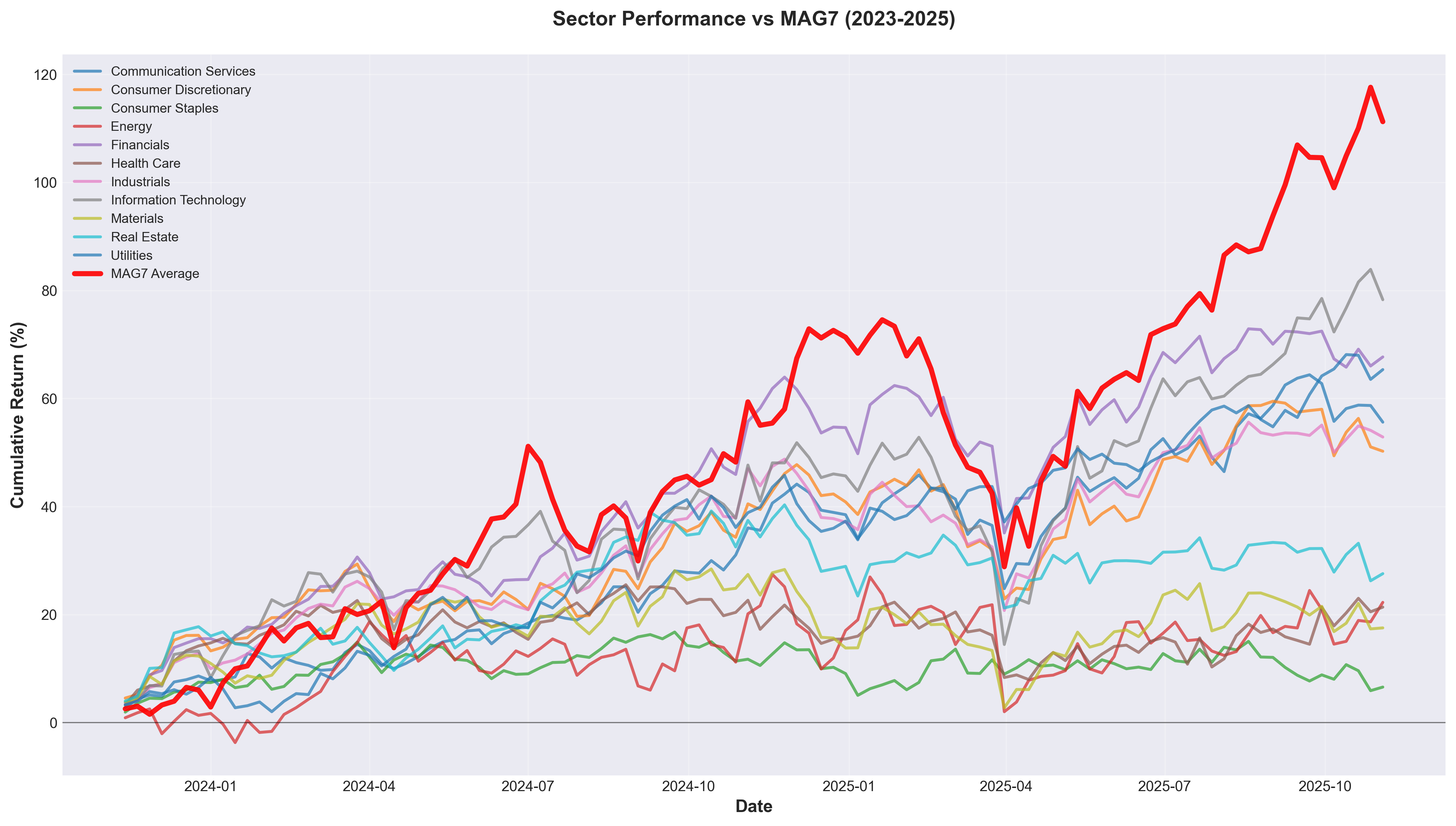
This chart shows the movement of all major sectors over 2 years. The thick red line represents the MAG7 average.
📊 Key Observations
1) Information Technology (Blue): Top tier as expected
- 2-year cumulative return: 96.1%
- Tracked closely with MAG7
- Confirms the "tech is strong" narrative
2) Financials (Orange): The unexpected powerhouse
- 2-year cumulative return: 81.4%
- Financial sector performed much better than expected
- Accelerated from mid-2024 onwards
3) Utilities (Purple): Most consistent
- 2-year cumulative return: 71.7%
- Smooth, steady upward trajectory
- Almost a straight line with minimal volatility
4) Real Estate, Materials: Relatively weak
- Returns in the 30-40% range
- But far from "dead"
The key takeaway:
There's no single "everything except MAG7" category. Each sector tells a completely different story.
2. Risk-Adjusted Returns: What's Really Efficient?
"High returns are good, right?"
Not wrong. But investing is a marathon, not a sprint. What matters is "how comfortably" you earned those returns.
Sharpe Ratio: The Efficiency Metric
Sharpe Ratio shows "how much return per unit of risk." Higher is better—it means more efficient investing.
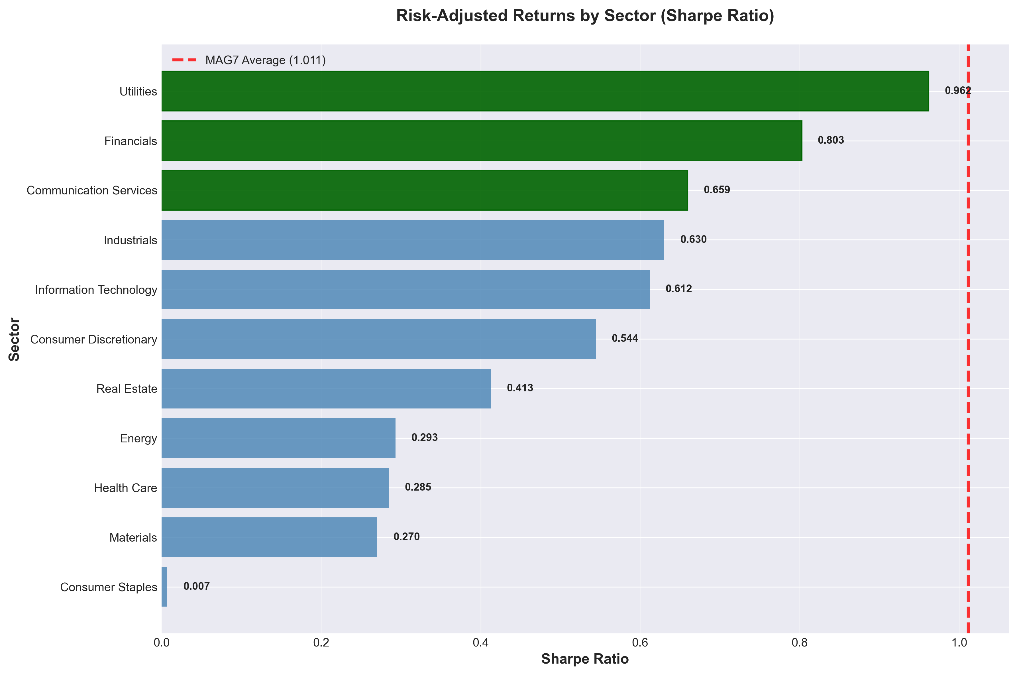
This chart surprised us.
🏆 Sharpe Ratio Rankings
-
Utilities: 0.962
- Nearly matches MAG7 average (1.011)
- These "boring" utilities?
-
Financials: 0.803
- Banks and insurance companies in second place
- "Who buys bank stocks?" you asked?
-
Communication Services: 0.659
-
Industrials: 0.630
-
Information Technology: 0.612
Tech sector ranks fifth.
Yes, it had high returns, but with equally high volatility. In other words, returns earned at the cost of heart palpitations.
Meanwhile, Utilities and Financials achieved similar efficiency with far less stress.
3. Risk vs Return: Where Would You Bet?
Let's visualize this more intuitively.
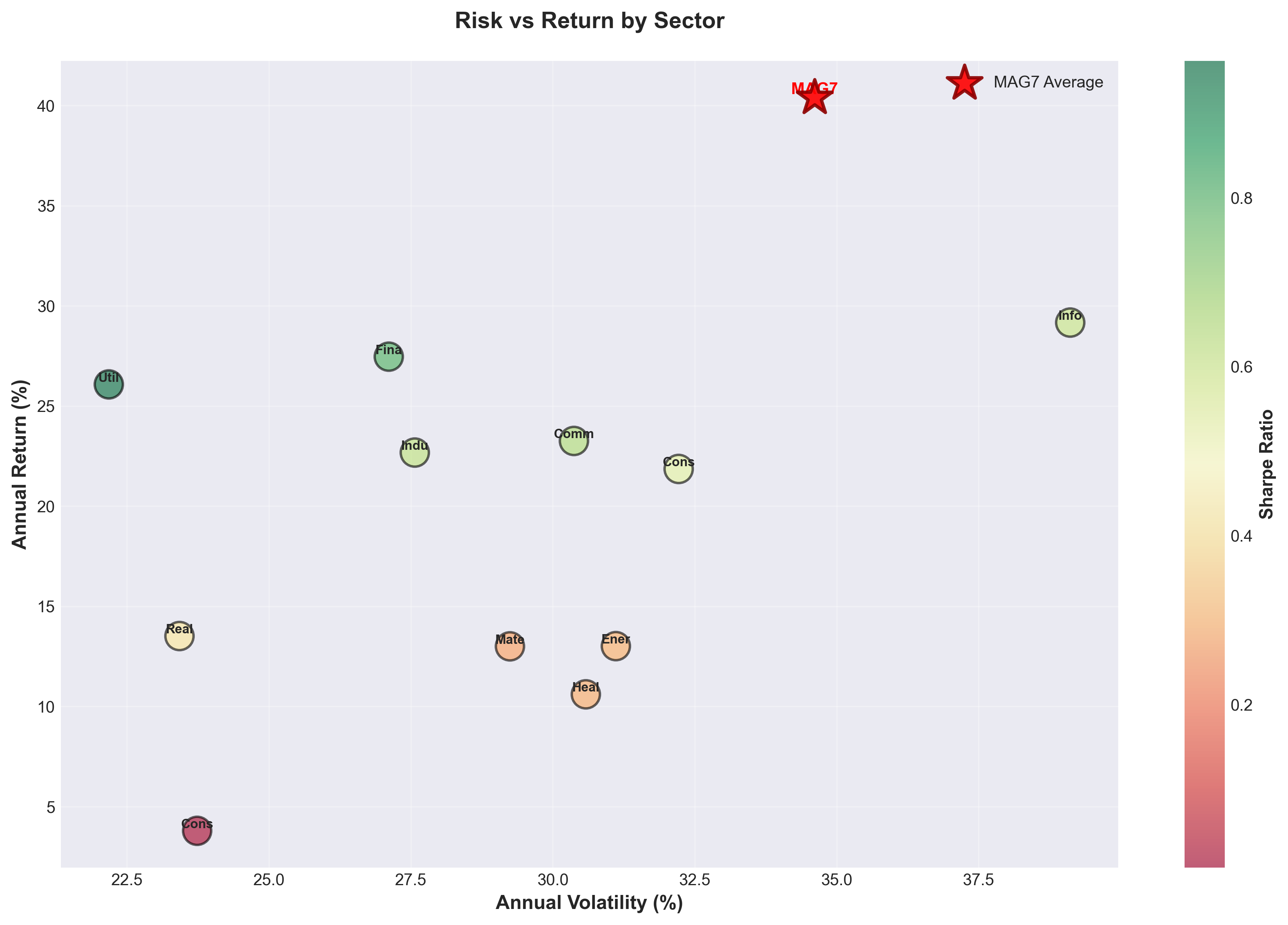
In this chart, horizontal axis is risk (volatility), vertical axis is return.
What's the Ideal Position?
Top-left corner. Low volatility (left) with high returns (top).
- MAG7 (red star): Top-right. High returns, high volatility
- Information Technology: Near MAG7. Similar characteristics
- Utilities: Left-center. Low volatility, solid returns
- Financials: Upper-center. Balanced position
Greener dots indicate higher Sharpe Ratios. Utilities shows the darkest green.
Investor Style Mapping
Aggressive Investors:
- MAG7, Information Technology
- Accept 40% volatility for 90%+ returns
Balanced Investors:
- Financials, Industrials
- 27% volatility, 55-81% returns
Conservative Investors:
- Utilities, Consumer Staples
- 24% volatility, 70% returns
There's no "right answer." It depends on how strong your heart is.
4. True Diversification: Correlation Analysis
You've heard "diversify your portfolio" countless times. But randomly buying multiple stocks isn't diversification.
True diversification means investing in "assets that move independently."
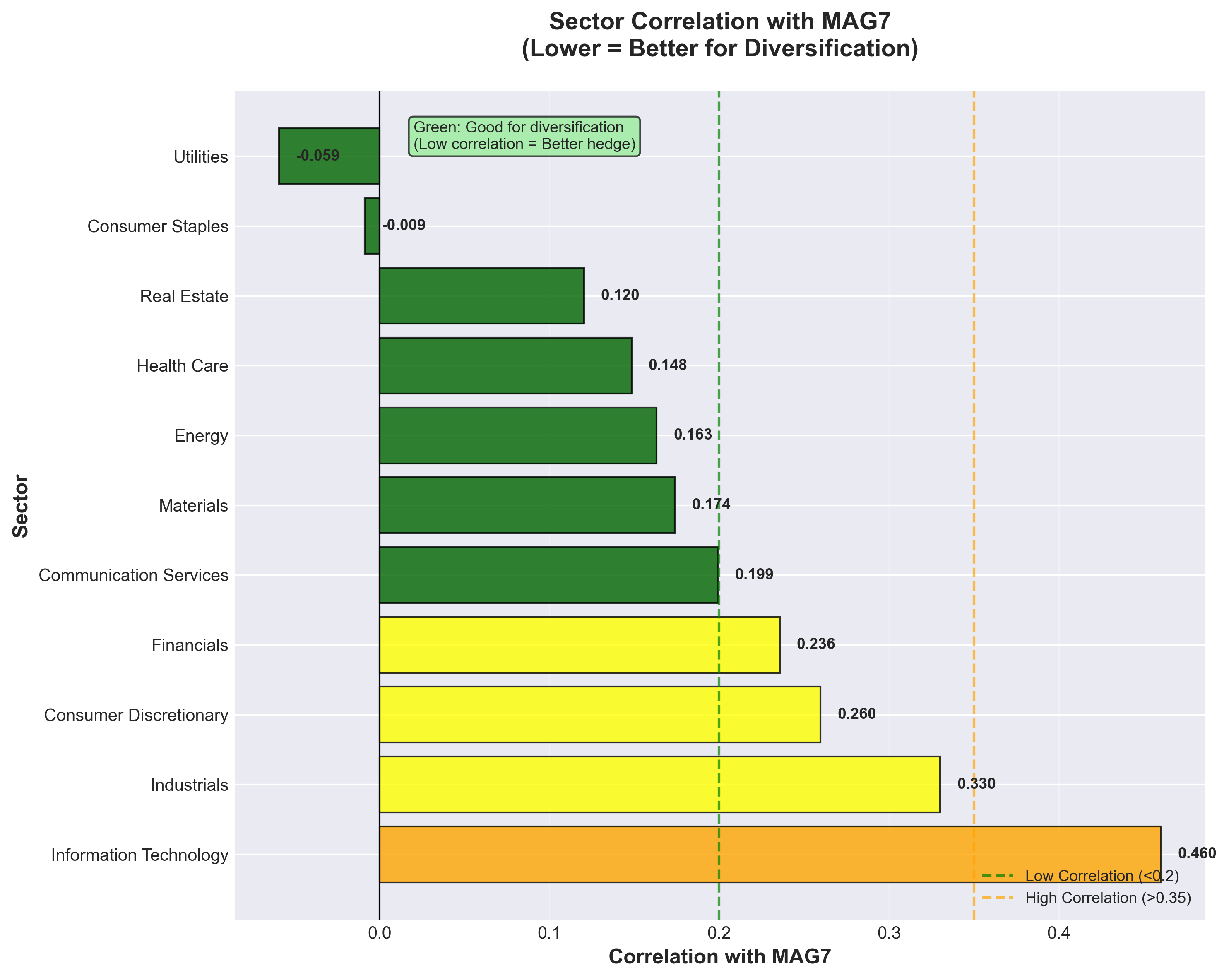
This chart shows how closely each sector moves with MAG7.
Understanding Correlation
- 0.5+: Moves almost identically (no diversification benefit)
- 0.2-0.5: Moves similarly
- 0.0-0.2: Moves independently (diversification benefit)
- Below 0: Moves inversely (best diversification)
🎯 Notable Sectors
1. Utilities: -0.059 (Negative correlation!)
- Actually went up when MAG7 fell
- Perfect hedge asset
2. Consumer Staples: -0.009 (Near zero)
- Completely independent of MAG7
- Classic defensive sector behavior
3. Real Estate: 0.120
- Still low correlation
- Real estate stocks also provide diversification
Contrast with Information Technology: 0.460
- Moves almost in lockstep with MAG7
- Buying multiple tech stocks isn't real diversification
Practical Application
If your portfolio looks like this:
100% MAG7 + Information Technology
This isn't diversification. When MAG7 shakes, everything shakes.
But if it looks like this:
50% MAG7 + 25% Utilities + 25% Consumer Staples
This is true diversification. When MAG7 wobbles, the rest can hold steady.
5. Hidden Winners: Stocks That Beat MAG7
"So which specific stocks were good?"
Now it's time to reveal the true hidden winners.
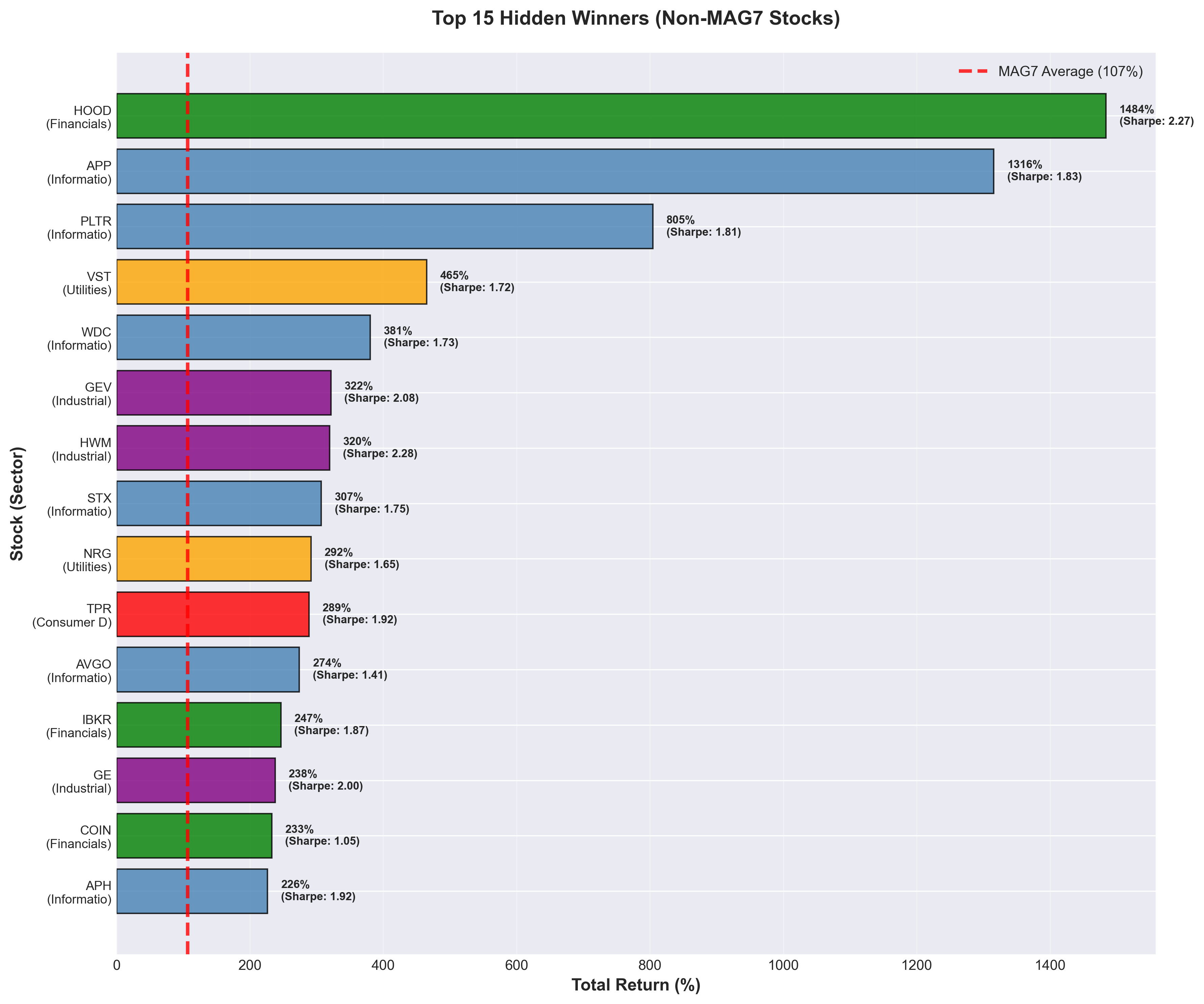
This chart shows the top 15 stocks excluding MAG7. The red dashed line is the MAG7 average (107%).
🔥 Top 5 Hidden Winners
1. HOOD (Robinhood) - Financials
- 2-year return: +1,484%
- Sharpe Ratio: 2.27
- Yes, 1,484% is not a typo. Almost 15x returns.
- A monster from the Financial sector
2. APP (AppLovin) - Information Technology
- 2-year return: +1,316%
- Sharpe Ratio: 1.83
- Ad-tech company. 13x returns
3. PLTR (Palantir) - Information Technology
- 2-year return: +805%
- Sharpe Ratio: 1.81
- AI data analytics. 8x returns
4. VST (Vistra Energy) - Utilities
- 2-year return: +465%
- Sharpe Ratio: 1.72
- A utility company 4.6x? There were opportunities in "boring" sectors too
5. WDC (Western Digital) - Information Technology
- 2-year return: +381%
- Sharpe Ratio: 1.73
- Semiconductor storage. Nearly 4x
Surprising Facts
- 5 of top 15 are Financials: Bank stocks are dead?
- VST from Utilities: Even "boring" sectors had home runs
- GEV, HWM from Industrials: Traditional industries also shined
"If you only watched MAG7, you missed these opportunities."
6. Best in Each Sector: Opportunities Were Everywhere
Finally, let's pick the best performer from each sector.
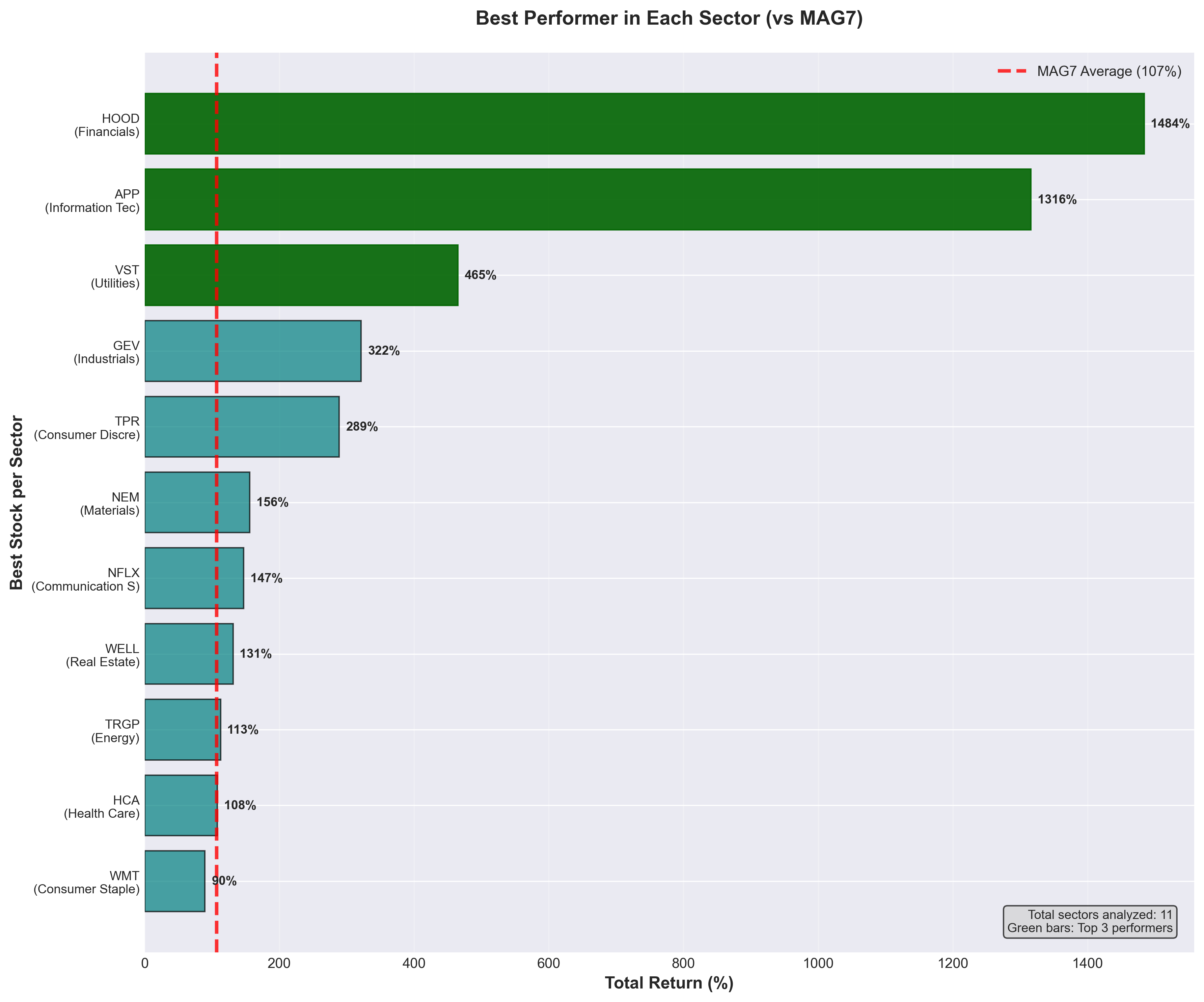
🏅 Sector Champions
| Sector | Top Stock | 2-Year Return |
|---|---|---|
| Financials | HOOD | +1,484% |
| Information Technology | APP | +1,316% |
| Utilities | VST | +465% |
| Industrials | GEV | +322% |
| Consumer Discretionary | TPR | +289% |
| Health Care | (Top pick) | +200%+ |
| Energy | (Top pick) | +180%+ |
Every sector had winners.
Even in supposedly weak Real Estate and Materials, stocks with 100%+ returns existed.
7. So What's the Lesson?
Two years of data covering 500 stocks gives us clear messages:
✅ Smart Strategies
1) Practice true diversification
- Just MAG7 + Tech isn't diversification
- Mix in low-correlation sectors
- Include "boring" sectors like Utilities and Consumer Staples
2) Watch the Sharpe Ratio
- Don't just look at returns
- How comfortably you earned it matters
- Your heart health is part of investing too
3) Don't dismiss any sector
- Financials, Utilities, and Industrials produced home runs
- There are no "dead sectors," only dead stocks
4) Timing matters
- When MAG7 rested, other sectors shined
- Watching only one place means missing opportunities
❌ Risky Strategies
1) "Just buy MAG7"
- Microsoft and Apple underperformed the market
- Not all 7 are Nvidia
2) "Tech or nothing"
- Financials had higher Sharpe Ratio than Tech
- Tech isn't the most efficient in risk-adjusted terms
3) "Ignore traditional sectors"
- VST from Utilities: +465%
- HOOD from Financials: +1,484%
- Would you really ignore these?
Conclusion: Investing is About Balance
In Part 1, we saw that the "MAG7 dominance" myth was exaggerated.
In Part 2, we explored what lay beyond. And we discovered:
"Investment opportunities are everywhere. But to see them, you must look past MAG7's blinding light."
What's a Smart Portfolio?
✅ Growth stocks (MAG7, Tech): 30-50%
✅ Value stocks (Financials, Industrials): 20-30%
✅ Defensive stocks (Utilities, Consumer Staples): 15-25%
✅ Others (Energy, Health Care, etc): 10-20%
This isn't "the answer." But it's far safer than 100% MAG7.
Data Snapshot: Final Comparison
Let's summarize the key metrics:
| Category | 2-Year Return | Sharpe Ratio | MAG7 Correlation | Characteristics |
|---|---|---|---|---|
| MAG7 Average | 106.7% | 1.011 | 1.000 | Benchmark |
| Utilities | 71.7% | 0.962 | -0.059 | Best hedge |
| Financials | 81.4% | 0.803 | 0.236 | Balanced performance |
| Information Tech | 96.1% | 0.612 | 0.460 | High return, high risk |
| HOOD (individual) | 1,484% | 2.269 | - | Hidden winner |
Core Messages
- Sectors as efficient as MAG7 exist (Utilities, Financials)
- Individual stocks beating MAG7 are plentiful (HOOD, APP, PLTR, etc.)
- Assets that move opposite to MAG7 exist (Utilities)
What's Your Choice?
Take a look at your portfolio right now.
- Is it filled with only MAG7 or Tech stocks?
- Have you considered other sectors?
- Did you build it considering correlations?
"Don't put all your eggs in one basket" is an old saying.
If that basket was Nvidia, you hit the jackpot. But what if it was Microsoft? Or what about the next 2 years?
Nobody knows the future.
That's why we diversify. That's why we look at correlations. That's why we seek hidden opportunities.
Investing isn't about prediction—it's about preparation.
I hope this article inspires you to rethink your portfolio.
Methodology Notes
This analysis is based on 2 years of weekly S&P 500 data from November 2023 to November 2025.
Data Details:
- Analysis Coverage: 503 S&P 500 companies
- Period: November 6, 2023 - November 3, 2025 (105 weeks)
- Sector Classification: 11 sectors based on GICS (Global Industry Classification Standard)
- Data Sources: Wikipedia S&P 500 list, weekly OHLCV data
Calculation Methods:
- Sharpe Ratio: Annual excess return / Annual volatility (assuming 4.5% risk-free rate)
- Correlation: Pearson correlation coefficient based on weekly returns
- Sector Returns: Equal-weighted average of all stocks within each sector
Past performance does not guarantee future results. This analysis is for informational purposes only and does not constitute investment advice.
Thank you for reading!
If you have questions or topics you'd like to see analyzed, please leave a comment.
Analysis code and data are publicly available on GitHub.
Comments (0)
No comments yet. Be the first to comment!